UI design that guides every tap. We design interfaces where visitors find what they need fast, in a layout built to convert rather than just to look good.

Attention spans are short, expectations are high. Studio Ubique designs interfaces that look right and work right, where visual hierarchy does a job rather than just decorating the page. Clean design, current without chasing every trend.

Consistent spacing, clear typography, and a defined colour system raise perceived quality and keep focus where it earns money.

We use contrast, sizing, and micro-animations to steer attention toward the action that matters, so visitors become users.

Colour choices pass WCAG contrast checks, so the interface works for low-vision and colour-blind users, which is most of your audience eventually.

Reusable components speed up new feature rollout, cut development time, and keep the brand consistent across screens.
languages from day one
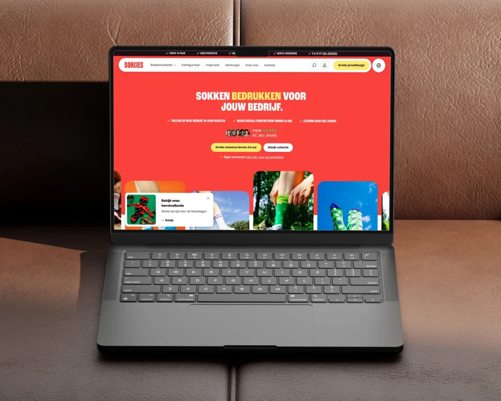
Webshop for custom printed socks, without a checkout
page storefront, brand to cart
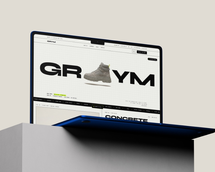
Streetwear ecommerce website design, a concept
dev cost savings since 2023
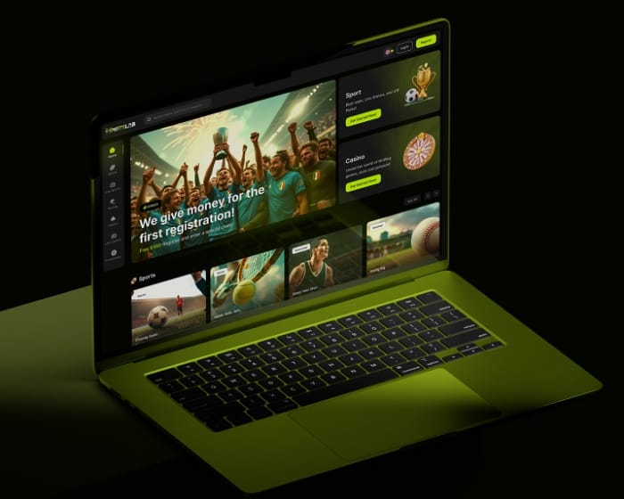
Sportsbook UI design & dedicated dev team
organic traffic grow in 3 months
Custom B2B WordPress website for Pine Tree Lane
more user engagement after redesign
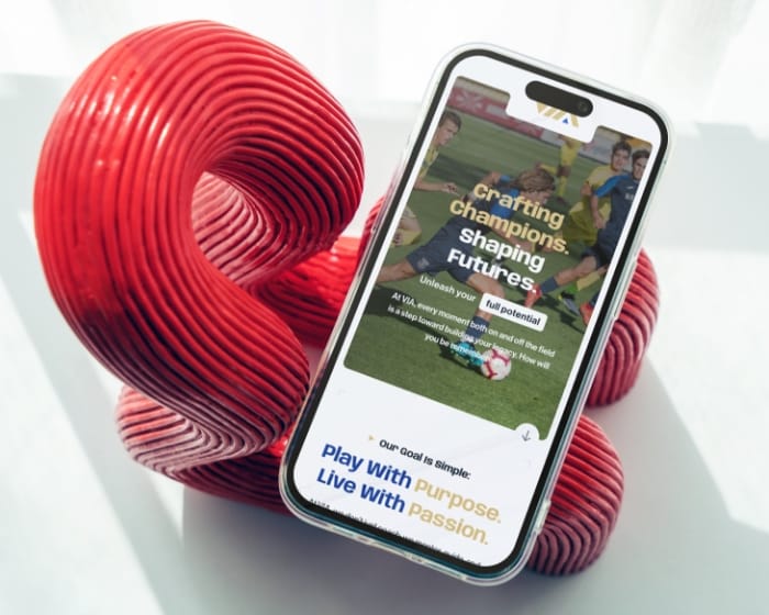
Sports travel website design and WordPress development for Via Sports Experiences

increase in blog post engagement
Nonprofit website UX redesign & navigation overhaul – Mission EineWelt
Good UI design is systematic, not guesswork. The process keeps projects on budget and on brand, and gives your developers a clean handoff.
01
We start with stakeholder conversations, analytics review, and an audit of your current visual style. Output: a clear picture of context, constraints, and what the interface actually needs to do before any design work begins.
02
Wireframes establish layout logic before any style discussion. Getting the structure right first means design decisions later are about refinement, not about fixing a layout that never worked.
03
High-fidelity screens apply your brand to established interface patterns, the ones users already know how to read. Current design choices where they help, familiar patterns where familiarity reduces friction.
04
Interactive prototypes in Figma simulate animations and edge states, so you can click through the interface before development starts. Feedback at this stage is cheap. Feedback after build is not.
05
Remote usability testing and A/B trials check whether the design actually works for real users. We test clarity and task completion against the goals set in discovery, then refine based on what the data shows.
06
Design tokens, specifications, and a component library hand off cleanly to your developers. The goal: a developer can build the screen from the file without a meeting to decode what the designer meant.
Studio Ubique designs interfaces for startups and mid-sized companies, from first product screens to redesigns of established sites. Since 2012, with clients across 15+ countries.
5.0


“Studio Ubique brought our vision to life with skill, passion, and precision, our website now truly reflects the soul of House of Books.”
5.0

“Project meets my expectations, good communication with the designer.”
5.0

“Studio Ubique revamped our brewery site with stunning UX/UI. Engagement, speed, and mobile retention soared, plus they nailed the brief on time, on budget, and with true creative flair.”
5.0
“Studio Ubique continue to do really excellent work! They are great at taking direction, but also willing to advise when ideas clash with good design. A great team to work with.”
5.0
“Simply outstanding. I am blown away by the not only the design expertise, but also the site functionality. Worth every dollar, and I will be coming back for more business. Do not look further - you found your developer here.”
5.0

“Fastest time ever for a premium website. Willing to make changes, always friendly and helpful - 100% recommend for start-ups and large businesses alike.”
5.0
“Great ideas, smooth communication, and a pleasure to work with, Studio Ubique made building our new website a seamless, collaborative process.”
5.0
“Studio Ubique boosted our site’s speed, security, and UX. With timely delivery, proactive updates, and expert execution, they’ve become a trusted partner in our digital growth.”
5.0
“Creative, skilled, and budget-conscious, Studio Ubique perfectly translated our vision with care, precision, and a truly personal touch. We used to post and pray. Their paid social and landing pages now bring real sales, not just likes. Clear plan, quick execution.”
5.0
“Studio Ubique earned our trust with their expertise and results. What started as one project grew into a long-term collaboration thanks to their consistent delivery and professionalism.”
5.0
“Studio Ubique understood our vision, responded fast to feedback, and kept the AGN website redesign smooth and efficient. A seamless, goal-driven collaboration from start to finish.”
The questions that come up most often, answered here. Yours not among them? Just ask, there's a human on the other end.
UX design is about how an interface works: the flows, the structure, the logic of how someone gets from landing on a page to completing a task. UI design is about how it looks and feels at the surface: visual hierarchy, typography, colour, spacing, components, micro-interactions. UX decides that the checkout has three steps and what each step asks for. UI decides what those steps actually look like on screen.
In practice the two overlap and good projects treat them as one process rather than two departments. A beautiful interface on top of a broken flow still fails. A logical flow with a confusing visual layer still loses people. We work on both, and on most projects the same team handles UX structure and UI surface so decisions stay consistent. If your project genuinely only needs the visual layer (the flows already work, the structure is sound), we scope UI-only. If the underlying experience has problems, UI polish alone won’t fix it, and we’ll say so.
We design in Figma. Yes, you get the working files. You own the design files for work we do for you. That includes the full Figma project: screens, components, design tokens, prototype flows, and the component library.
This matters more than it sounds. Some agencies keep design files as leverage, so you can’t move to another team or handle small changes in-house without coming back to them. We hand over everything, documented well enough that another designer or your own team can pick it up. If you later want us to keep iterating, that’s because the work is good, not because you’re locked in. The handoff also includes developer-facing specs so your engineers can build from the file directly.
A design system is a documented set of reusable components (buttons, forms, cards, navigation), design tokens (colour, spacing, typography values), and rules for how they combine. Instead of designing every screen from scratch, designers and developers assemble screens from agreed building blocks. It keeps a product visually consistent and speeds up both design and development.
Whether you need one depends on scale. For a small marketing site of 5 to 10 pages, a full design system is overkill, a simpler style guide does the job. For a web app, a product with many screens, or a site that multiple people will keep editing over the years, a design system pays for itself fast: new features stay consistent, onboarding new designers or developers is quicker, and the interface doesn’t drift into inconsistency over time. We scope the right level for your project rather than selling a full system to everyone.
Accessibility is built into the design from the start, not added as a compliance pass at the end. The main areas: colour contrast that meets WCAG AA ratios so text stays readable for low-vision users, colour choices that don’t rely on colour alone to convey meaning (since colour-blind users miss that), focus states for keyboard navigation, text sizing and spacing that work when a user zooms, and touch targets large enough to tap reliably.
An honest note on scope: colour and visual design are part of accessibility, not all of it. Full WCAG compliance also covers semantic HTML, screen reader support, keyboard navigation logic, and ARIA attributes, which is development work as much as design work. We design with accessibility in mind and flag what the build needs to do to get to a given WCAG level. If accessibility compliance is a hard requirement for your project (public sector, certain regulated industries), we plan it as an explicit workstream with the development side rather than assuming the visual layer covers it.
Hourly rate is €60-€65 across all design roles. A focused UI design project (visual design for an existing structure, a defined set of screens) typically runs €4,000 to €12,000. A larger project with a component library, design system, and a wider set of screens runs €12,000 to €30,000. Full product UI with extensive flows, multiple states, and ongoing design support runs higher and is usually scoped as a phased engagement.
What moves the cost most: number of unique screens and states, whether a design system is in scope, how much UX structure work is needed before the UI layer, and how many rounds of iteration the project expects. Pure visual redesign of a sound existing structure is the lower end. UI as part of a from-scratch product build is the higher end. See our pricing page for the broader framework, or book a discovery call to scope your specific project.
Both. Redesigns are actually the more common request. The approach starts with understanding why the current interface underperforms: a usability review, a look at analytics and any heatmap or session-recording data you have, and a check of what users complain about. That tells us whether the problem is the visual layer, the underlying structure, or both.
For redesigns we usually recommend an honest decision early: a visual refresh (new look on the existing structure, faster and cheaper) versus a deeper redesign (rethinking flows and structure, more work but fixes problems a coat of paint won’t). We’ll tell you which one your situation actually needs rather than selling the bigger project by default. For interfaces with significant traffic, we also plan the rollout carefully so a redesign doesn’t tank metrics on launch day, sometimes phasing changes rather than switching everything at once.
Contact
Not everyone likes to write. Rather talk to someone first? Book a 30 to 45 minute intro call through Calendly. It's free, and by the end you'll know whether a proposal makes sense.
Book a call(opens in a new tab)Tell us what's stuck, what you want to build, or what needs fixing. We usually reply within 1-2 business days.