
Timeline:
1,5 week
Impact:
6 page storefront, brand to cart
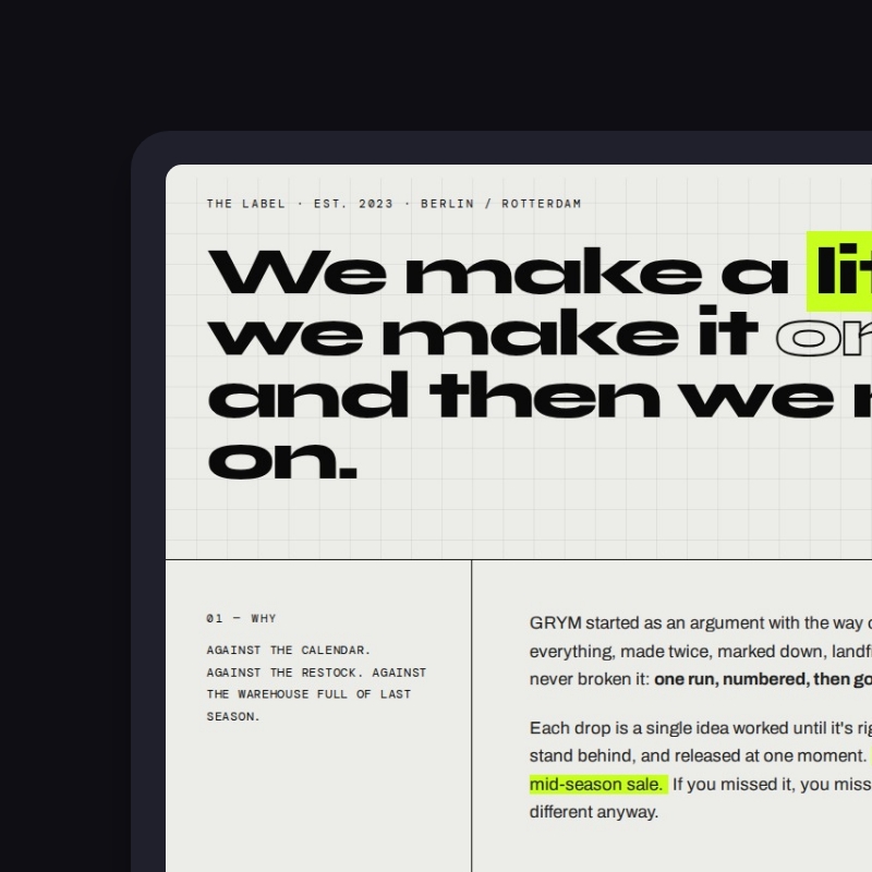
GRYM is a streetwear ecommerce website design concept we built at Studio Ubique, the kind of work we bring to a pitch when we want the brief badly. We invented the brand ourselves, a limited run footwear label, and built it out into a working six page storefront, so you can judge how we think before there is money on the table. Because the brand is ours, there are no client sales numbers to wave around. There is the work, live on our staging and clickable end to end, kept up because we are proud of it and because it shows you faster than any slide what is possible for your own store.
Pitching is half of agency life. You go up against other studios, you win some and you lose some, and it is rarely down to one clean reason. So alongside the client work, we build pieces like GRYM on our own terms, where the only brief is the one we set ourselves and the only bar is the one we would bring to a real one. This is that bar.
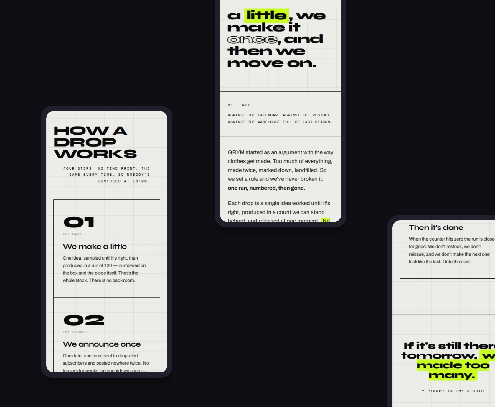
Most fashion stores look the same because they start the same way. Pick a theme, drop in the product, ship it. It works, and it is forgettable. We wanted to see how far you can push a store’s personality before it stops being usable, because that line is exactly where the interesting work sits. Push too little and you have another grid of cards. Push too far and people cannot find the size button.
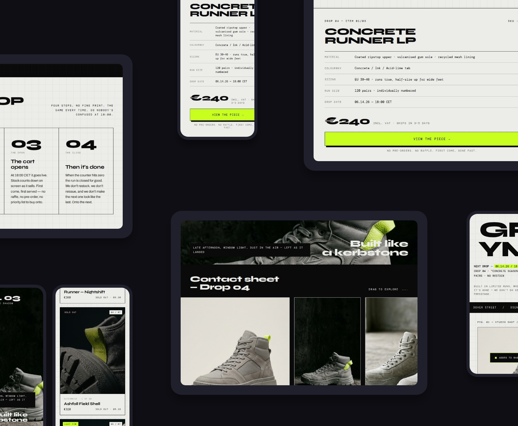
A drop label makes the test harder. The whole model runs on scarcity and timing. One run, a fixed number of pieces, a clock, then it is gone. That has to feel like an event without turning into a guessing game for the person trying to buy. So we wrote ourselves three rules. The store should feel like the brand from the first screen, not from the third. Scarcity should be obvious without being a cheap trick. And the system should hold across every page, not only the homepage that gets all the attention in a pitch. Good limited drop ecommerce UX is mostly about removing doubt while the clock is running, and that is harder than it sounds.
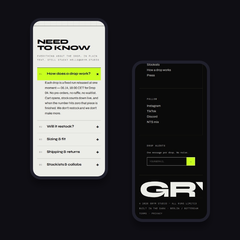
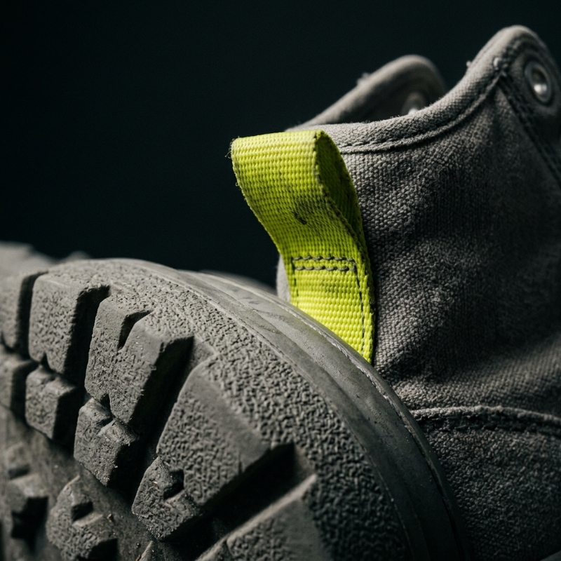
GRYM is a limited run footwear and streetwear label, invented for the occasion. The identity leans almost entirely on type, which is the cheapest and most underrated tool in fashion brand web design. The wordmark is set in Syne, heavy and wide, and on the homepage it stops behaving like a logo and becomes the layout. The letters span the screen and the product sits inside them, nested between the R and the Y. It reads as confident rather than loud, which is the tone the whole label is going for.
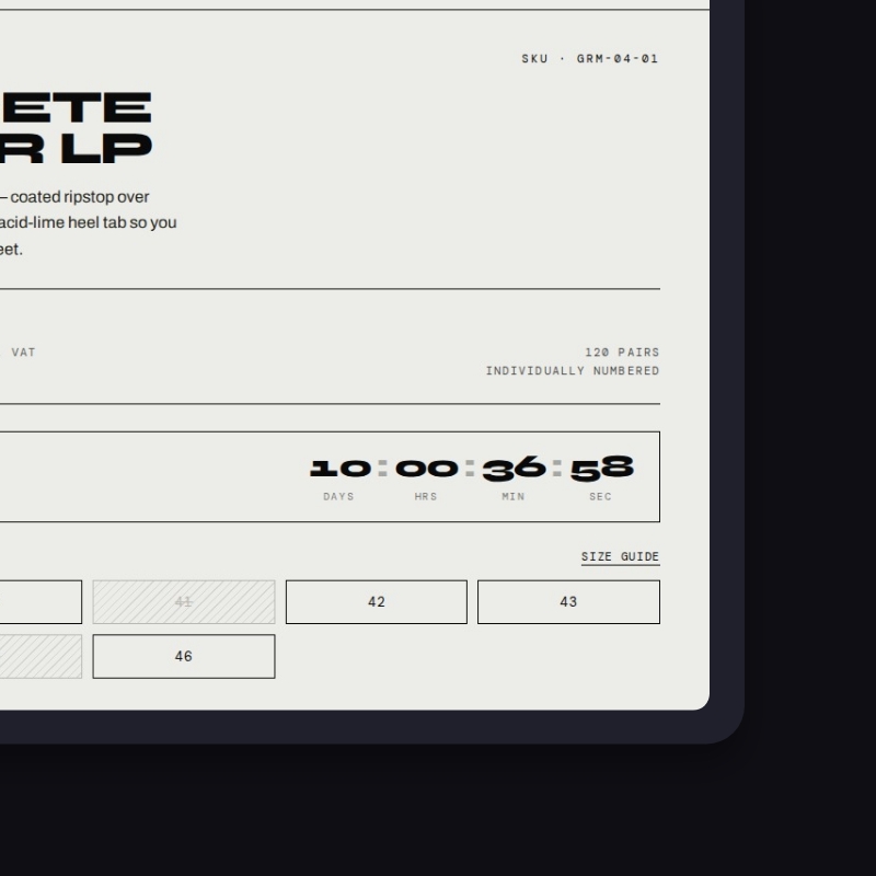
Archivo carries the body copy, and DM Mono handles the small, technical stuff: the spec lines, the labels, the drop clock, the things that should read like a packing slip rather than a poster. That split does a lot of quiet work. The mono signals precision and inventory, the serif-free display signals attitude, and you never confuse the two.
The palette is short on purpose. Off white paper at #ECECE8, near black ink at #0A0A0A, and a single acid lime at #C8FF1E that does all the pointing. Every button, every live state, every “this is the thing to click” is lime, and nothing else is. Two concrete greys fill out the product world. A faint graph paper grid sits under it all, so the page reads like a worktable instead of a billboard. Five tones, one accent, a lot of restraint. That is the whole kit, and it carries six pages without getting tired.
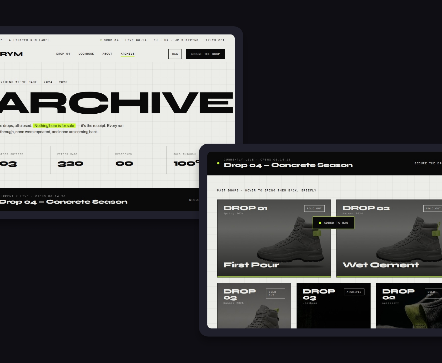
A homepage proves nothing on its own. Anyone can make one screen sing. The harder question is whether the idea survives a product page, a cart, and the pages nobody screenshots. So we built the full set:
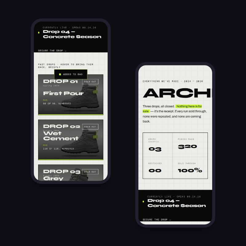
Six pages, one system. The header and footer are identical everywhere, the type scale does not wander, and the lime only ever means one thing. That consistency is the actual work. Designing a hero is easy. Keeping the sixth page as disciplined as the first is the part that separates a real ecommerce design system from a nice-looking homepage.
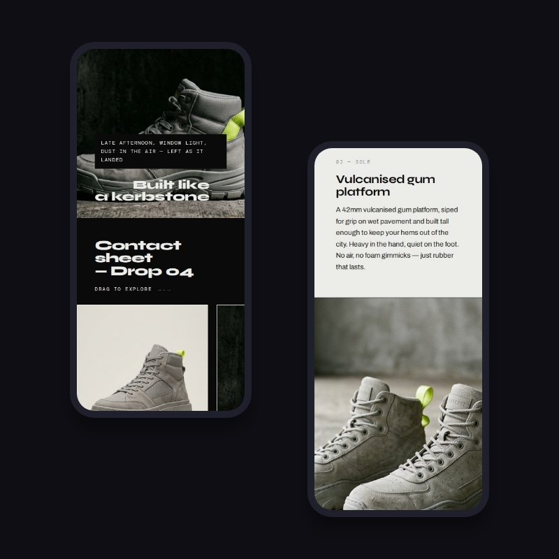
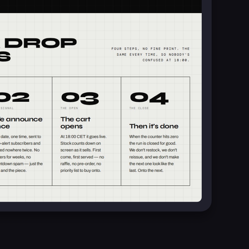
A drop store that does not move feels dead, so the front end is built to respond. The cart is real. Add the Concrete Runner and it slides in from the side as a drawer with the running total, rather than throwing you onto another page and breaking your flow. A live countdown ticks toward the drop date, 14 June 2026 at 18:00 CET, built on a timer rather than a static graphic, so it reads as a real deadline and not a sticker.
The collection filters in place instead of reloading. Product cards lift and swap to a second image on hover, so you can scan a lineup quickly without opening every page. And because motion is a problem for some people, the whole thing respects reduced motion settings and calms down when the browser asks it to. None of this is animation for its own sake. Each piece is there to take doubt out of a fast, time boxed purchase, which is the moment a drop store usually loses people.
This is a front end concept, not a live shop, and we are not going to pretend otherwise. It was designed to be built on WooCommerce, which is one of the platforms we use for real work, alongside Shopify and a custom CMS where that earns its place. We do not build on page builders like Elementor or Oxygen. So the design maps onto a real build without a fight.
The Concrete Runner and its siblings become WooCommerce products, with sizes as variants and the “individually numbered” and run size details held as product fields. The drop itself becomes a product category, so “Concrete Season” is a real, filterable collection rather than a hand-built page. The countdown and the sold out logic hang off the drop date and the stock count, which means that when a run sells through, the store says so on its own without anyone editing a banner at midnight. The cart drawer, the filtering and the product templates are the kind of custom front end we would build on top of WooCommerce, skipping the bloated theme entirely.
The reason we design it this way is simple. A concept that cannot be built is a poster. This one is a storefront you could ship, with a clear path from the design you see here to a working shop.
Here is the straight version. Because the brand is ours, there are no conversion numbers and no before and after graphs, and we would rather say that than paint a chart to fill the gap. What you can judge is the work itself, which is the whole point of building it.
What it shows you is how we work when the brief is ours to set and there is nowhere to hide. A brand built from zero with a point of view. A system tight enough to hold six pages without drifting. Commerce flows that match how people actually buy under time pressure, a real cart, a product page that answers questions before you ask them, filtering, and scarcity logic that is honest about what is gone. And a front end designed to sit on a real platform, not a sandbox.
If you are trying to work out whether an agency can hold an idea together from the first screen to the last, a piece like this tells you more than a polished homepage with a borrowed logo on it. When we build for a paying brand, the same discipline applies, with your goals and your numbers added on top. The work is held to the same standard whether we are pitching for it or already winning it.
If your shop looks fine but feels like every other shop, that is usually a brand and structure problem, not a plugin problem. Book a quick 30 minute video call and we will show you exactly what to fix, in plain language, no pressure.


Book a quick 30 min video call, we will show you exactly what to fix. We reply within 24 hours.
