Seen on top review platforms


Recruitment UX sits in the middle of your hiring funnel, right where candidates decide whether you’re serious or just collecting CVs for sport.
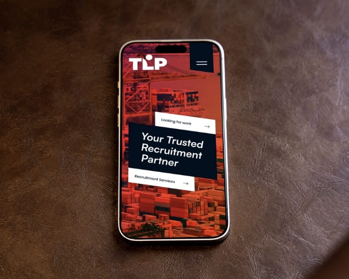
We fix the usual friction: tiny tap targets, long forms, unclear copy, and job pages that load like it’s 2009.


65% of users start on their phones, but 40% drop off halfway through. To solve this, we optimize recruitment UX design by automatically compressing files, repositioning key fields into the thumb zone, and reducing taps by a third.
Walls of text and unclear progress bars can drive users away. That’s why we simplify the process into three clear steps, using concise micro-copy to address questions before they even arise. This approach ensures a smoother mobile career site UX design, keeping users engaged every step of the way.

Poor color contrast and missing labels can exclude a significant portion of your talent pool. That’s why every palette and component we deliver is designed to meet WCAG 2.2 AA standards, ensuring accessibility for all. With inclusive recruitment interface design, no one is left squinting or struggling to navigate.
Dutch UX leads the decisions, the India sprint team ships at pace. You get weekly outputs you can review, test, and sign off, without turning the process into a ceremony.
01
We review analytics, heatmaps, and ATS drop-offs to see where candidates disappear. Then we pick 1–2 funnel metrics to track (start apply, submit, completion rate).
02
We draft low-fidelity flows in Figma or XD and test with five candidates early. Then we adjust the flow based on what real people do, not what we hope they do.
03
We set up tokens (type, spacing, colors) and a small component library that passes accessibility basics. This keeps UI consistent and dev handoff realistic.
04
We create an interactive mobile prototype and run quick feedback loops. Changes happen the same day, because waiting two weeks to move a button is peak internet nonsense.
05
Specs, states, and edge cases get documented, and we open a dev Q&A channel. If you want, we also validate the first implementation to make sure UX didn’t get “interpreted.”
We’ve been building and maintaining digital products long enough to know what breaks, what scales, and what “urgent” actually means.


Studio Ubique designs career pages and recruitment flows that feel obvious to candidates and practical for your team. We remove steps, clarify copy, and design for real devices, so the funnel works when people are tired, distracted, and on a phone.
The questions that come up most often, answered here. Yours not among them? Just ask, there's a human on the other end.


Book a quick 30 min video call, we will show you exactly what to fix. We reply within 24 hours.