Jump to

Jul 15, 2026
Microinteractions in web design that actually earn their place
Most microinteractions in web design exist because someone saw a slick animation once and wanted that feeling, not because anyone needed feedback at that exact spot. The useful answer is narrow: microinteractions earn their place when they confirm an action, show progress, or prevent a mistake, and they become noise the second they do anything else.
A microinteraction is supposed to answer a tiny question the user is silently asking, not perform a small interpretive dance about it.
What microinteractions actually are
A microinteraction is a tiny, single-purpose moment of feedback in an interface, like a button that visibly responds when pressed, a toggle that slides, or a form field that confirms it understood your input. UX here means user experience, the actual felt quality of using the thing. UI means user interface, the visible controls. Microinteractions sit in the seam between them.
The job is small and specific. When you click submit, something should tell you the click registered before the next page loads. When a field rejects your password, it should say why, immediately, near the field, not three scrolls down in red. That is the entire genre. It is not the loading screen that plays a cartoon while your patience evaporates.
In real work this is usually where design wants delight, engineering wants nothing extra to maintain, and the actual user just wants to know whether their form went through. Studio Ubique tends to side with the user here, which is less fun at the kickoff and much better six months later.
Where they earn their keep, and where they don’t
Microinteractions earn their keep at moments of uncertainty: submitting, loading, switching state, succeeding, or failing. Those are the points where a user pauses and wonders if anything happened. A well-placed bit of feedback removes that pause. Everywhere else, animation is mostly you entertaining yourself with the company’s render budget.
The clearest signal is whether the interaction answers a question the user already has. A spinner during a slow save answers “is this working.” A button that bounces for no reason answers nothing, it just moves. The first reduces anxiety. The second adds a small tax to every interaction and, multiplied across a site, that tax gets expensive in attention.
We once spent an afternoon removing a beloved hover animation from a navigation menu because it added a fraction of a second before anything felt clickable. Nobody missed it. The menu felt faster the next day, and faster usually beats fancier when a tired person is trying to find your contact page.
Decision box
- Best if: the interaction confirms an action, shows progress, or prevents a clear user error.
- Not ideal if: it exists to look modern and answers no real user question.
- Likely overkill when: every hover, scroll, and tap has its own animation competing for attention.
The four parts every microinteraction has
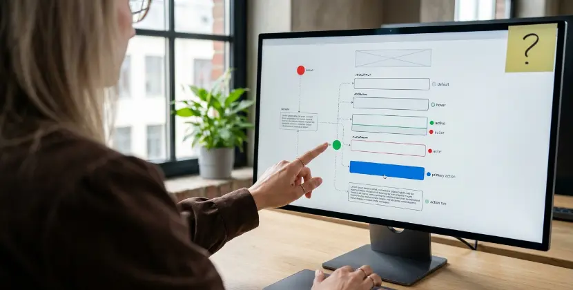
Every microinteraction has four parts: a trigger that starts it, rules that decide what happens, feedback that shows the user something, and loops or modes that handle what happens next. Skip any of these and the interaction feels broken, even when each piece looked fine in isolation during the design review.
The trigger is the click, hover, scroll, or system event. The rules are the logic, what counts as valid, what happens on success, what happens on failure. The feedback is the visible or audible response, the part everyone obsesses over. The loops and modes decide how long it lasts and what state the thing is in afterward, which is the part everyone forgets until a button gets stuck spinning forever.
Most failures happen in the rules and the loops, not the feedback. The animation looks great in the prototype because nothing has gone wrong yet. Then a real network times out, the success state never fires, and the user is staring at a frozen spinner wondering if they just paid twice. That is a rules-and-loops problem wearing a feedback costume.
Common mistakes that make UX worse
The most common mistake is treating microinteractions as decoration rather than communication, which leads to animation everywhere and meaning nowhere. The second is duration: anything that makes the user wait to feel a result, instead of confirming it instantly, is working against you. Speed of feedback matters more than smoothness of motion.
A close runner-up is inconsistency. If a success state looks different on three pages, the user relearns your interface three times. Microinteractions are a language, and a language with three accents per sentence is just confusing. Pick one feedback pattern for success, one for error, one for loading, and reuse them until they are boring.
Then there is the silent failure, the worst one. A form that does nothing visible when you hit submit, so you hit it again, and again, and now you have three duplicate enquiries and a sales team that thinks you are very keen. The fix is small and the absence of it is expensive in confusion.
Performance and accessibility, the boring part that matters
Microinteractions touch two unglamorous things that decide whether they help or hurt: performance and accessibility. Heavy animation can drag down responsiveness, which Google measures with INP, Interaction to Next Paint, a metric for how quickly a page reacts after you interact with it. Janky feedback is worse than no feedback, because it signals slowness at the exact moment you wanted to signal control.
Accessibility is the other half. Some users get nauseous or disoriented by motion, which is why browsers expose a setting called prefers-reduced-motion, a signal that the person wants less animation. Respecting it is not optional politeness, it is part of meeting WCAG, the Web Content Accessibility Guidelines that define accessible interfaces. The Nielsen Norman Group has documented for years that subtle, purposeful feedback beats elaborate motion for usability, and their research on microinteractions is worth a read before anyone reaches for a third easing curve.
Here is the uncomfortable trade-off nobody likes at the design review. Every animation you add is a small bet against speed and against motion-sensitive users. Sometimes the bet pays off because the feedback genuinely helps. Often it does not, and you have quietly made the site slower for everyone to make it feel busier for you.

How to ship microinteractions without regret
Ship microinteractions the way you ship anything you will have to maintain: start with the moments that confirm, prevent, or show progress, build those properly with real failure states, and resist the rest. The goal is a small, consistent set you can defend, not a portfolio of effects nobody asked for. If you want this baked in from the start rather than retrofitted, our UI UX design services treat interaction states as part of the design, not an afterthought.
Build each interaction with its failure case first. Decide what the user sees when the network dies, when validation fails, when nothing happens for two seconds. If you design the sad path before the happy path, the happy path tends to take care of itself. Most teams do it the other way and find out about the sad path in production.
Keep one source of truth for feedback patterns. One success animation, one error pattern, one loading state, documented so the next person reuses instead of reinventing. This is dull and it is also the difference between an interface that feels coherent and one that feels assembled by a committee that never met.
What to monitor monthly
- INP and responsiveness on key pages, to catch animation that quietly slowed things down.
- Form completion and duplicate submissions, to spot silent-failure microinteractions.
- Whether prefers-reduced-motion is still respected after recent changes.
- Consistency drift, where a new page introduced a fourth success animation nobody approved.

Microinteractions in web design help UX only when they confirm an action, show progress, or prevent an error, and they hurt when they add motion without meaning or slow page responsiveness. The Nielsen Norman Group, 2023, finds subtle purposeful feedback outperforms elaborate animation for usability. Studio Ubique treats interaction states, including failure states and reduced-motion support, as part of design rather than decoration.
FAQs
What is a microinteraction in simple terms?
A microinteraction is a tiny moment of feedback in an interface, such as a button reacting when pressed or a field confirming your input, that answers a small question the user is silently asking.
Do microinteractions actually improve UX?
They help UX when they confirm actions, show progress, or prevent errors at moments of uncertainty, and they harm it when they add motion that answers no real question or slows the page down.
Can microinteractions slow down a website?
Yes, heavy or poorly built animation can hurt responsiveness, which Google measures with INP, so feedback that feels janky is worse than no feedback at all because it signals slowness exactly when you wanted to signal control.
How do microinteractions affect accessibility?
Some users are sensitive to motion, so interfaces should respect the prefers-reduced-motion setting and follow WCAG, otherwise an animation meant to help can leave certain users disoriented or unable to use the page comfortably.
How many microinteractions should a site have?
Fewer than most designers want, ideally a small consistent set covering success, error, and loading, reused everywhere, because consistency communicates more clearly than a large collection of unique effects.
Sooner is cheaper
Retrofitting failure states and reduced-motion support after launch costs far more than designing them in, and every silent-failure form quietly generates duplicate enquiries until someone notices. Not urgent, just expensive.