Seen on top review platforms


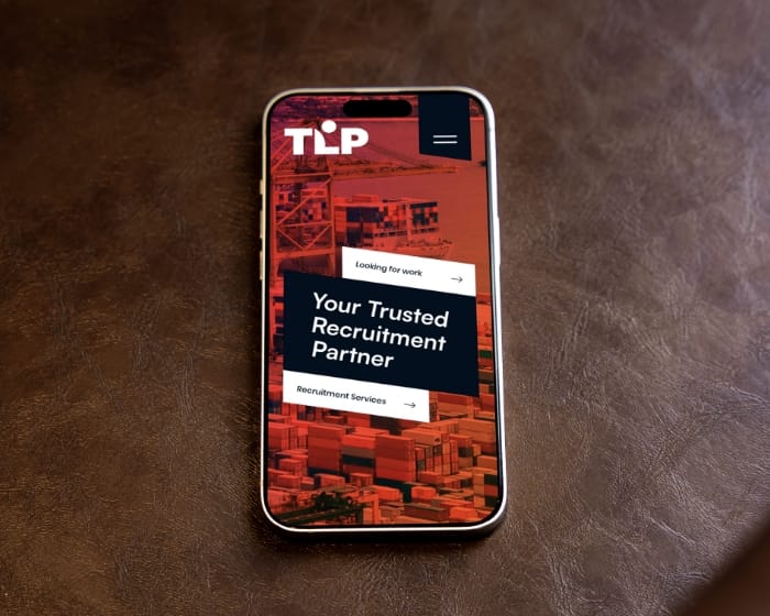
Most candidates browse jobs on a phone, on bad Wi-Fi, between real life. If your career site is slow, fiddly, or form-heavy, they bounce. This is the gap between “looks interesting” and “submitted,” and it’s where hiring funnels quietly die.
We design the mobile apply flow to be short, readable, and hard to mess up. That means fast pages, clear steps, sensible defaults, and an ATS connection that doesn’t turn into a side project.


If the first meaningful screen takes longer than a blink, you lose candidates. We build for sub-2 second first paint with a PWA shell, caching, and a CDN setup that’s boring in the best way.
Long forms don’t “filter candidates,” they filter patience. We split applications into small steps, prefill what you already know, and show progress so people don’t feel trapped in a digital corridor.

Poor color contrast and missing labels can block talent. Our sprint three audit ensures WCAG 2.2 AA compliance, making mobile career site development accessible so everyone can see, tap, and trust.
Dutch UX leads the decisions, the India sprint team ships while you sleep. You wake up to real outputs, clickable flows, commits, and things you can react to, not motivational quotes.
01
We map the current funnel, spot drop-offs (site + ATS), and agree on what success means. Then we sketch thumb-friendly wireframes for the apply flow and job detail page.
02
We test those wireframes with five candidates. We watch where they hesitate, where they quit, and what they misunderstand, then we adjust the flow.
03
We design the UI in Figma or XD and set up a small design system. Accessibility is baked in (contrast, focus states, labels), because lawsuits are a weird growth channel.
04
We build the front end (often headless) and connect the data layer to your ATS via API. The goal is simple, job data in, job pages out, without manual drama.
05
We add the PWA layer (service worker, caching rules, offline-ish behavior where it makes sense) and set performance budgets so “fast” stays fast.
06
We run UAT on real devices, including older phones and real thumbs. We also validate multi-language and edge cases, because production will definitely do that for you otherwise.
07
We wire analytics and event tracking for the funnel (view job, start apply, submit). Then we cut over CDN and caching settings for stable performance.
08
We go live with a clean release plan, redirects where needed, and a short handover that tells your team what matters and what to touch only when supervised.
We’ve been building and maintaining digital products long enough to know what breaks, what scales, and what “urgent” actually means.


Studio Ubique builds recruitment UX and career sites for teams that want candidates to finish the job, literally. Mobile-first apply flows, ATS connections, job feeds, and tracking that tells you where people drop out, so you can fix the actual problem next.
Most things you’re wondering about are answered here or on the FAQ page. If something’s missing, reach out, humans deserve clarity too.


Book a quick 30 min video call, we will show you exactly what to fix. We reply within 24 hours.