
Industry:
Independent medical assessments
Timeline:
5 weeks
Impact:
15 pages on 6 templates, wireframe to launch
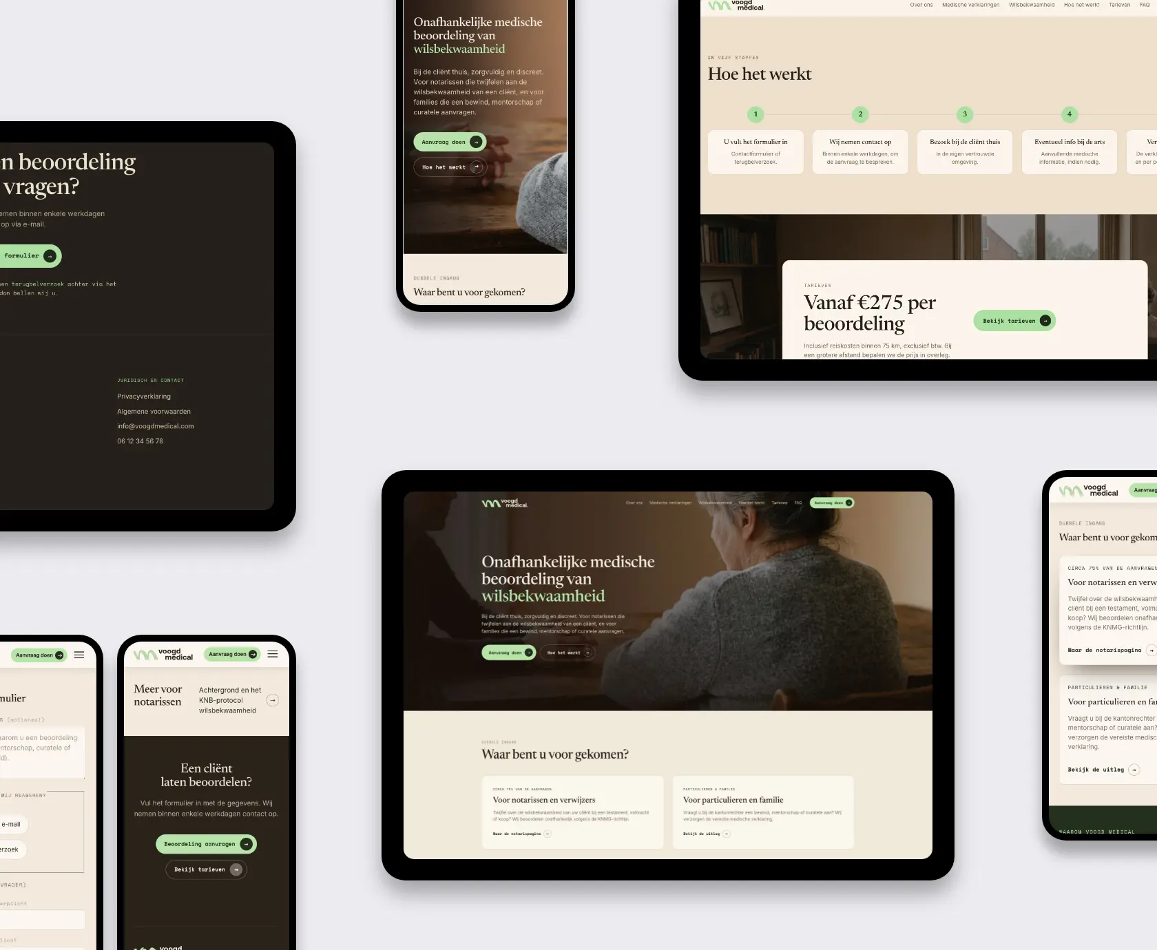
Voogd Medical assesses wilsbekwaamheid, the capacity to make your own decisions, for notaries and families across the Netherlands. The practice needed website design for a medical assessment service: a new name, a new domain and a site that stays calm on a day that usually is not.
The doctors behind it are BIG registered and work by the KNMG guideline for independent assessments. They visit clients at home, notaries send most of the work, families find them when a court asks for a medical statement. In 2026 the practice traded the name JGV Medisch for Voogd Medical, and the fifteen year old website was not coming along for that ride.
The site is being implemented in WordPress. Thinking about a similar project? Talk to us.
The old site had been online for roughly fifteen years and it showed. The rates button led somewhere else entirely, the privacy statement sat in an odd corner, and the design made visitors wonder whether anyone still worked there. Meanwhile the practice itself was changing: a second doctor joining, a new name, a new domain.
The content had its own knots. Three protective measures (financial administration, mentorship and full guardianship) were explained on three pages that repeated each other almost word for word. Two very different audiences landed on the same homepage: notaries who send about three quarters of the requests and want facts, and families who arrive on one of the harder days of their lives and want reassurance.
And then the phone. The old site listed a personal number, which meant calls on Saturday evenings. The brief between the lines: make the site the calm front door, not the doctor’s pocket.
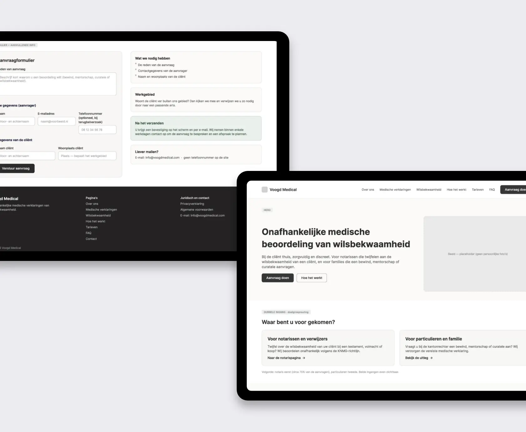
We started with a list of fourteen questions for one call. Which name goes on everything, since the documents still mixed JGV Medisch and Voogd Medical. Does the site say I or we (we, it turned out, since there are two doctors). Which audience leads the homepage. Whether a phone number belongs on the site at all.
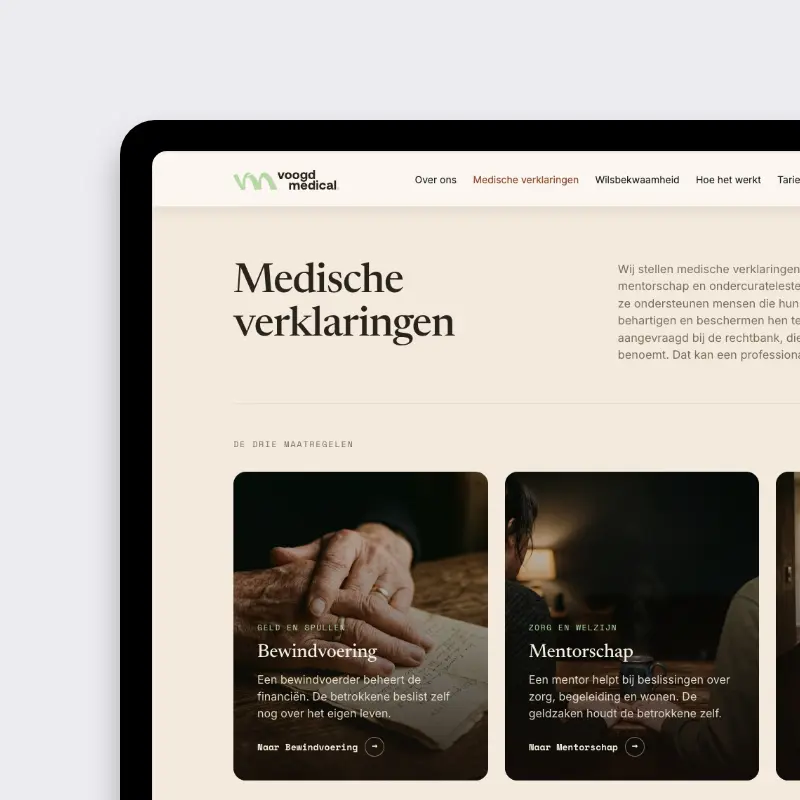
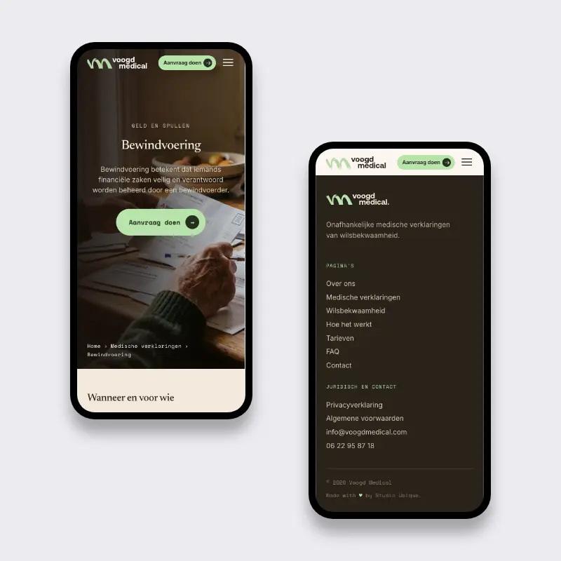
The answers shaped the structure. The homepage opens with a dual entry: one card for notaries, one for families, because both groups need to know within seconds that they are in the right place. The three near identical measure pages became one shared template, with a plain comparison that says what each measure covers: money, care, or everything. Repetition out, clarity in.
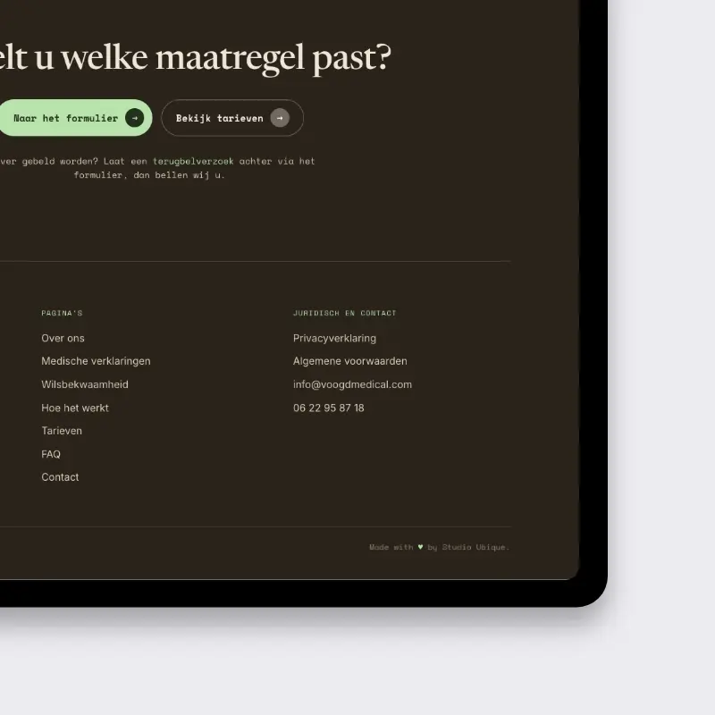
Contact became a deliberate choice instead of a leftover. No phone number anywhere on the site. One short form asks who is requesting, who the client is, where they live and why, which is exactly what the practice needs to judge whether a visit is feasible. The follow up happens by email and a scheduled call, on the practice’s terms.
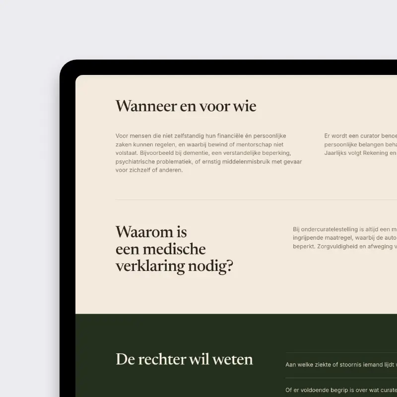
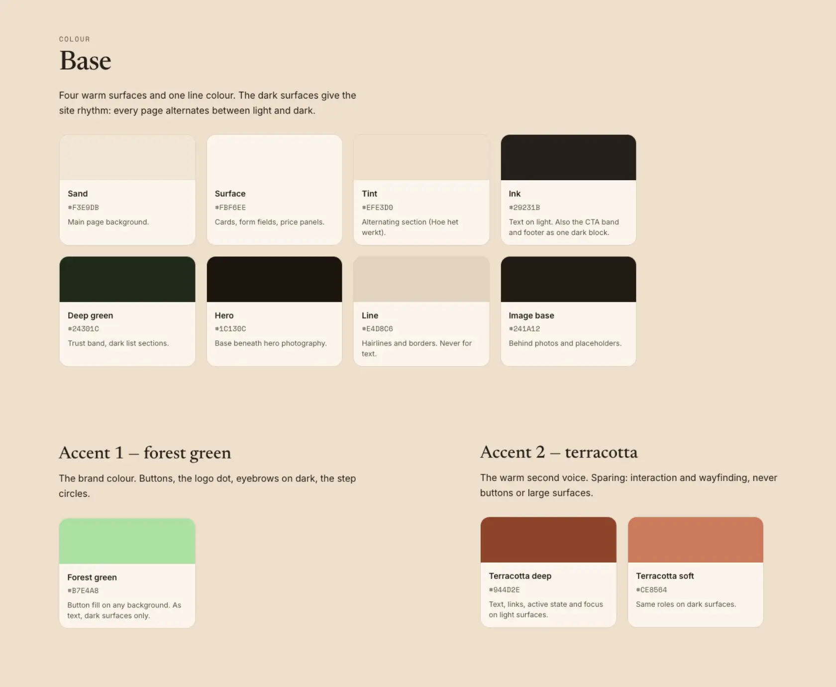
For the brand we proposed a warm direction: a serif for the headings, sand and cream surfaces, two greens for accents, and a word mark that folds the V and the M into one shape. Imagery got a firm rule: no recognizable faces, no white coats, no stethoscopes. You see someone in conversation with an older person, photographed over the shoulder. The first design round came back with sharp feedback on four breakpoints, from a price block that stretched too wide on tablets to a footer that fell apart on small screens. We fixed, compared design against browser side by side, and moved to build.
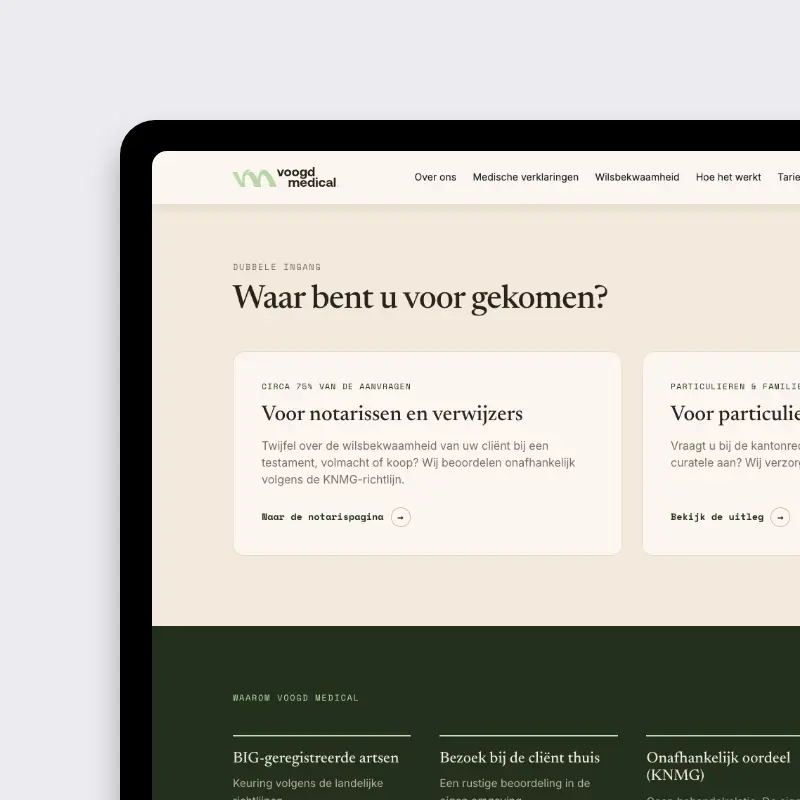
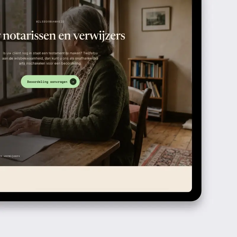
The site runs on a custom WordPress build, no page builders. Six templates carry all fifteen pages, so the practice can grow the content without every new page becoming a design project.
The contact form sends email notifications and asks only what the practice needs, a conscious limit since medical requests and web forms are an uneasy pair under the GDPR. The old domain does not simply die: we planned redirects from jgvmedisch.nl to voogdmedical.com, because a new domain means starting over in search and the redirects soften the landing. The domain itself moved to our management with a transfer code, so one party is responsible when something needs to change.
Accessibility is the quiet backbone. Large readable type, high contrast on the sand background, a visible focus ring, and almost no motion: one small animation on load, nothing on forms or navigation, and the reduced motion setting is respected. The audience is often older and often stressed. The site gets out of the way.
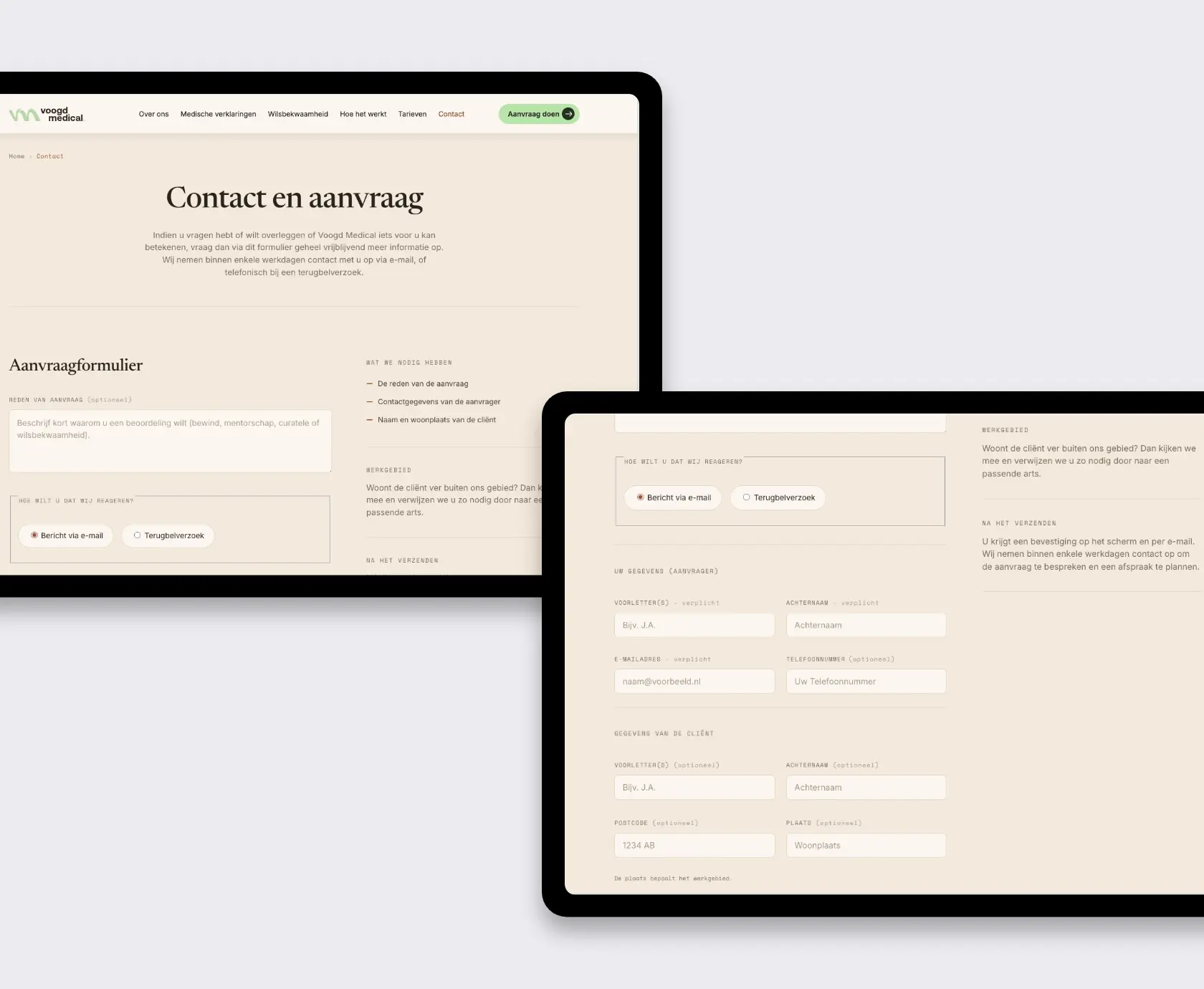
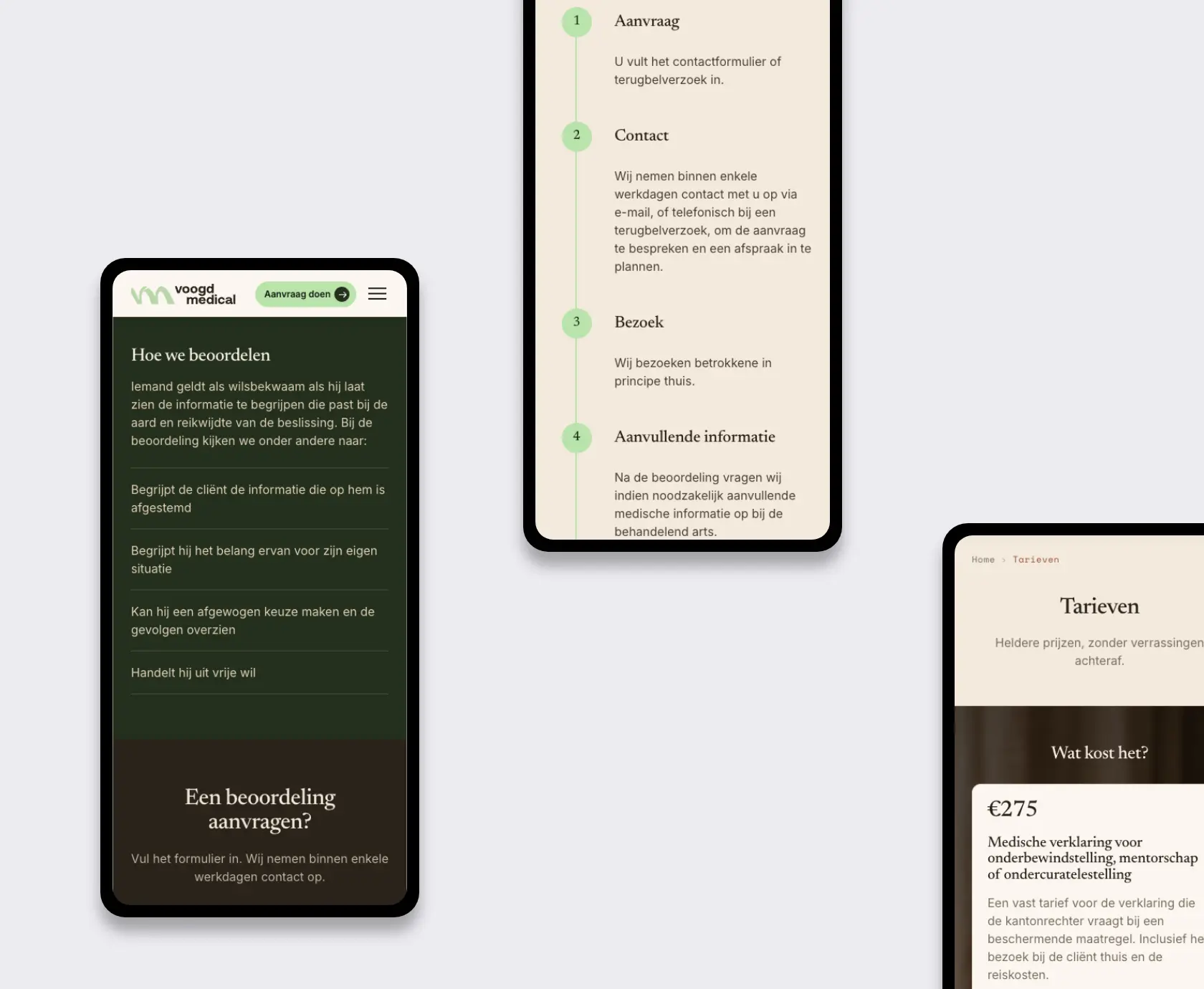
At launch, Voogd Medical gets:
In practice that means a notary can check the working method and send a request in minutes, a family gets an explanation that does not require a law degree, and the doctors get their Saturday evenings back. The site does the intake, the practice does the medicine.
By choice. The old site listed a personal number and the calls came at all hours. One short form now collects what the practice needs, and every request gets a reply by email followed by a call, planned instead of surprised.
Fifteen, on six templates. The trick is not the page count but the reuse: the three protective measures share one template, so the content stays consistent and the build stays affordable.
Yes. Voogd Medical chose not to show recognizable faces, partly because more doctors may join later. We use warm imagery photographed over the shoulder, no white coats, no clichés, so the site feels personal without being a portrait gallery.
It redirects. Every meaningful page on jgvmedisch.nl points to its successor on voogdmedical.com. A new domain still means rebuilding visibility in search, the redirects make sure existing links and bookmarks keep working.
Large type, high contrast, a visible focus ring and almost no motion. We test against the reduced motion setting and keep forms and navigation completely still. Calm is a feature here, not a style preference.
If your visitors arrive on a hard day, the site should carry some of the weight. Tell us what your visitors need and we will tell you honestly what the site should stop doing.
Contact
Not everyone likes to write. Rather talk to someone first? Book a 30 to 45 minute intro call through Calendly. It's free, and by the end you'll know whether a proposal makes sense.
Book a call(opens in a new tab)Tell us what's stuck, what you want to build, or what needs fixing. We usually reply within 1-2 business days.