A bold digital stage for cutting-edge dev talent

Industry:

Custom software development & IT services

Timeline:

2 weeks

Impact:

+45% faster development kickoff time after our XD hand-off

Tablet and phone mock-ups displaying Kalkyl’s dark mode UX across breakpoints

Introduction

A sharp software agency branding and web design project doesn’t always start from zero. Kalkyl, a new dev arm spun out of KUBE Studio, already had its brand mark and colour rules nailed. What they lacked was a dark-mode website layout that felt as slick as their code. They asked Studio Ubique for one thing only: a full UX / UI design package in Adobe XD, complete with custom tech illustrations and motion notes the KUBE devs could turn into Svelte components. Five-week countdown, no scope creep allowed.

The pinch points we had to fix

  1. Blank canvas, ticking repo – Devs had begun scaffolding pages while design was still vapour.
  2. Needle-thin brief – “Dark, techy, premium, go.” Brand identity was locked; our task was to give it legs.
  3. Code-first culture – Any fanciness had to compile clean. Heavy PNG gradients or 3 MB Lotties? Hard pass.
Desktop hero section underlining Kalkyl’s premium offer and fresh development brand identity
Mobile dashboard and tech-stack wheel illustrated with bespoke custom tech illustrations

The 4 moves that kept everyone in lane

  1. Narrative first, wireframe second – Two-hour workshop → one-sentence promise for the hero:
    “We build lean, maintainable software that survives the hype cycle.”
  2. Relume → Adobe XD wireframes – Block-based sitemap that devs could already mirror in markup.
  3. Dark-mode UI with lightweight SVG art – Charcoal (#0F1015) base, lime-neon accent (#A4FF78), pure-CSS gradients.
  4. Developer-ready hand-off – XD design-spec links, an SVG sprite sheet, animation cue cards (duration, easing, max 40 KB).

What “developer-friendly UX UI” looks like in practice

Asset: Colour & spacing tokens
  • How we packaged it: XD style guide + .scss variables
  • Why devs cared: Paste-and-go into Svelte project
Asset: Icons & illustrations
  • How we packaged it:Single SVG sprite (8 KB)
  • Why devs cared:One HTTP request, retina-proof
Asset: Motion ideas
  • How we packaged it:Text doc + GIF demo, no code
  • Why devs cared:Devs choose GSAP or CSS—zero rework
Asset: Fonts
  • How we packaged it:System stack + Inter headers
  • Why devs cared:No FOUT, Core-Web-Vitals-safe


Result? 45% faster development kick-off compared with KUBE’s previous green-field builds.

“Your business advantage” cards rendered in a sleek, modular dark mode UX aesthetic
Cybersecurity and open-source benefit cards showcasing neon-edge custom tech illustrations
Testimonial slider and booking calendar built for a smooth Adobe XD hand-off to developers

Roadmap - 5 weeks, pixel-only scope

  • Week 1: Discovery & sitemap: Mood-board, user stories
  • Week 2: Wireframes: XD low-fi prototype
  • Week 3: Dark-mode UI pass: Home + Work pages hi-fi
  • Week 4: Illustration & motion kit: SVG set, animation notes
  • Week 5: Final polish & hand-off: XD spec link, assets ZIP


No brand revisions, no dev detours—just clean files on the Friday hand-off call.

Early wins (even before launch)

  • Zero layout blockers when dev imported assets, every component behaved as specced.
  • Three fewer design-to-dev back-and-forth cycles versus KUBE’s baseline.
  • Core design approved in one round, brand team happy, dev team coding by Monday.
Full-stack developer job page and CTA panel highlighting Kalkyl’s evolving development brand identity
Recent projects list in slim mobile frames, emphasising reusable components of the dark mode UX
Conversion-focused contact form styled to match the site’s software agency branding and web design tone

Add-on: the illustration system we crafted

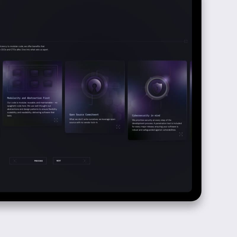
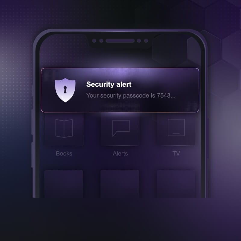
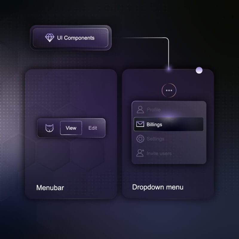
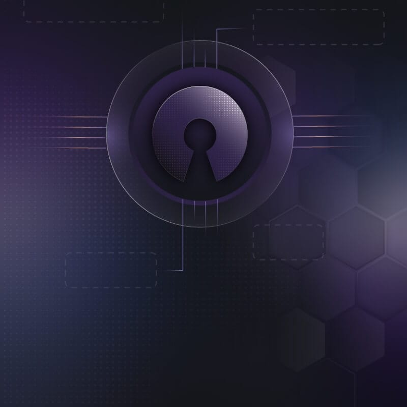
Kalkyl didn’t want off-the-shelf icons; they asked for a mini “graphic design kit” that would scale across pitch decks, blog headers and, later, their SaaS dashboards. Here’s how we baked it into the UX package:

  • Concept first – each custom tech illustration riffs on the brand’s “calculate, refine, deploy” mantra. Think circuit-board skylines, modular node graphs and a tongue-in-cheek robot casting a green glow.
  • Vector all the way – we drew everything in Adobe Illustrator, exported as tidy SVGs (< 12 KB each) so devs could inline them or animate paths with CSS.
  • Reusable colour tokens – line strokes inherit the same charcoal / lime palette as the UI; one variable swap = instant theme shift.
  • Motion-ready layers – each illustration comes with grouped IDs (background, mid, accent) plus a cue card: “fade-in 300 ms, ease-in-out, max 40 KB.” Engineers plug in GSAP or keyframes—no redlining required.


These graphics aren’t filler; they reinforce Kalkyl’s premium software brand identity while adding near-zero weight to the page. Fold this slice into the design-process section and the case study now tells the full story of our UX + graphic design hand-off.
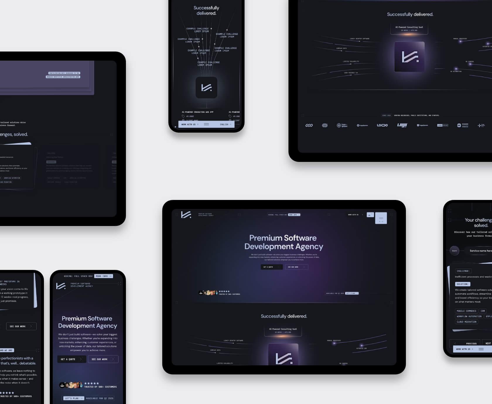
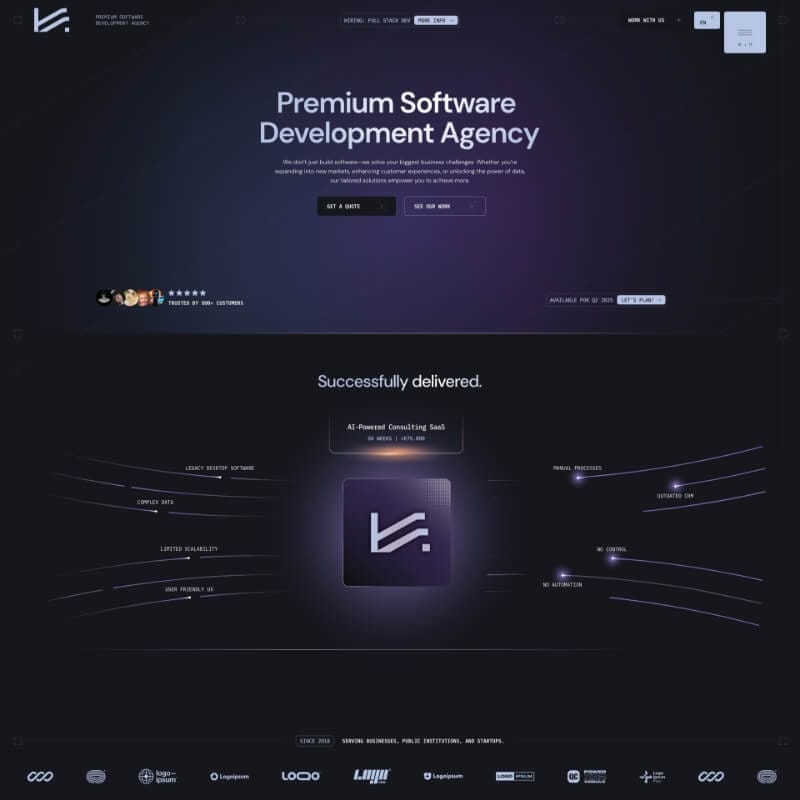
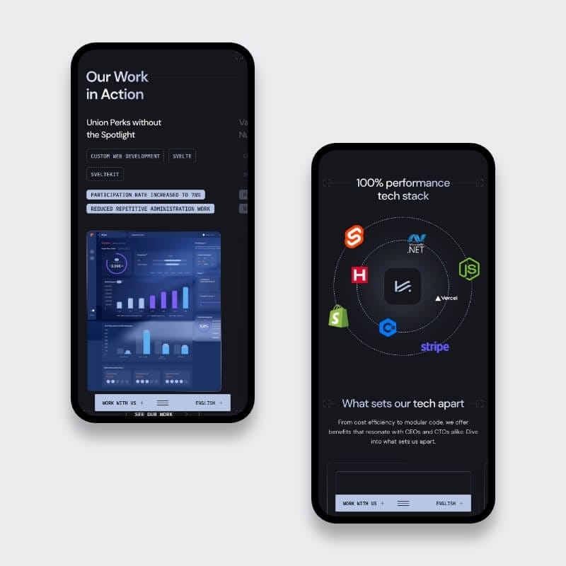
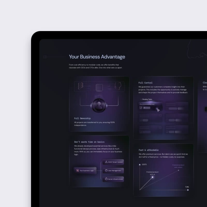
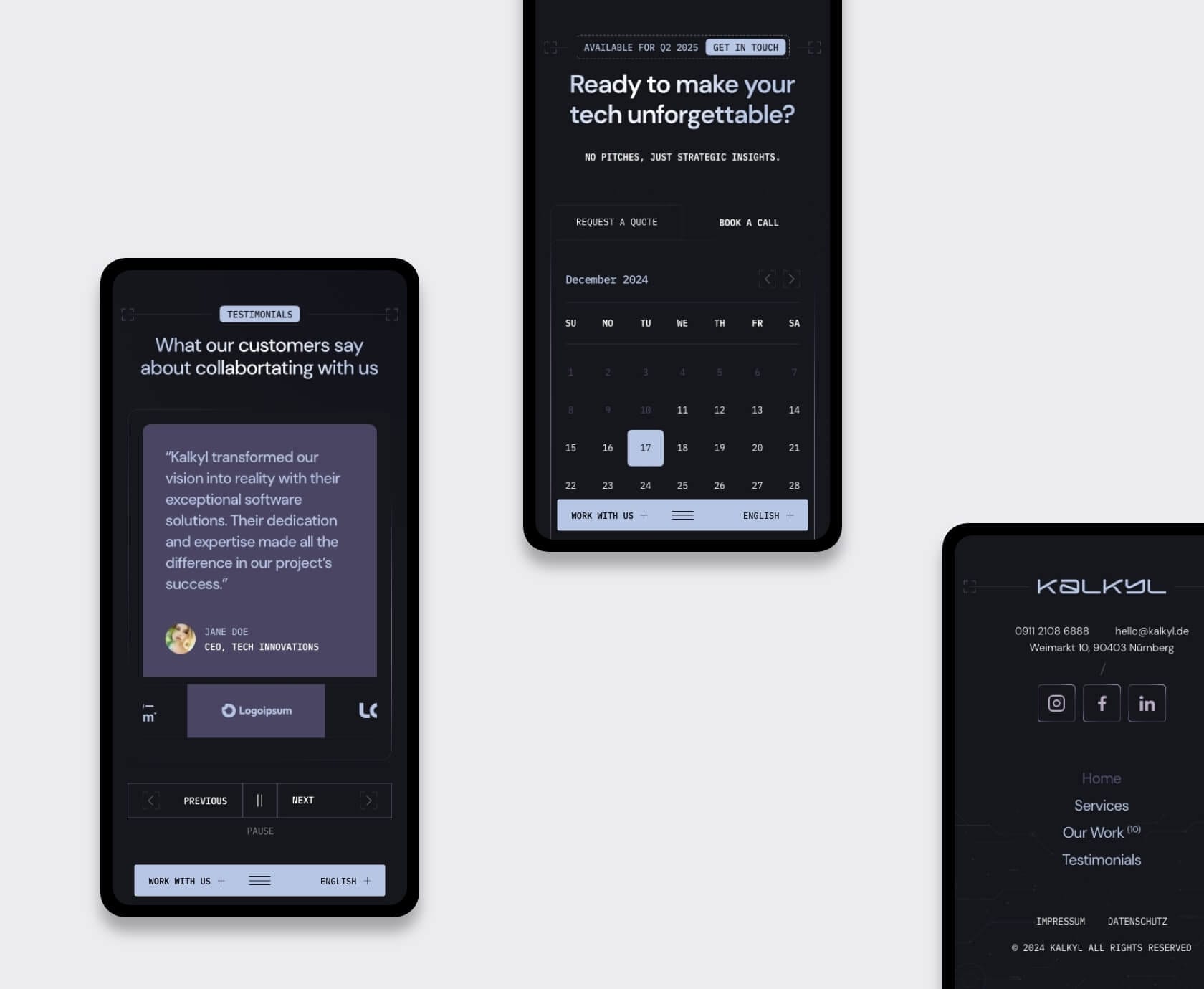
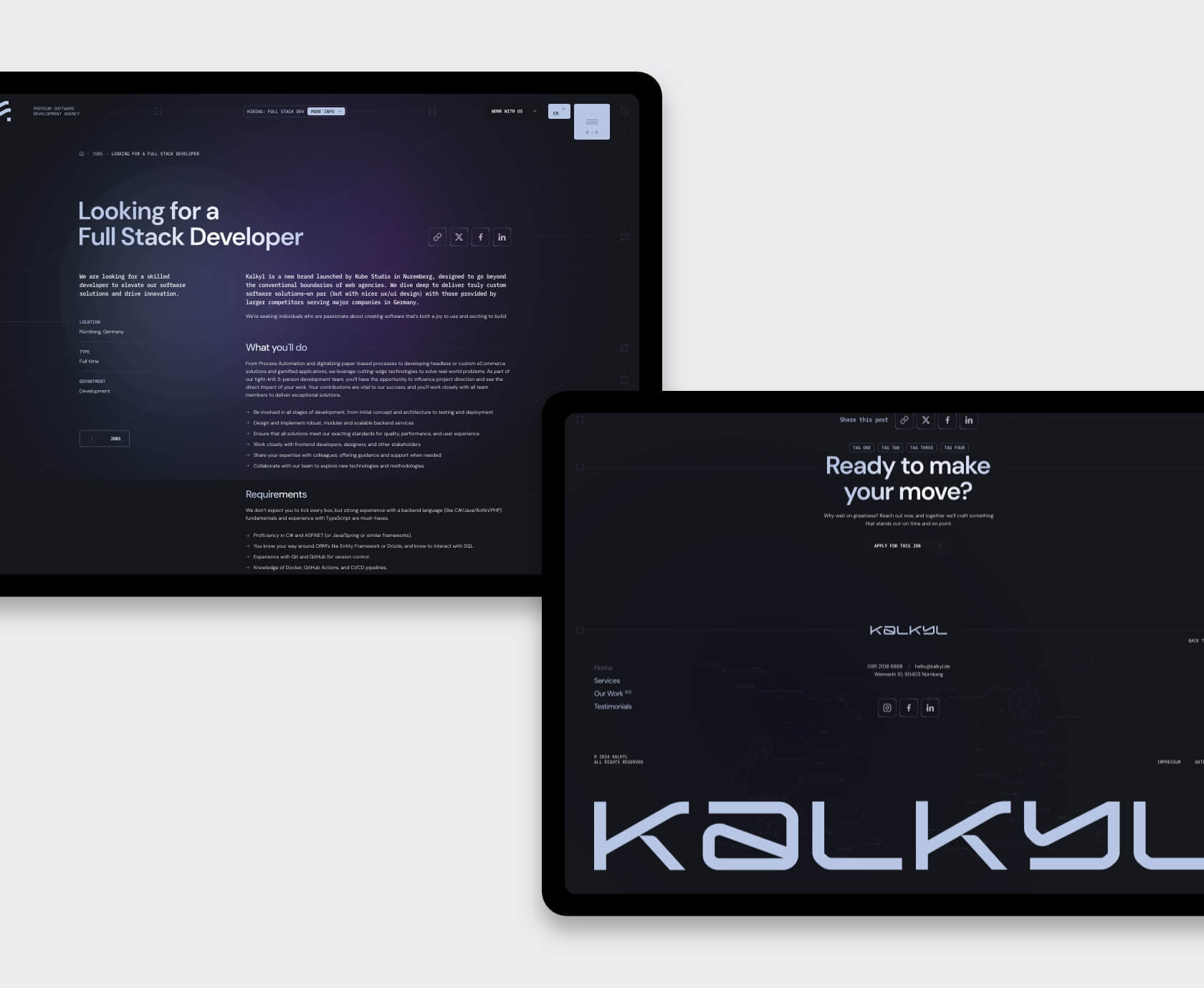
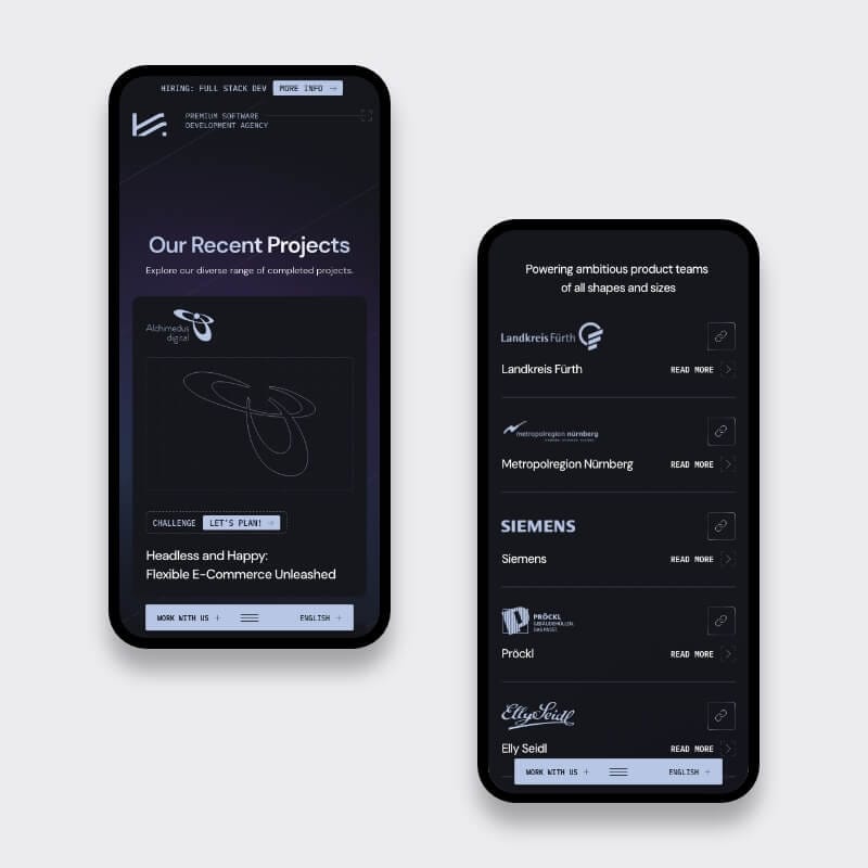
Lessons you can steal today

  • Lock the story before you push pixels. A single headline guides every design choice.
  • Tokenise colours in your design file. Devs paste vars, not hex codes.
  • Ship motion as intent, not code. Lightweight GIFs + timing specs let engineers pick their own poison.
  • Dark mode first saves time. Light theme becomes a free skin once contrast is solved.
Cybersecurity shield icon rendered as a luminous custom tech illustration
Security-alert pop-up on a smartphone crafted for a sleek dark mode UX
Menu bar and dropdown UI components visualised for a smooth Adobe XD hand-off to devs
Open-source keyhole emblem anchoring Kalkyl’s bold development brand identity

Your next step

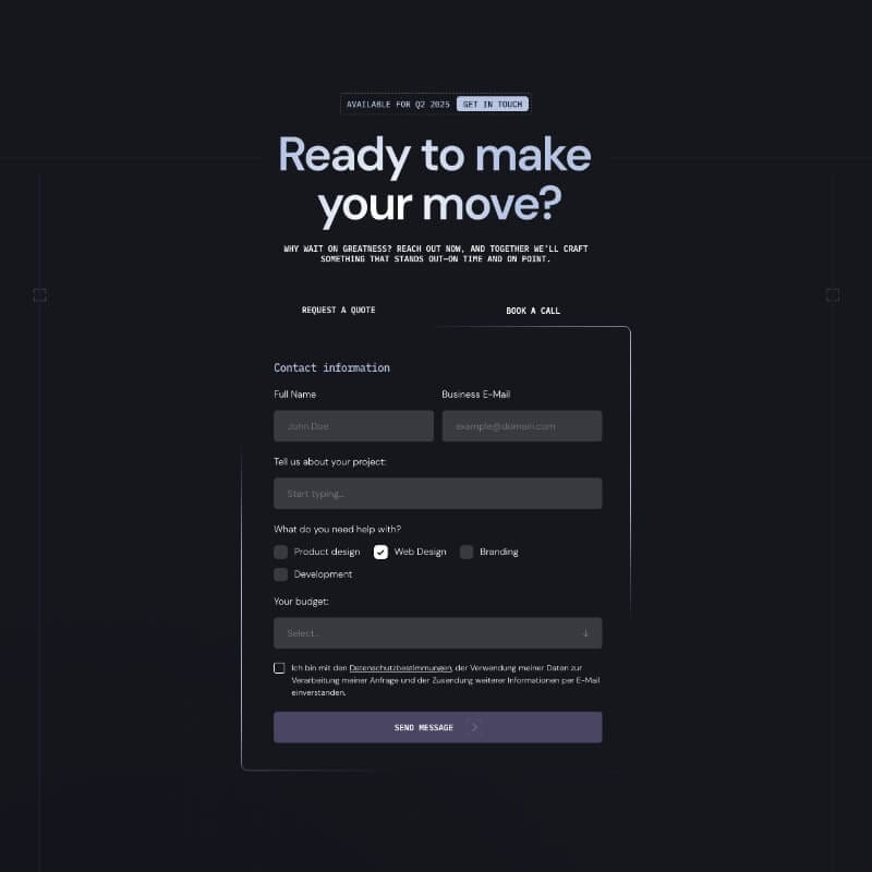
Need UX / UI that your in-house devs can drop straight into the repo? Book a quick 30-min video call—no pressure, plain language. We’ll show you exactly how to package design so your coders start 45 % faster, too.

UX strategist mapping sprint tasks on flip-chart while developer reviews code on phone and laptop, Studio Ubique office
Designer pointing at code review on monitor during pair-programming session with developer, plant-filled Studio Ubique workspace
Colleagues checking website mock-ups on laptop in bright corridor, blurred team in background, Studio Ubique design agency Mobile coffee cart barista serving cappuccino to UX designer in sunlit hallway, Studio Ubique team break
Team lunch-and-learn: three coworkers discussing project over salads and laptop in airy Studio Ubique café-style area Studio Ubique team walking with client, showcasing new website on laptop while chatting in modern white corridor
Designer jotting product ideas in notebook beside laptop on window bench at golden hour, Studio Ubique brainstorming
Remote UX sync: designer video-calling teammate on desktop monitor, taking notes in minimalist Studio Ubique office

Let’s make your digital
project the next success story.

Tell us where you’re stuck, what you dream of building, or what needs fixing. We’ll reply within 24 hours

    Just a heads-up: we’re not into acquisitions. If you’re not here for our services, please step away from the button :)

    whatsapp-icon