Kamatz came to us with wireframes and a vision — they just needed someone to bring it to life visually. This project focused on recruitment platform UX/UI design for HR tech companies, where the layout and logic were already mapped out, but the look? Not so much. That’s where we stepped in. From structure to sparkle, we delivered a design solution that included responsive recruitment platform UI design to ensure a seamless user experience. Here’s how we tackled the UX/UI design for Kamatz.
When structure boxes you in, how do you still make it beautiful?
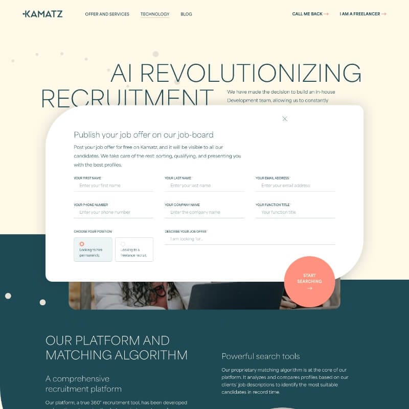
Kamatz had their recruitment concept locked down—smart Figma wireframes, clear content, and internal devs ready to build. But what they didn’t have was a recruitment platform UX/UI design for HR tech companies that spoke their language: professional, sharp, and distinctly “not generic SaaS.” They wanted the quality of a Parisian creative agency but needed frontend files—clean, functional, and responsive—delivered in record time.
Here’s the real kicker: no freedom to reinvent structure. We had to stick 1:1 to their content layout. In short: no excuses, just great design.
Imagine walking into a perfectly furnished apartment — but everything is grayscale. That was Kamatz’s setup.
They had already done their homework: layout, messaging, CTA placement — all set. But nothing popped. No emotion, no visual hierarchy, no subtle animation to guide the user. We’ve seen this before: all bones, no charm.
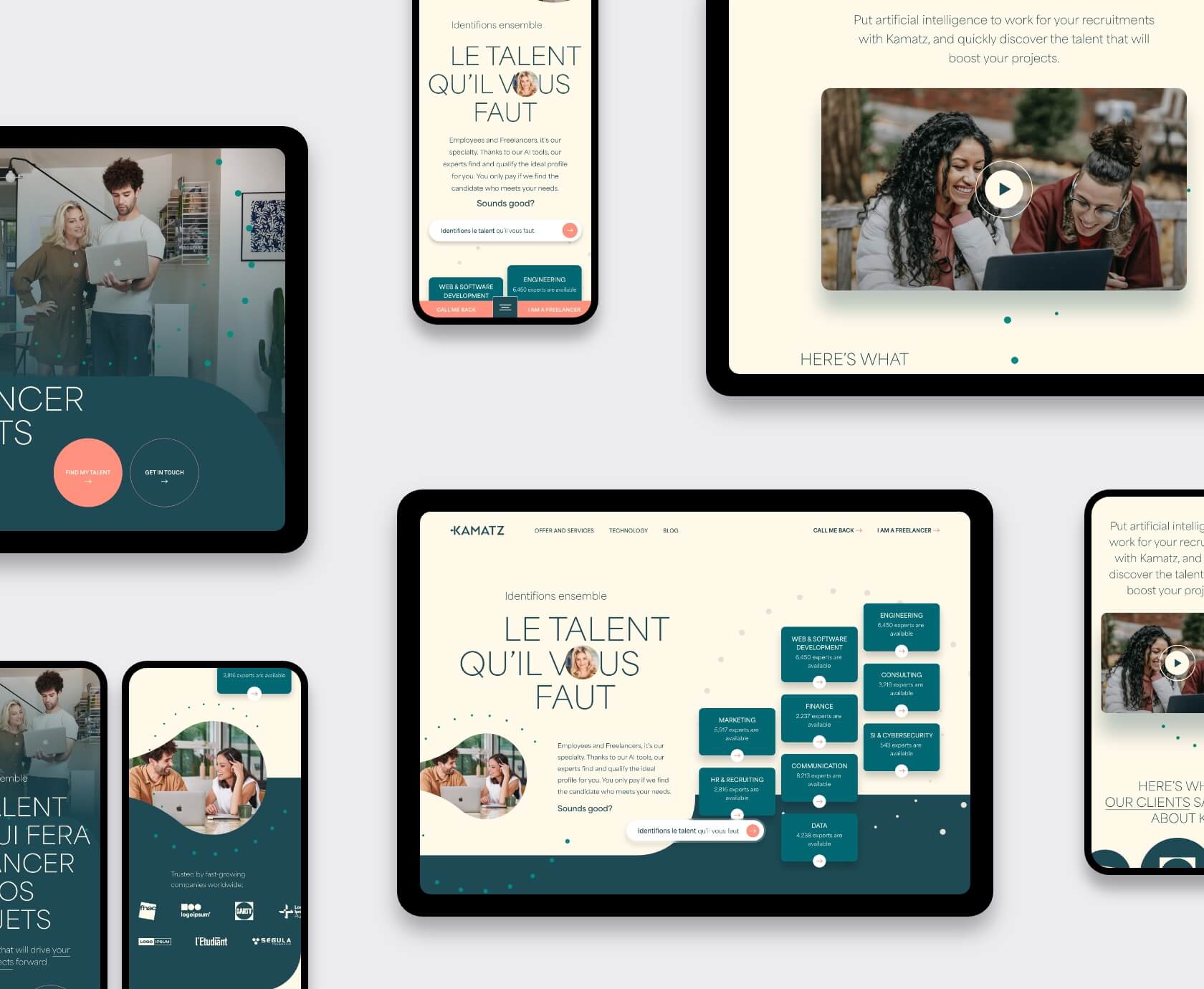
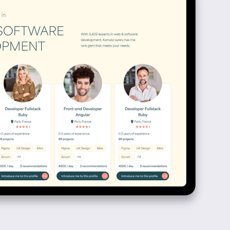
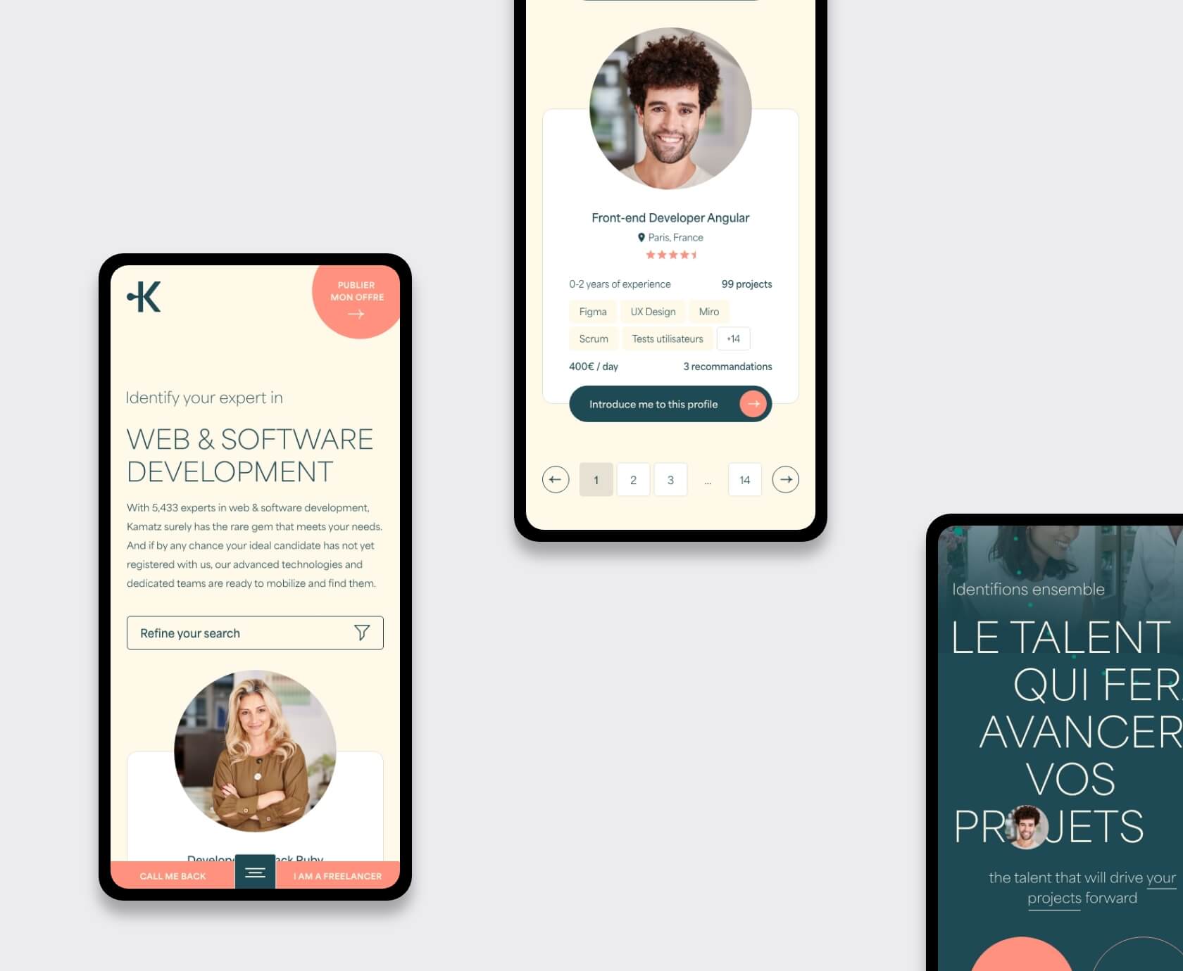
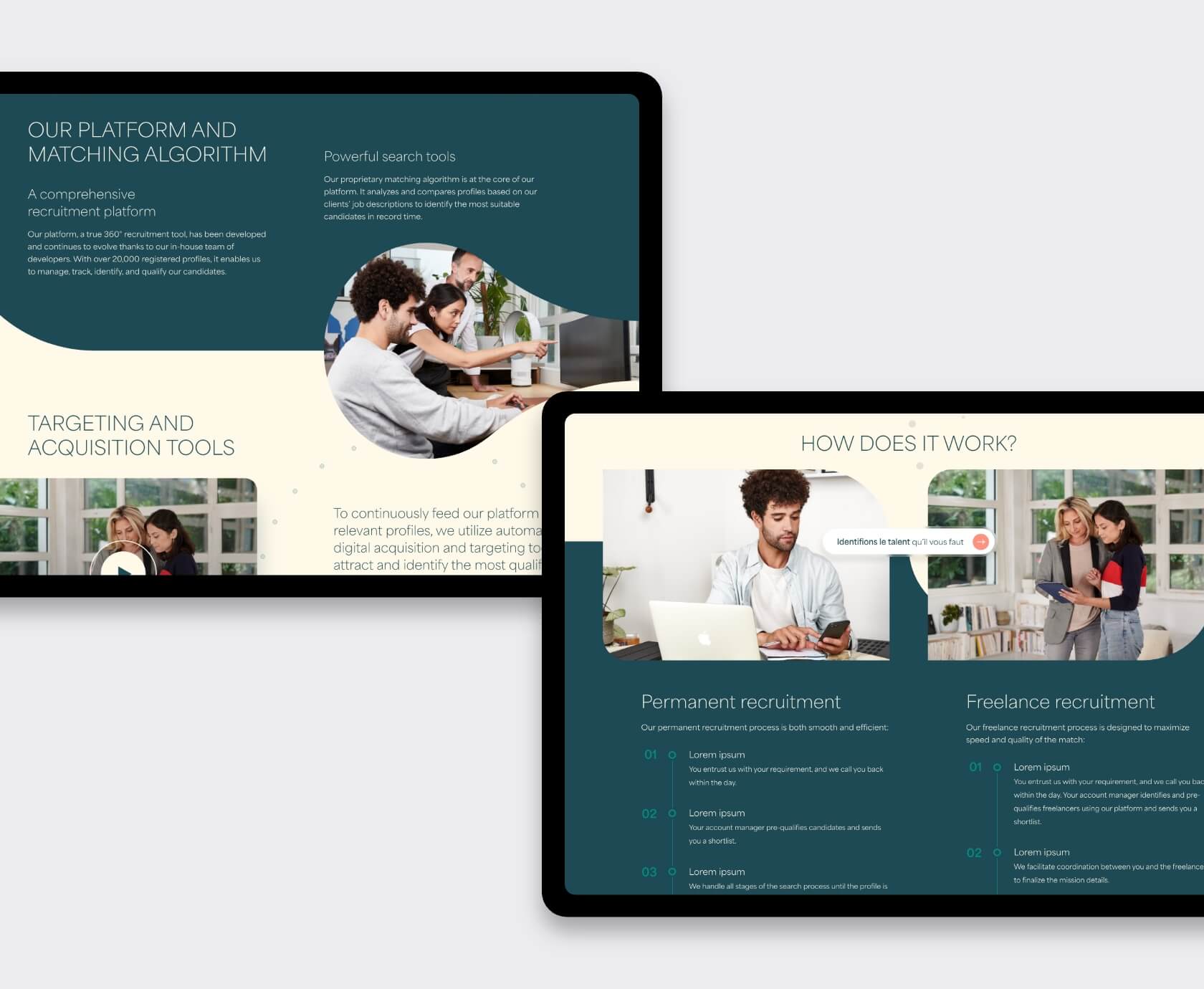
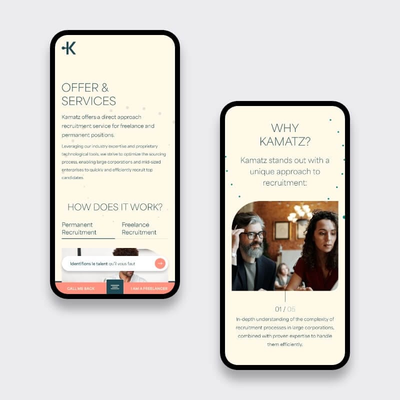
So, we did what we do best. Took their grayscale blueprint and injected it with tone, rhythm, and flow. We designed a sleek, minimal interface that still manages to feel rich and dynamic — the kind that builds trust before users even start scrolling. It’s the attention to detail that makes all the difference, especially for recruitment platform UX/UI design for HR tech companies.
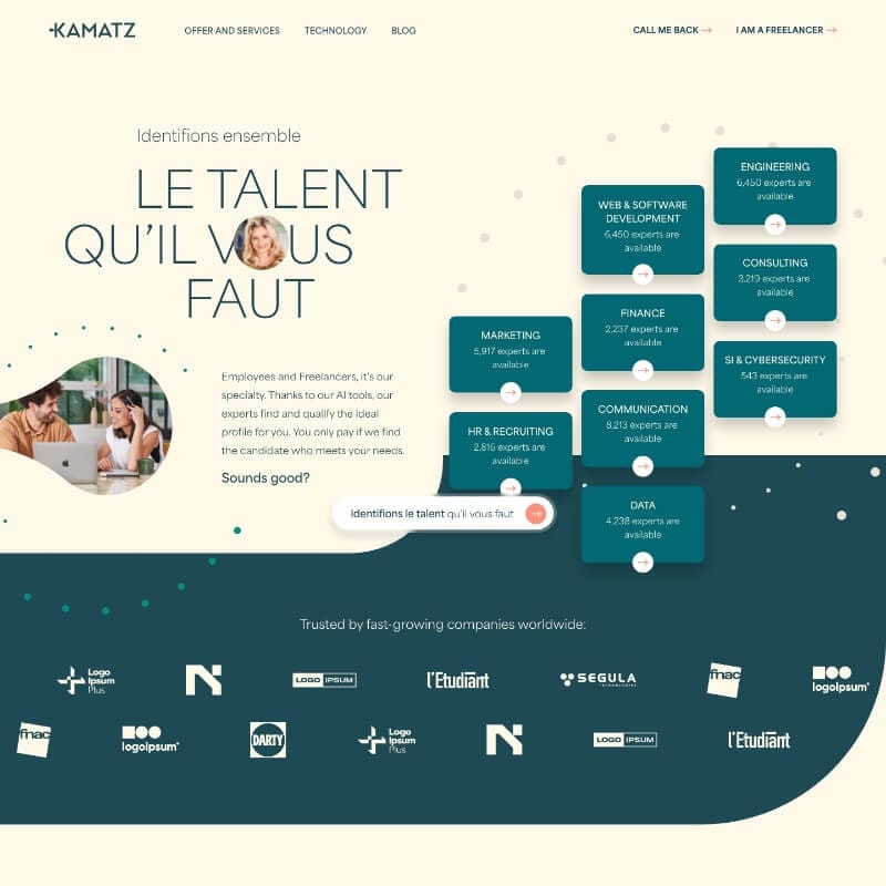
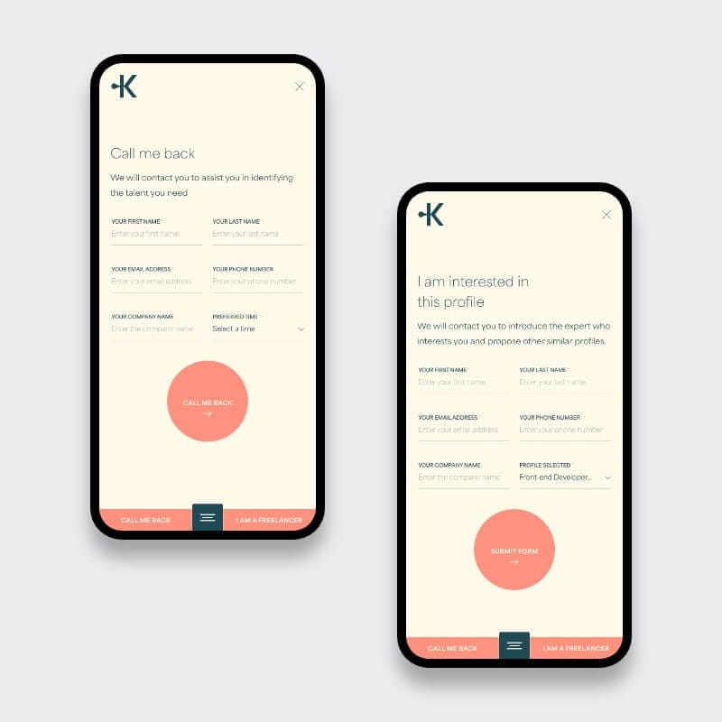
Their internal dev team? Ready and waiting. So we didn’t just hand over pretty screens. We delivered production-ready, well-organized HTML/CSS files, complete with mobile versions and light GSAP animations. The result? A responsive recruitment platform UI design, aligned perfectly with the exact pixel grid they gave us.
Here’s what we did — straight and to the point:
We started with references the client liked (shoutout to Riveal.fr). Clean lines, full-bleed visuals, soft transitions. We built a design foundation based on elegance and flow, all while respecting their rigid content blocks.
The structure came from their Figma wireframes. We used Adobe XD to deliver the visuals — fully responsive for desktop and mobile. No frills, just smart UI decisions: clear fonts, breathing space, good contrast, and components designed to convert. This was key for crafting a recruitment platform UX/UI design for HR tech companies.
No back-end in our scope — just crisp, production-level frontend:
Every line of code was clean and ready for integration into their system, with GSAP-animated UX interactions for SaaS enhancing usability.
We delivered:
In short? We delivered top-tier recruitment platform UX/UI design for HR tech companies, complete with Adobe XD production-ready front-end design. We made their skeleton shine — and gave it some muscle.
Let’s talk. Book a 30-min call and we’ll show you how we craft recruitment platform UX/UI design for HR tech companies, turning boxes and bullets into brand-ready brilliance. Whether it’s responsive recruitment platform UI design or GSAP-animated UX interactions for SaaS, we’re here to bring your vision to life.


Book a quick 30 min video call, we will show you exactly what to fix. We reply within 24 hours.
