Mission EineWelt had a mission, but their website didn’t reflect it. Outdated layouts, scattered navigation, and inconsistent structure made it hard to communicate their work in global partnerships, education, and social justice. For an organization with such an important focus, the site needed more than just a visual refresh, it called for a full nonprofit website UX redesign and navigation overhaul.
Through our collaboration (via our partner KUBE Studio), we delivered a smart, scalable solution. The result? A streamlined UX foundation that improves content management, highlights projects, and makes storytelling seamless. We also integrated features like a mobile-first nonprofit website design and accessibility improvements to ensure the site works for everyone.
Need a nonprofit mega menu design or a donation-focused website UX that drives real impact? This is how we do it.
Mission EineWelt, the global partnership center of the Evangelical Lutheran Church in Bavaria, had a website that simply couldn’t keep up with their impactful work across continents, cultures, and causes. It was time for a nonprofit website UX redesign and navigation overhaul.
Here’s what we tackled:
Our goal was to create a clean, accessible nonprofit web design with a focus on clarity and usability. We streamlined navigation with a nonprofit mega menu design, prioritized donation-focused website UX, and ensured the site was mobile-first to meet modern user needs. Now, Mission EineWelt has a consistent, scalable foundation that stays true to their brand and supports their critical mission.
KUBE Studio came to us with a challenge: “We’ve got a client with big ideas and a website stuck in the past. You up for it?”
Absolutely. Having teamed up with KUBE on complex digital projects before, we knew the drill: build it smart, scalable, and beautifully on-brand.
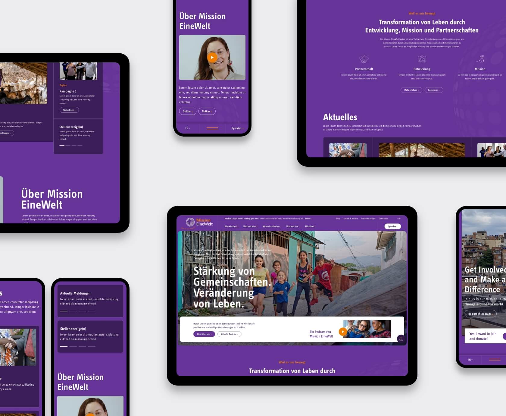
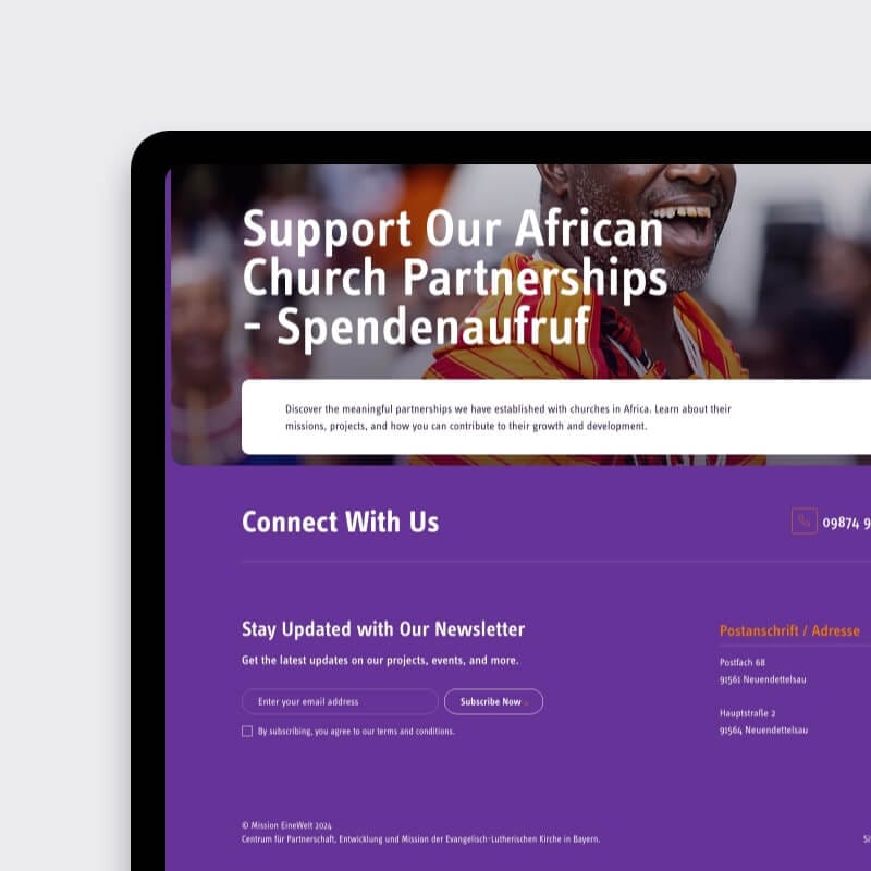
The Mission EineWelt team trusted us with their full corporate identity (fonts, logo, colors, even their quirky purple) and was open to bold ideas. This nonprofit website UX redesign and navigation overhaul included a dark theme, an innovative mega menu concept, and reimagined page layouts.
Our goal? Design just three key screens to serve as the blueprint for the entire website:
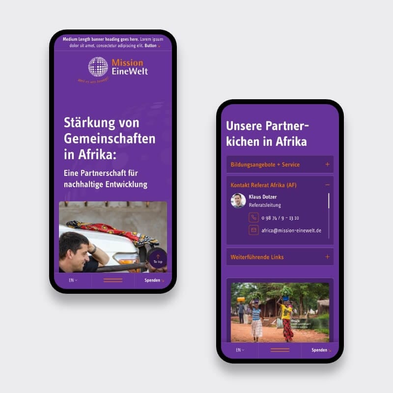
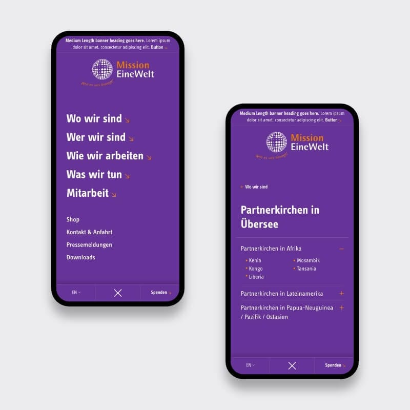
We focused on creating an accessible nonprofit web design that works seamlessly across devices, using a mobile-first approach. Starting with brand exploration and wireframes, we iterated through full UI designs — desktop and mobile — with constant feedback from KUBE and the Mission EineWelt team.
This redesign centered on clarity, scalability, and a modern user experience, including nonprofit mega menu design to enhance navigation.
Let’s keep it practical — here’s how we tackled this nonprofit website UX redesign and navigation overhaul:
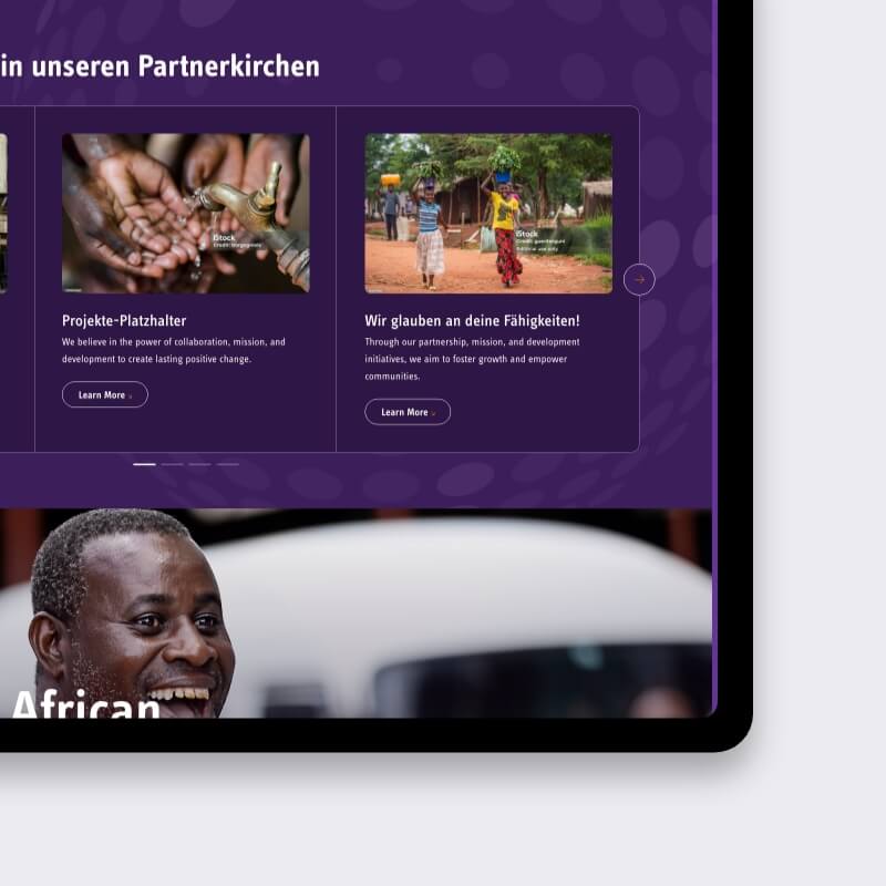
We stripped out the clutter and focused on four key elements:
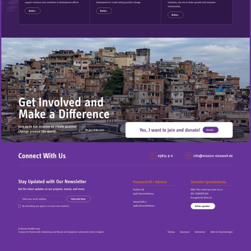
We also added a subtle “urgent alert” bar above the menu for time-sensitive announcements, making it a true donation-focused website UX.
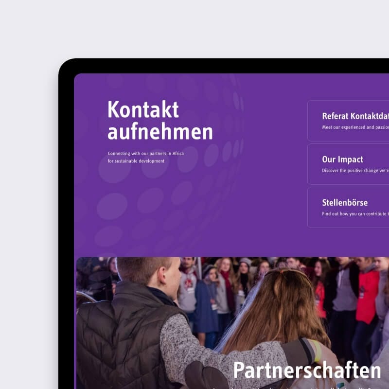
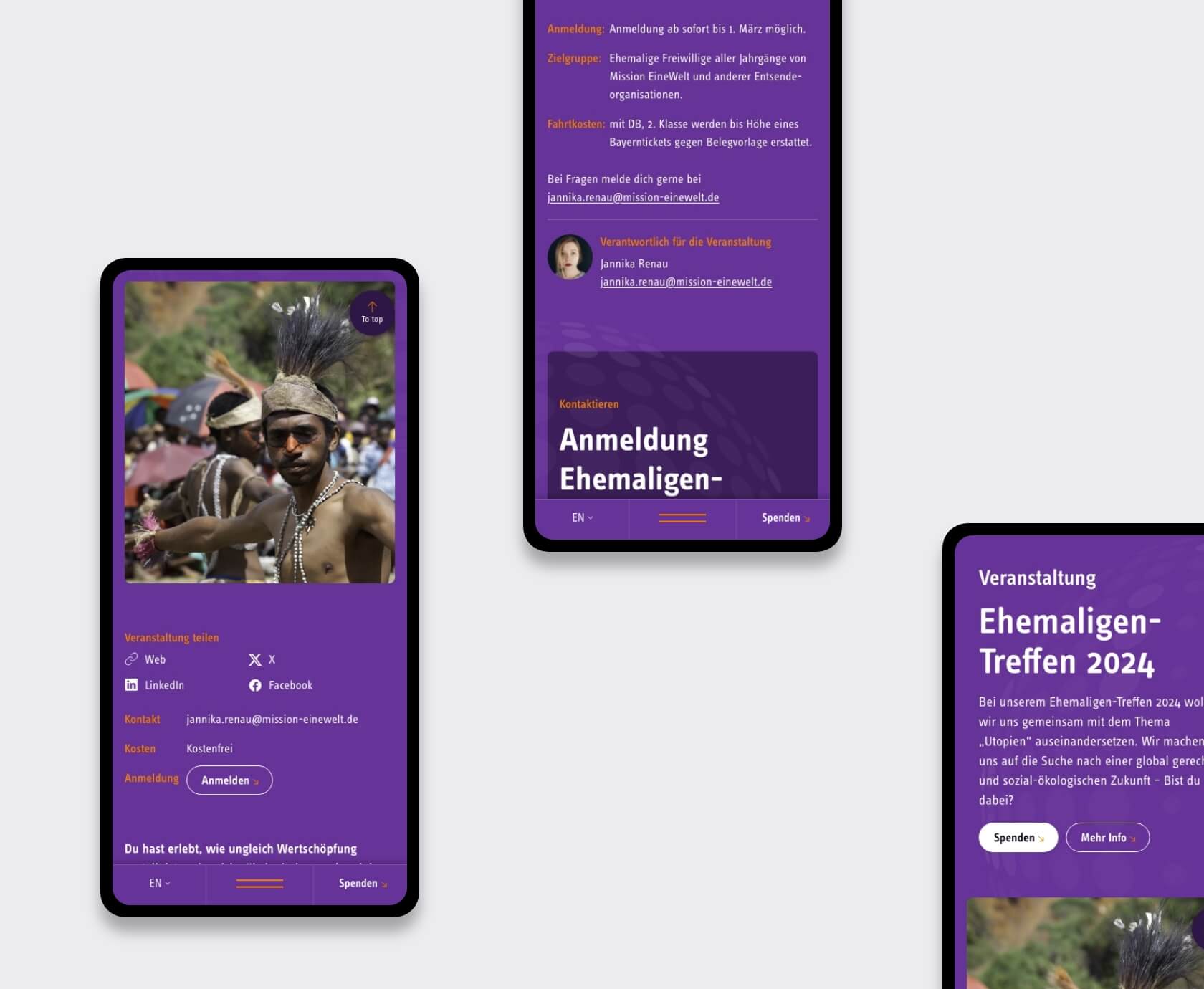
Instead of designing a few static pages, we built modular, reusable templates:
This approach ensures consistent design and smooth content creation, even for editors without design expertise, supporting accessible nonprofit web design.
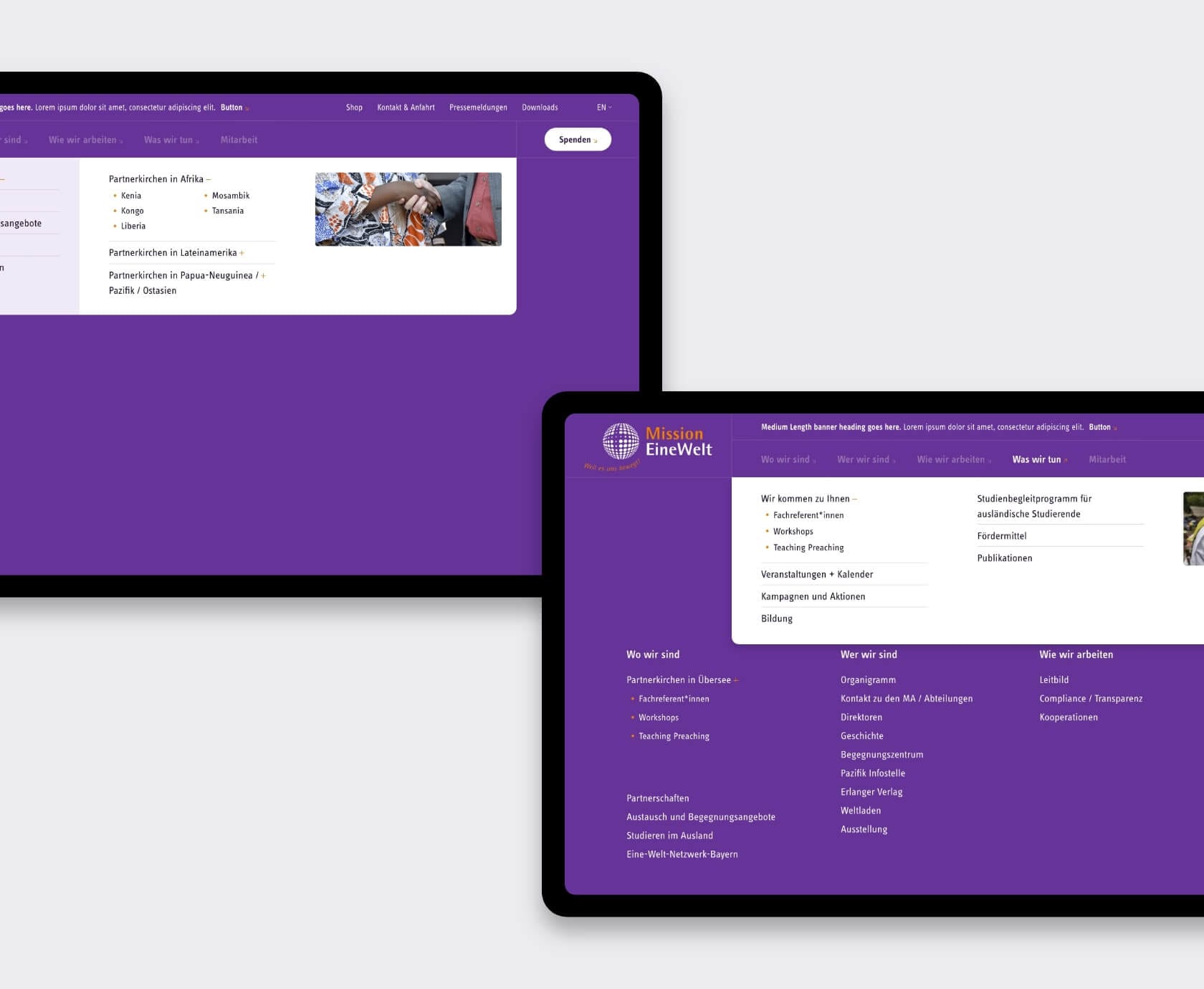
For intuitive navigation, we implemented a custom nonprofit mega menu design. It surfaces high-traffic sections without overwhelming users by including:
The bold purple? We leaned into it. We paired it with fresh iconography, modular cards, and typography that stays true to their CI while feeling modern and engaging.
This redesign doesn’t just look good; it delivers a better experience for users across all devices.
The finished UX design package (delivered in Adobe XD) provided everything KUBE’s development team needed for a seamless nonprofit website UX redesign and navigation overhaul.
With a focus on accessible nonprofit web design and mobile-first functionality, the redesigned Mission EineWelt site is now easier to navigate, update, and most importantly, understand.
Let’s talk. We’ll show you exactly how we approach complex content structures and deliver rock-solid design templates your dev team will thank you for. Book a no-pressure 30-min video call


Tell us what’s stuck, what you want to build, or what needs fixing. We reply within 24 hours.