Imagine you’re shopping for handmade chocolates, the kind that melt hearts (and mouths) across Munich. Now imagine trying to do that on a site that feels more 2003 than luxury boutique. That’s exactly the challenge KUBE Studio brought to us.
They were working with Elly Seidl — a premium chocolatier with decades of tradition — and needed help transforming their clunky online shop into a sleek, irresistible digital experience. Our focus? Luxury chocolate eCommerce UX/UI design. Not the dev, not the shop integration — just pure, strategic user experience to elevate their brand and create an exceptional mobile-first chocolate store UI.
Elly Seidl is no small-time chocolatier. We’re talking about a company with 100+ years of history, high expectations, and a loyal customer base that ranges from Munich locals to global gift buyers. The goal was to redesign their shop homepage, navigation, and product filtering flow — without scaring off less tech-savvy users or losing the charm that makes the brand so special.
KUBE Studio, our partner in this project, came to us with the brief and a shared mission: modernize the luxury chocolate eCommerce UX/UI design while respecting the brand’s heritage.
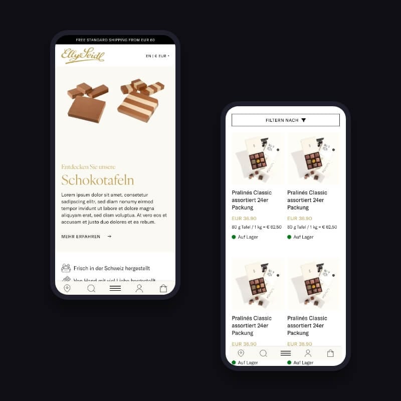
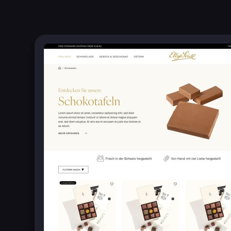
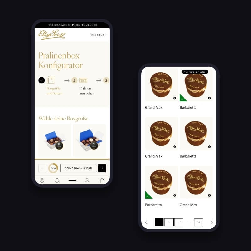
After a couple of calls and the usual “who-does-what” alignment, we got to work. Our focus: desktop and mobile UX wireframes. No design fluff — just functional, clear, conversion-ready wireframes that a dev team could actually implement for a seamless, mobile-first chocolate store UI.
We began with a good look at the existing Elly Seidl shop. The vibe was old-school and the navigation? Let’s just say it was a bit of a sugar rush in all the wrong ways. Key issues we identified:
So we mapped out a streamlined strategy. One that simplifies browsing and puts chocolate (literally) front and center.
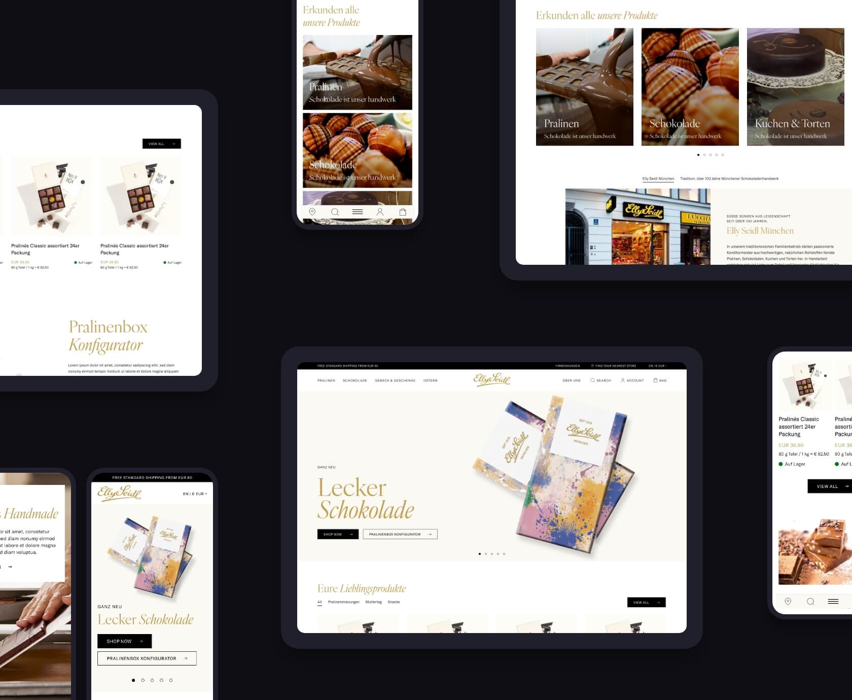
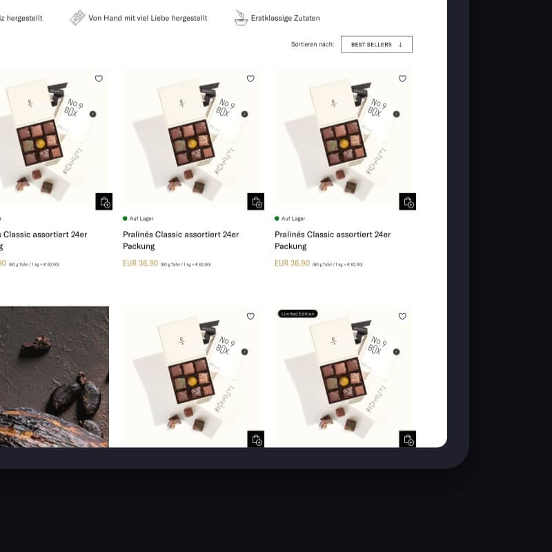
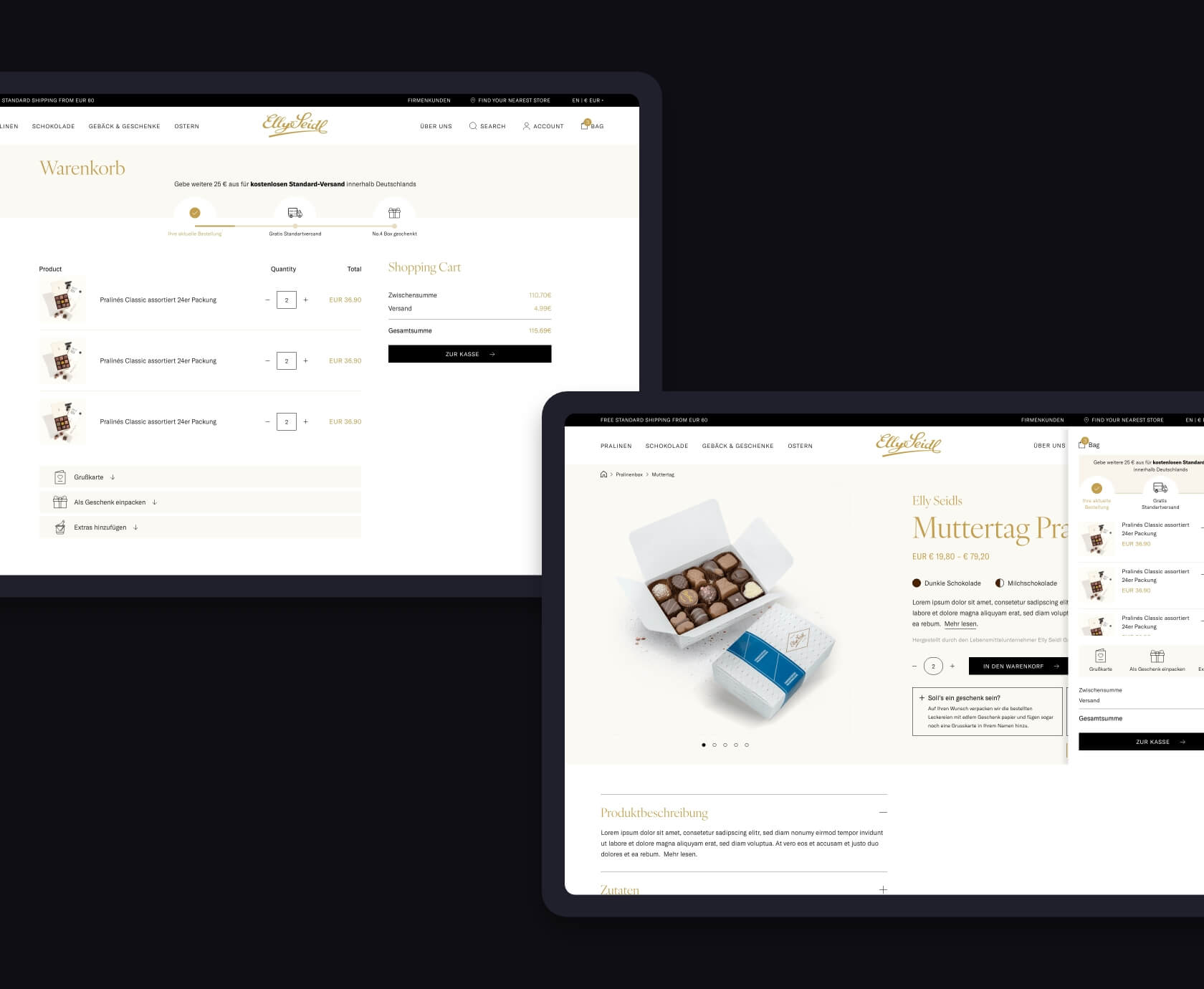
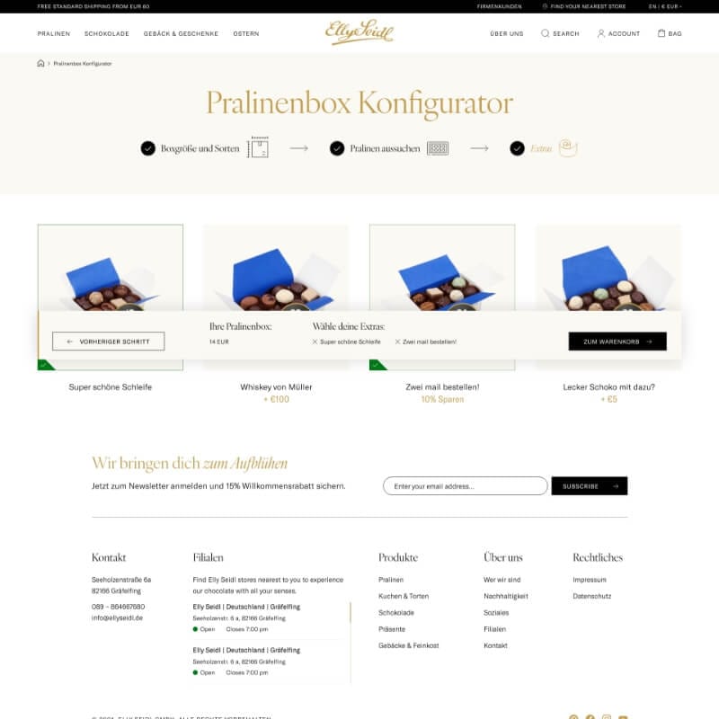
We developed interactive wireframes in Figma for both desktop and mobile. Our focus? Clarity, delight, and delicious decision-making.
Some highlights from the UX revamp:
This approach ensured that the Elly Seidl shop delivered an exceptional luxury chocolate eCommerce UX/UI design, balancing aesthetics with functionality.
KUBE handled project management and the final UI design, while we focused purely on UX and function. This setup worked perfectly — they knew the client, we knew the flow. Throughout the process, we kept KUBE in the loop with:
This collaborative rhythm made feedback efficient and helped avoid the classic “too many cooks” trap.
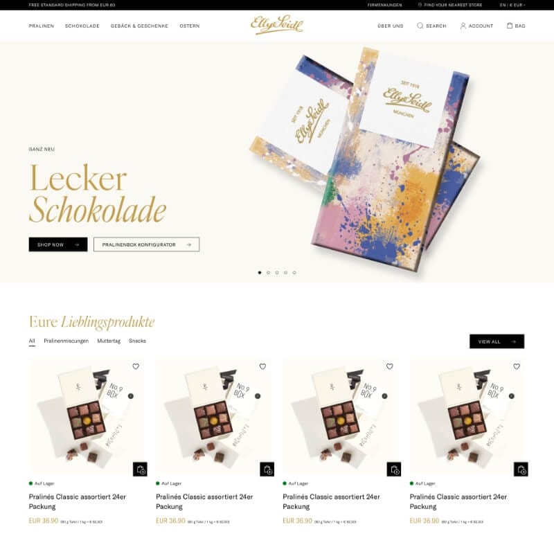
Once the client approved our wireframes, KUBE took over for the final visual design and development. A few weeks later, the new Elly Seidl shop was live — and the difference is obvious.
Visitors can now:
Even though we weren’t involved in the final build, our UX work laid a solid foundation for a modern, user-friendly site that feels as premium as the brand it represents. The result is a gourmet chocolate online shop UX experience that perfectly mirrors the brand’s luxury image while making the shopping journey seamless and enjoyable.
No fancy frameworks or custom stacks here — just proven methods and clean UX logic.

This project was a sweet reminder (pun intended) that great UX isn’t about flashy animations or oversized hero images. It’s about clarity, structure, and emotion — especially when you’re working on luxury chocolate e-commerce UX/UI design for a brand known for its gift-worthy products.
And for legacy brands like Elly Seidl, the challenge lies in modernizing the journey without losing the soul. That’s where we come in: turning customer confusion into conversion — one wireframe at a time, creating a mobile-first chocolate store UI that truly delivers.
Since the new UX went live:
Not bad for just a few weeks of UX work, huh?
Thinking about upgrading your luxury chocolate eCommerce UX/UI design? Maybe your categories feel like a maze. Or your filters make visitors rage-quit. Or perhaps you’re planning a redesign and want the UX right before anyone touches pixels.
That’s where we shine.
We work quietly behind the scenes, mapping flows, fixing pain points, and turning every click into progress. Whether it’s a gourmet chocolate online shop UX or a mobile-first chocolate store UI, we’ve got you covered. We speak Figma, devs love our files, and we’re not afraid to tell you when something doesn’t work.
Just 30 minutes. No jargon. No pitch deck. Just clear answers and practical takeaways about luxury chocolate eCommerce UX/UI design. You bring the questions — we’ll bring the chocolate metaphors (and maybe a tip or two about mobile-first chocolate store UI).
👉 Book your call now


Tell us where you’re stuck, what you dream of building, or what needs fixing. We’ll reply within 24 hours