Industry:
Ecommerce, climate control equipment retail
Timeline:
5 days
Impact:
+19% filter usage rate (usability test)
You are here because your store feels busy, your buyers feel busy, and your cart feels shy. This ecommerce redesign shows how we took a noisy category and a high intent landing page and made decisions obvious. Short version, designs only, desktop only, built in Adobe XD for Act Bold Media Group and their client AMG Air Marketing Group LLC.
AMG Air sells technical products that regular folks do not buy every day. Visitors arrive with questions, not confidence. The live category page scattered specs in small type, filters felt like a quiz, and the landing page was more catalog than guide. Paid traffic was landing on pages that did not earn trust first. People needed a quick way to answer four things, what is this brand line, which model fits my room, why buy from AMG Air, and what else do I need to finish the job.
On the category page, tiles blended together and the scan path was uneven. Voltage, amps, and heat type sat in fine print. Reviews were present but not persuasive. Upsells like sleeves, grilles, cords, and filters were hidden in the accessory forest. That hurts attachment rate and leads to support tickets like, which cord do I need. On the landing page, there was no simple narrative, start with trust, then explain the lineup, then let people shop, compare, and ask for help.
Constraints mattered. This sprint was desktop only. Content was rough. Timelines were tight. Implementation would be handled by Act Bold Media, so our handoff had to be crystal clear. We kept our eyes on one outcome, make the next buyer’s path obvious.
We kept the plan simple, earn trust, teach, help choose, then let people act. Think of the page as a good store associate. First a hello and a reason to believe. Then a quick explanation in plain language. Then a neat shelf where products line up by size and power. Then a smart nudge on accessories. Last, a real person to talk to.
Here is the high level map we used.
We backed that with a copy deck, image prompts for lifestyle and isolated accessories, and schema guidance so search engines get clean signals without a dev treasure hunt.
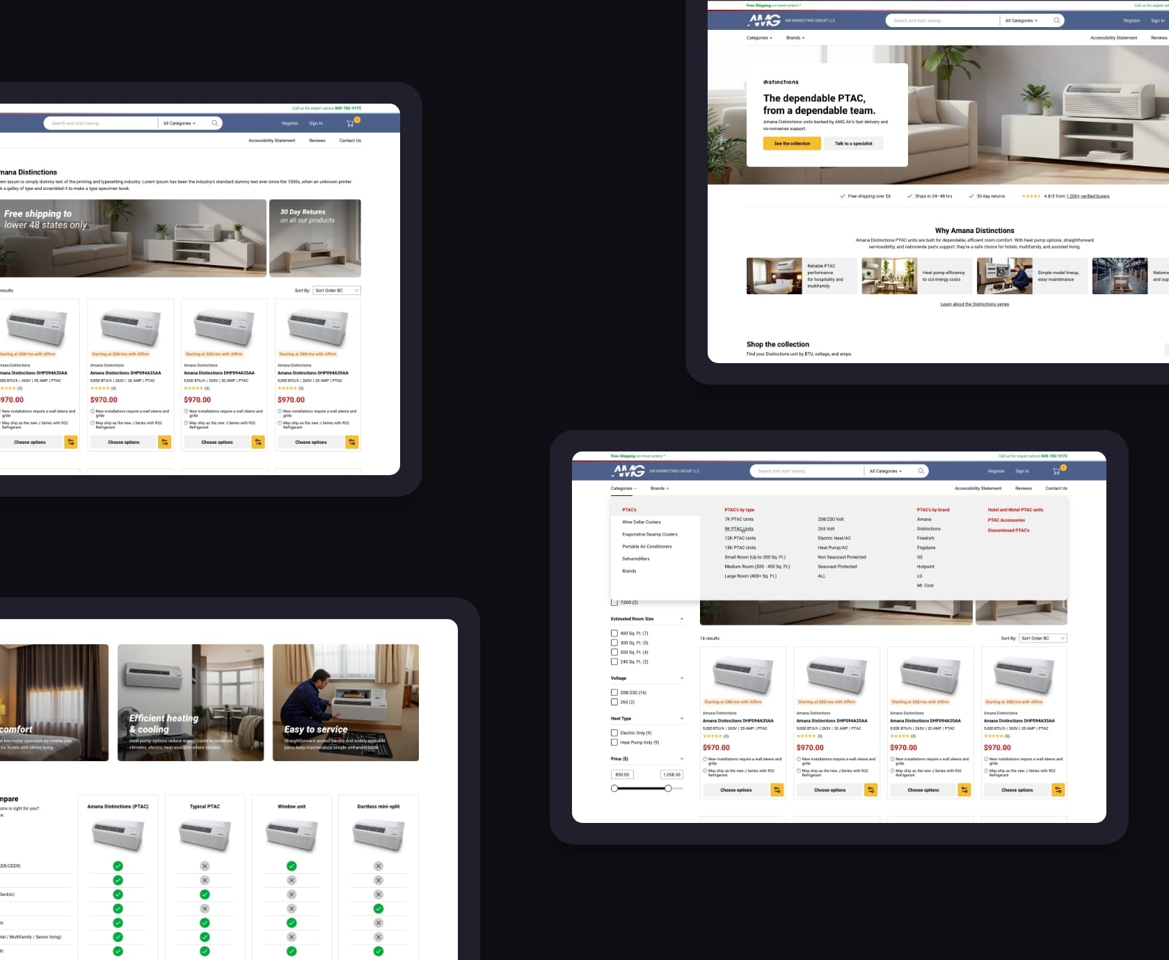
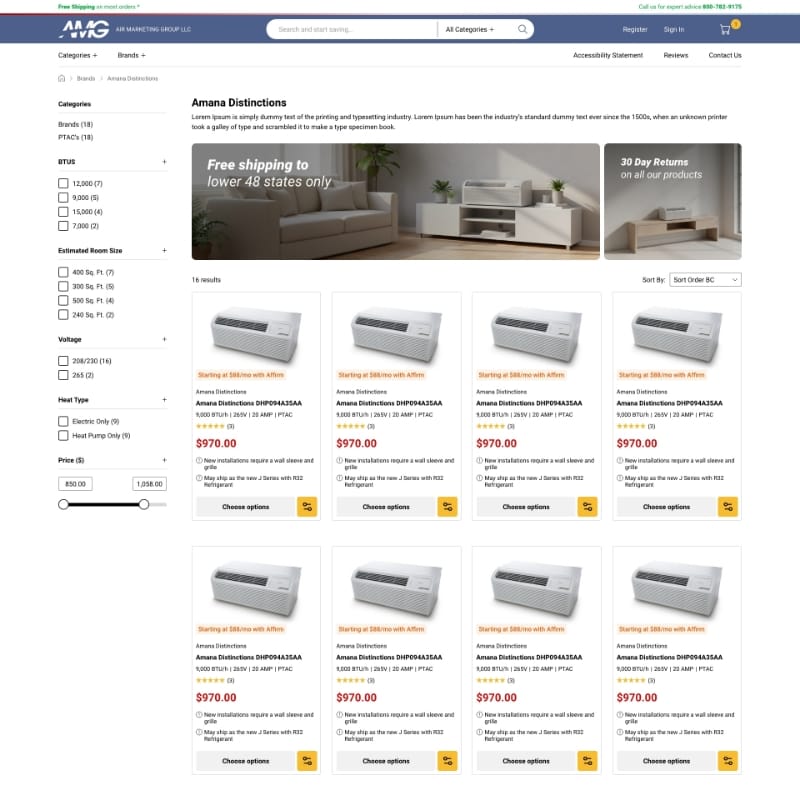
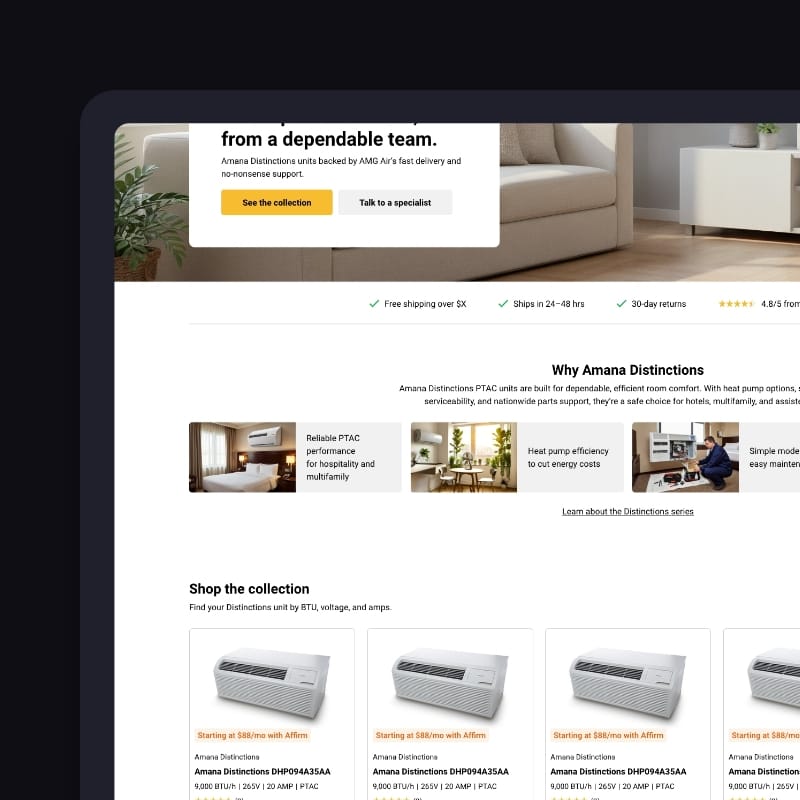
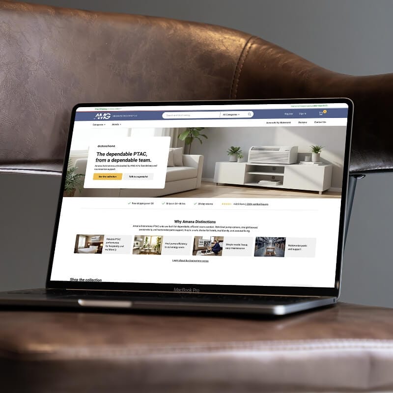
The landing page is where paid traffic lands, so it needs to calm the room first. We wrote a headline that says what this is and why to trust it, no fluff. The sub line sets the tone, fast shipping, real support, honest pricing. We added one primary button to shop the collection and one secondary to talk to a specialist. A small review chip shows the average rating, so visitors get a quick pulse without leaving the page.
Next comes the brand primer. Four cards do the heavy lifting.
We keep it short, then link to the brand hub for deeper reading. Think appetizer, not encyclopedia. The ecommerce redesign tone stays steady, clear and useful.
Then the why buy from us section. Buyers do not only pick a model, they pick a merchant. We show fast fulfillment with typical ship windows, real support before and after purchase, authorized reseller status, and fair pricing including volume options for multi unit orders. A link points to the about page for folks who want to check the story.
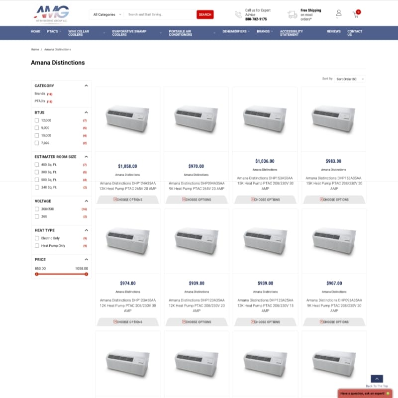
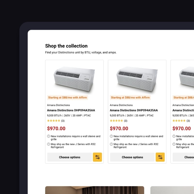
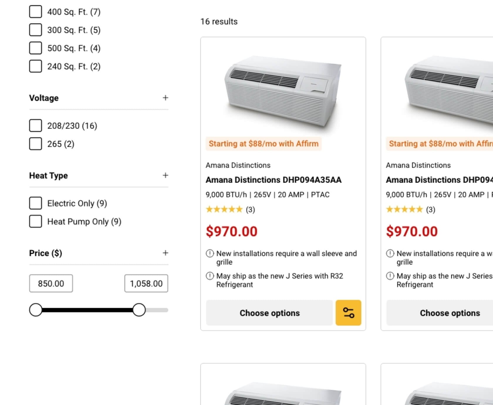
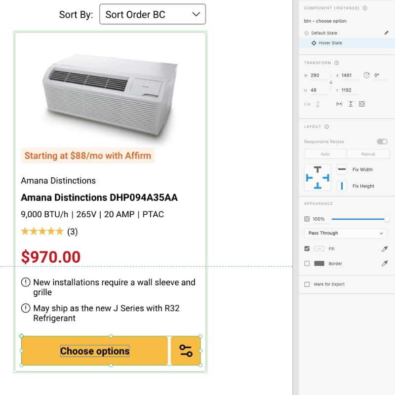
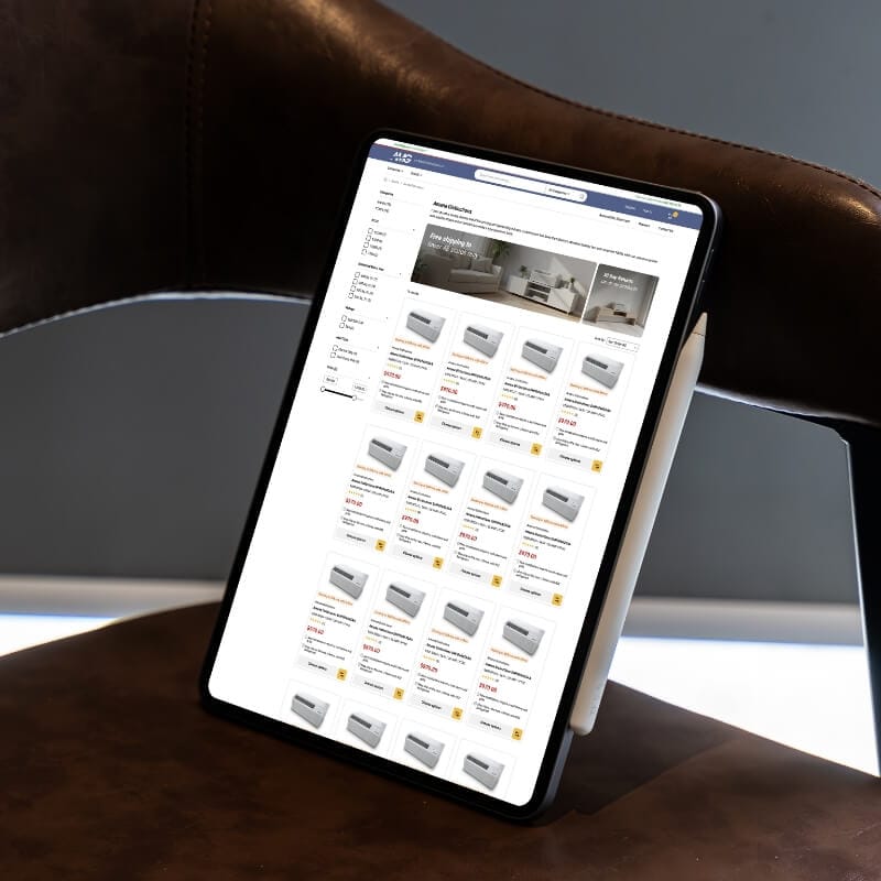
After that comes the business end, shop the collection. Filters match buyer logic, BTU options nine, twelve, fifteen, voltage two hundred eight or two hundred thirty, or two hundred sixty five, amps fifteen, twenty, thirty, heat type heat pump or electric. Product tiles show the model name, quick specs, a simple room size guide, and a button to view the product. A note reminds readers that room size is a guide, insulation and sun matter. This is category page UX done with manners.
Not every buyer wants a compact catalog on arrival. Some need space to breathe before they click. That’s why we built a second landing page version, same story but with more white space, more lifestyle images, and a cleaner rhythm. Think of it as the same store associate, just in a calmer showroom.
Where v1 is compact and straight to the filters, v2 slows the tempo. Images do more of the talking, copy takes shorter lines, and sections stretch out with clear air around them. The trust strip and hero headline land softer, the product set feels curated instead of crowded, and buyers get time to nod before they scroll.
V2 works especially well for paid traffic, where visitors often arrive skeptical or stressed. It earns confidence first, then points to the shop button. Side by side, both versions tell the same story, but in two voices: one quick, one calm. Both guide buyers to the right model, but v2 does it with a quieter handshake.
Takeaway: same logic, two tempos — pick the landing style that matches your traffic mood.
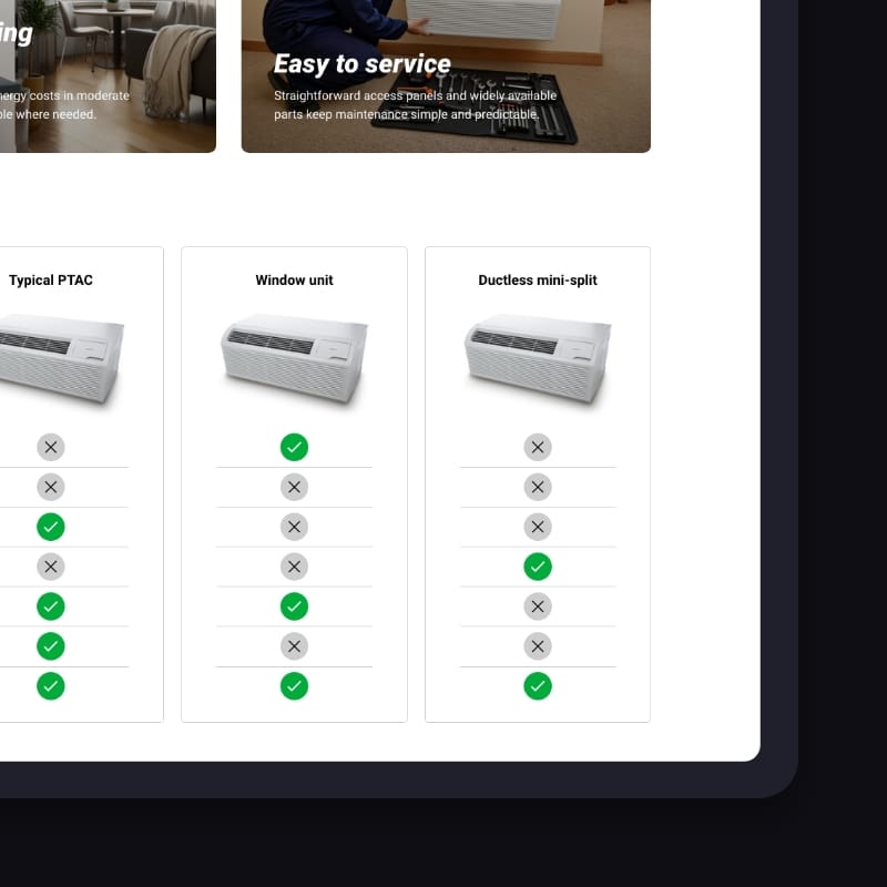
We follow with a small comparison. People love a quick table when they face a wall of acronyms. We compare this product type to a typical alternative, a window unit, and a ductless mini split. Criteria include energy efficiency, noise level, install complexity, parts availability, best use cases, and a rough room fit. No hype, just the kind of back of the napkin view buyers ask for. A button offers a tailored pick list if they want human help.
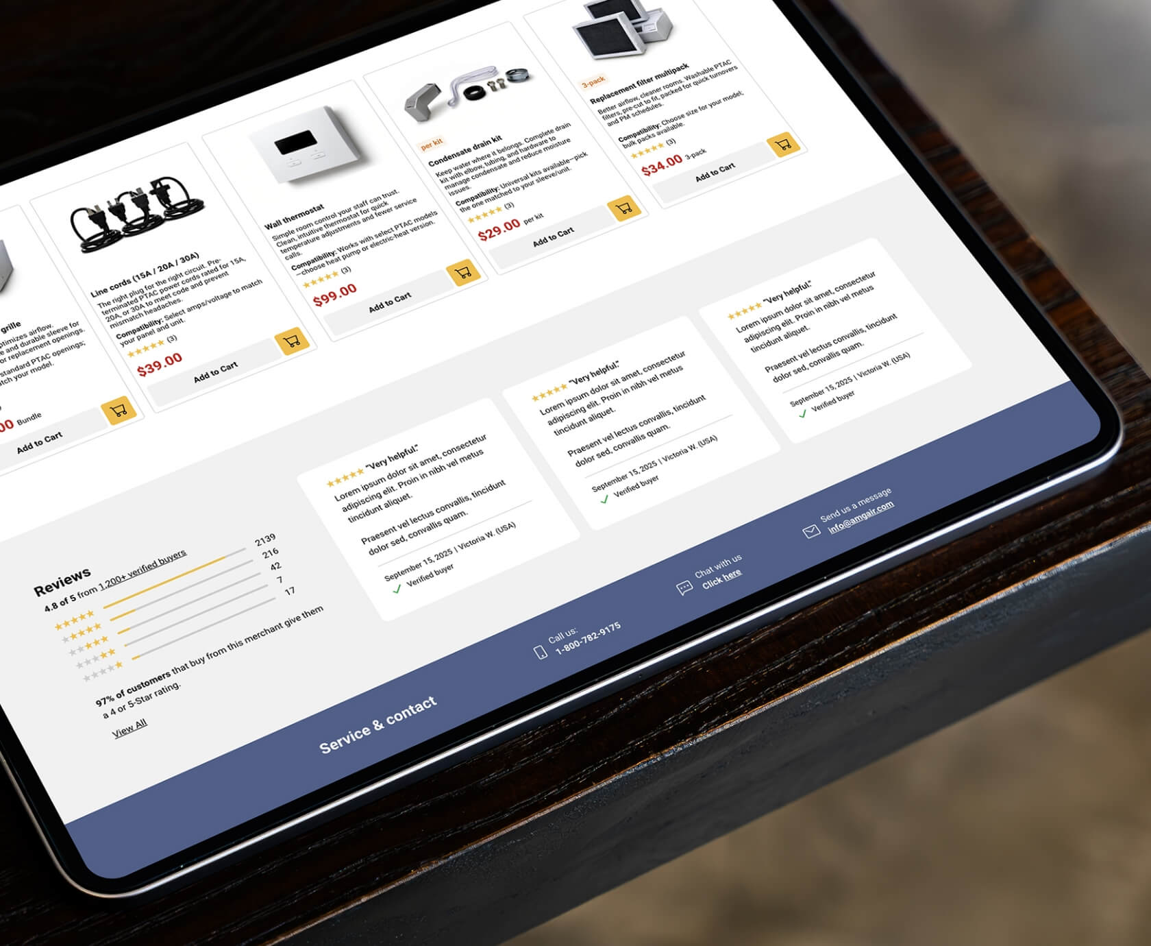
Upsells sit right under the comparison, not buried three clicks away. Five cards, sleeves and grilles, cords and thermostats, drain kits, filters, and professional installation. Each card has one line of copy and an example price, for instance sleeves plus grille bundle at one hundred forty nine, cords at thirty nine forty nine fifty nine, thermostat at ninety nine or one seventy nine, drain kit at twenty nine, filters at thirty four for three or ninety nine for ten. This section lifts average order value and cuts oops wrong cord emails.
We end with reviews and a final help nudge. Short quotes from hotel and property managers with stars and first names build confidence. The final block gives a plain next step, send room sizes, voltage, and timeline, we send a matched pick list and quote.
The category page turns casual interest into actual product choice. We used a clear type scale, a clean grid, and filters that stick. Each tile shows the model, cooling and heating numbers, voltage and amps, heat type, and a quick room fit. Price is readable, finance notes do not shout, reviews are visible but not a circus.
We tuned the scanning pattern. Name and spec line first, then the action. We reduced extra labels and kept microcopy short. The eye gets a rhythm, left to right, top to bottom, card by card. The user does not have to pause and decode odd phrasing. The ecommerce redesign work here is about friction removal.
We also added a small sticky helper on long lists, a mini filter row that follows you. It lets a hotel GM switch from nine thousand to twelve thousand without scrolling back to the top. No tricks, just time saved. That is how category page UX earns its place.
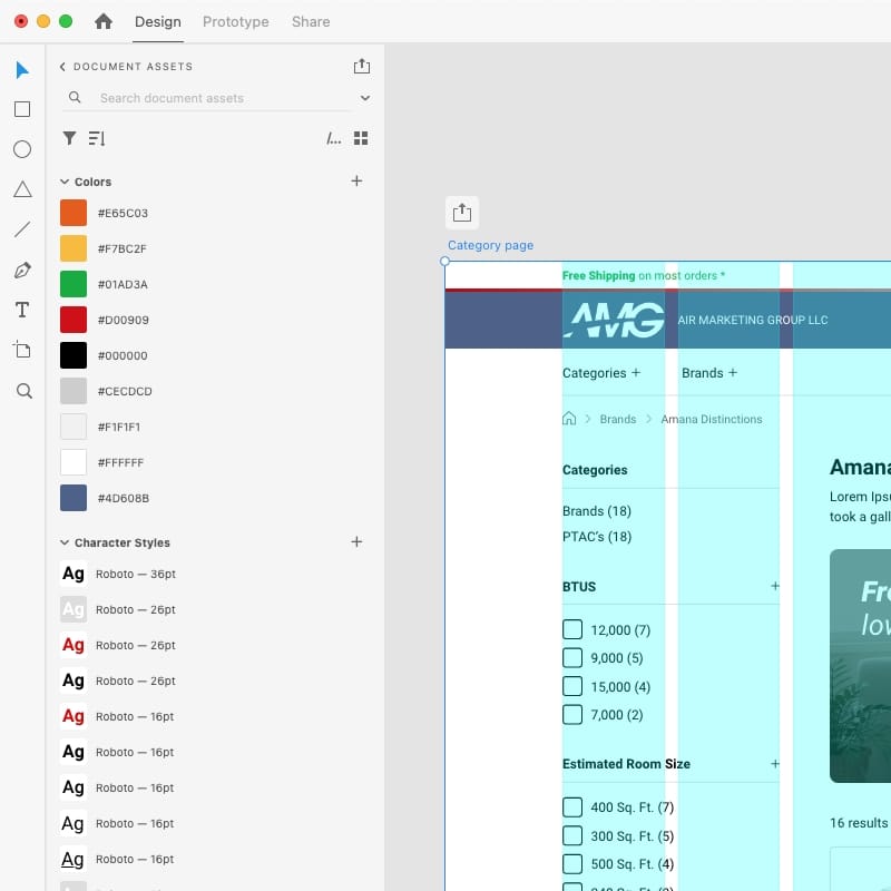
We designed the system in Adobe XD. Components, styles, spacing tokens, and redlines are all in the file. Buttons and tiles share a type scale. Icons and badges are consistent. Color accents guide the eye but do not scream. We kept contrast healthy, especially on small finance text, since that line matters for purchasing teams.
We handed over XD specs that a developer can read without squinting. Spacing is in even steps. Breakpoints are noted for future mobile work. The hero supports a review chip and two buttons. Product cards accept an upsell micro badge, for example add sleeve plus grille. Filters can expand gracefully when inventory grows.
If you want to nerd out, a framework is like cake mix, it saves time if you follow the recipe. APIs are the waiter, they take your order to the kitchen and bring back what you asked for. QA is the picky customer who sends the dish back if the salt is off. We keep these metaphors close so teams align fast.
We delivered designs only, but we set the table for development. The layout works with common ecommerce stacks. The upsell logic can map to product tags or metafields, voltage, amps, heat type. The comparison block can be static at first, then templatized.
We also included schema notes so search engines understand the page without guesswork. Product on tiles, FAQPage on the accordion, Organization for AMG Air, and AggregateRating where it is available and compliant. Clean schema helps rich snippets, and yes, that can nudge clicks without any extra ad spend.
If you want to go deeper on interface craft, our UX and UI design process is spelled out here, it shows how we structure research, wireframes, and high fidelity work, UX and UI design. Different project, same toolkit.

This timeline held because the brief was focused and the decision makers were available. If your project needs stakeholder workshops or user testing, we fold that in before high fidelity, same calm rhythm.
If your landing pages try to sell before they say hello, buyers bounce. If your category grid looks like a receipt printer, buyers stall. An eCommerce redesign is not special effects, it is tidy shelves, clear labels, and a friendly human nearby. That is what we built here, and it is what we build for teams that want less guesswork and more checkout.
If your product set has tricky attributes, we can map them to filters that feel human, not database shaped. If your accessories are quiet, we can make them speak at the right moment. If your copy is technical, we can write it like a waiter explains the menu, short and tasty.
We delivered desktop pages, including a brand landing page and a category page, both designed in Adobe XD. The project also included a comprehensive copy deck, image prompts, and schema notes. Additionally, we refreshed the header and footer, resulting in significant UX improvements.
No, this sprint was designs only, Act Bold Media handles implementation.
The brief was desktop only for the first testing round, the component system is ready for mobile adoption later.
We wrote short benefit copy, a simple FAQ, upsell texts and example prices, and a calm hero line that sets expectations.
By model attributes, voltage, amps, heat type, so the right sleeve and cord surface with the right unit.
For this project, yes, we used Adobe XD. We also work in other tools like Figma when a team needs it, but consistency beats tool wars.
Yes, hero headline, CTA label, comparison presence, and upsell position are good test candidates.
Give us your top product page and the landing page that gets the most paid traffic, we will tell you what is holding your site back, in plain language, and we will keep it short. Book a video call right now.


Book a quick 30 min video call, we will show you exactly what to fix. We reply within 24 hours.
