Jump to

Jun 26, 2025
The trigger: data don’t lie
After six months of analyzing our site performance, we noticed an interesting trend: higher mobile traffic, longer scroll depths, yet lower conversion rates. The numbers were telling us a story, it was time to dig deeper and act. With the Studio Ubique relaunch, we’re focused on bridging the gap between traffic and conversions to ensure a seamless user experience and better results.
The problem with “just one more patch”
Like many agencies, we’d been adding new pages and features onto an aging framework over the years. It’s a common trap, quick fixes and patches pile up until the structure feels clunky. After 4–5 years of this, the user experience shifted from smooth and streamlined to something more like a Swiss Army knife, clever, but not exactly built for speed or efficiency. That’s why the Studio Ubique relaunch was essential. We needed more than just another patch. We needed a full overhaul.
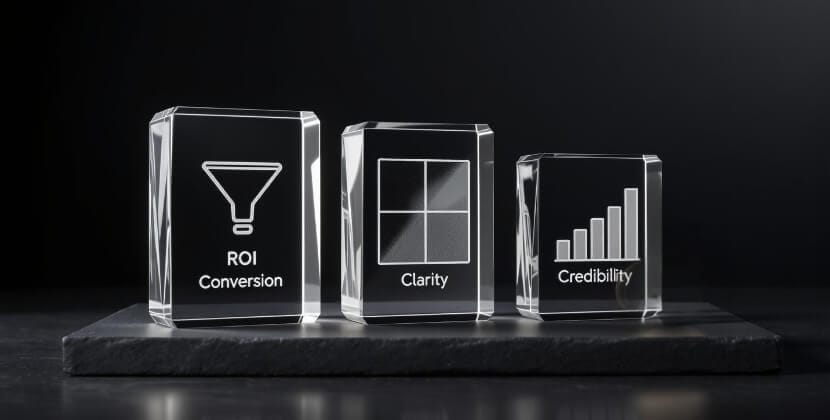
Our goals (spoiler: conversion, clarity, credibility)
We set out with three key goals in mind:
- Conversion: Simplify user journeys, make CTAs intuitive, and eliminate unnecessary friction.
- Clarity: Cut out jargon, add FAQs for common user questions, and ensure our services were clearly mapped to real-world problems our clients face.
- Credibility: Showcase measurable results for transparency, like a 38% bounce-rate drop for Client X or a 120% ARR lift for Client Y. We wanted real numbers to tell our story.

The approach
To achieve these goals, we adopted a comprehensive, user-first approach:
- User-first workshops: Heatmaps, user interviews, and funnel audits helped us understand behaviors and pain points.
- Content overhaul: Every headline and piece of text was reworked for SEO optimization, readability, and a conversational tone.
- Design sprints: These one-week cycles allowed us to test and iterate quickly, keeping the user experience at the forefront.
- Performance and accessibility focus: We ensured our site scored 95+ across the board on Lighthouse metrics, prioritizing speed, accessibility, and usability for all users.

What makes Studio Ubique different?
We’ve always taken pride in delivering something beyond the ordinary. Here’s what sets us apart:
- Full-stack thinking: We integrate UX, UI, and backend development seamlessly under one roof, so everything works perfectly together.
- Data devotion: Every decision we make is driven by metrics, not creative whims or mood boards, ensuring results are backed by evidence.
- Transparent process: Clients get full visibility into our process through live Kanban boards, so they’re never left in the dark about what’s happening.
What’s new on the site?
Here’s what we’ve added to the Studio Ubique relaunch to take the user experience to the next level:
- Service deep-dives: Detailed pages for services like UX/UI design, backend development, no-code projects, and CRO strategies.
- Case-study hub: Featuring real KPIs and tangible results for our clients—no fluffy marketing lingo here.
- Resource library: A treasure trove for curious leads who love to educate themselves, complete with guides, tips, and insights.
- Dynamic FAQ: Built to answer questions based on actual user-support tickets, ensuring it’s relevant and helpful.
The Studio Ubique relaunch is all about creating value and delivering a seamless experience!

Coming soon: Dutch edition
We discovered that 85–90% of our visitors prefer English, so we prioritized that for the initial launch. However, we’re working on a Dutch version of the site, which is now in production. Want to know when it’s live? Drop your email in the footer, and we’ll notify you as soon as it’s ready.
FAQs
Q.1 Why did Studio Ubique relaunch the website?
Six months of data showed higher mobile traffic and deeper scrolls but lower conversions. A full relaunch let us fix the gap between visits and actions.
Q.2 What problems were you solving?
Years of quick patches on an aging framework made UX clunky. We replaced “just one more fix” with a clean, modern build designed for speed and clarity.
Q.3 What goals guided the relaunch?
Conversion, clarity, credibility: simpler journeys and CTAs, plain-language content with FAQs, and real results (e.g., bounce-rate drops and ARR lifts) shown transparently.
Q.4 How did you approach the redesign?
User-first workshops, content overhaul, rapid design sprints, and strict performance/accessibility targets informed every decision.
Q.5 What performance targets did you set?
95+ scores on Lighthouse for Performance, Accessibility, Best Practices, and SEO, with a focus on fast loads and usable flows across devices.
Q.6 What’s new on the site?
Service deep-dives, a KPI-driven case-study hub, a resource library, and a dynamic FAQ based on real support questions.
Q.7 How will the relaunch improve conversions?
Clearer paths, fewer steps, better page speed, and content that answers real questions reduce friction and raise completed actions.
Q.8 When is the Dutch version coming?
English launched first (it serves ~85–90% of visitors). The Dutch edition is in production; subscribe in the footer to get notified.
Q.9 How can I report issues or share feedback?
Email hello@studioubique.com with bugs, typos, or suggestions—everything helps us improve.


Take it for a spin
We’d love to hear what you think about the Studio Ubique relaunch! Found a bug? Spotted a typo? Have a suggestion (or even a dad joke)? Send all your feedback to hello@studioubique.com. Your input helps us make our site even better.
Book a call