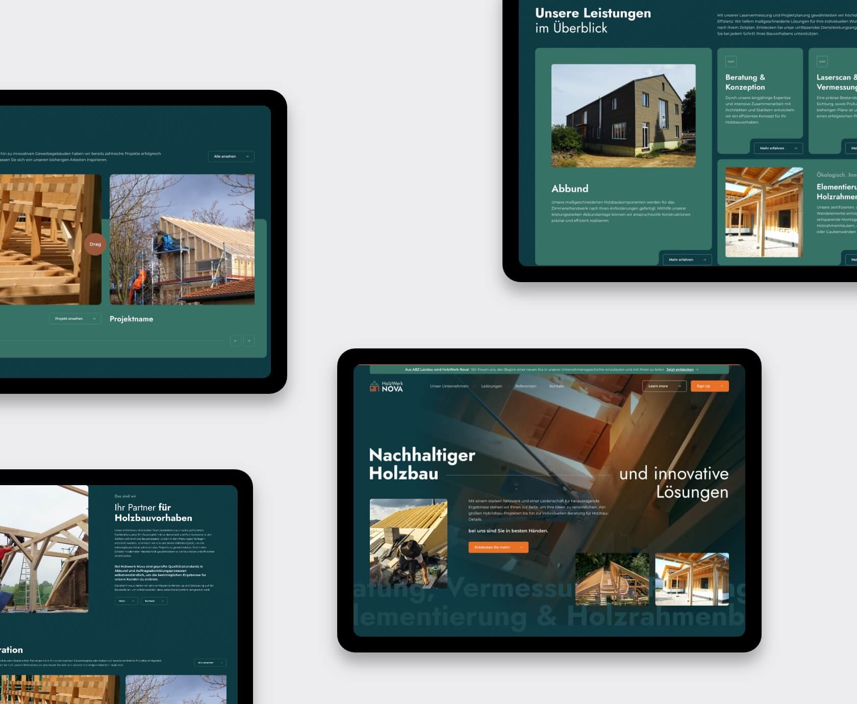
Custom UX design for a German woodworks brand. When a fast-growing timber company wants to bring its website up to the standard of its product design, you don’t offer them a generic WordPress theme. You build a tailored timber construction website UX design system that can scale, flex, and translate their identity into pixels — without looking like it came from a template graveyard.
That’s exactly what we did for Holzwerk Nova. And it wasn’t just about style. They needed clarity, structure, and a smarter way to present content across dozens of pages. By creating a modular website design system, we delivered a solution that grows with their business. Let’s break down how we did it.
No structure, no style, no system
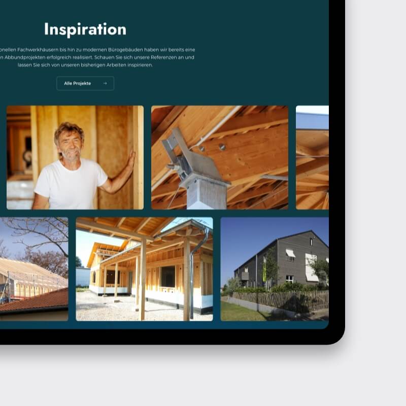
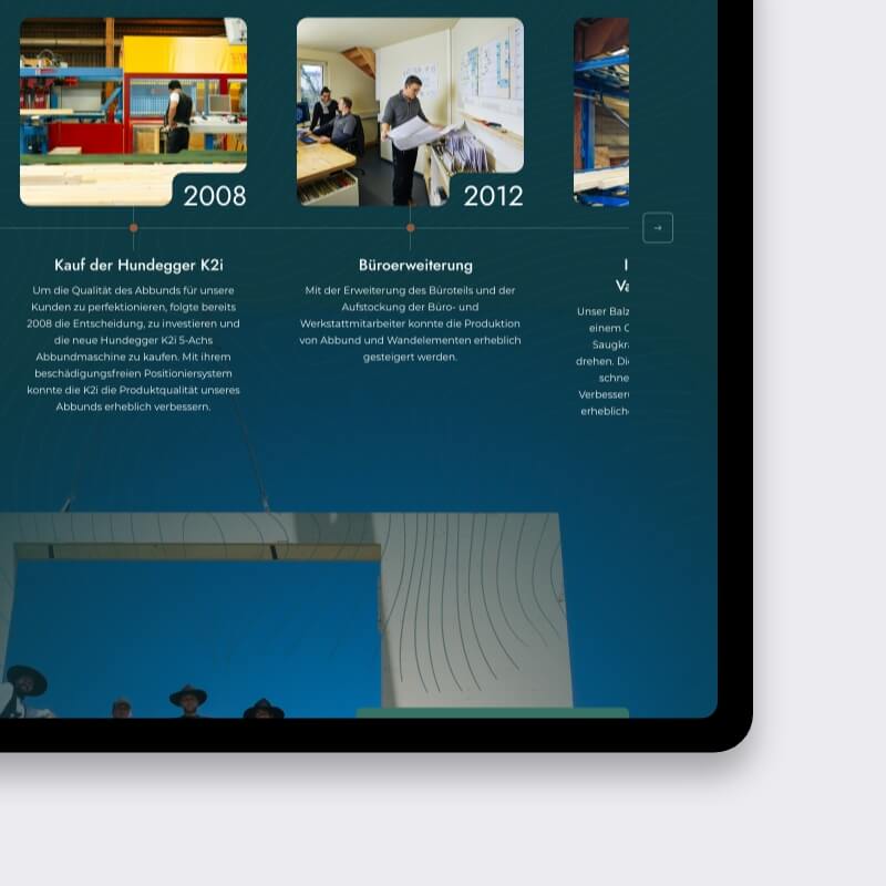
Holzwerk Nova had solid content — but no consistent layout, no visual story, and no scalable design framework. Their existing website felt more like a document dump than a digital showroom. The structure was chaotic, the brand identity wasn’t visible, and every new page felt like starting from scratch.
The core issues:
They didn’t just want a new look. They needed a timber construction website UX design system to bring order to their digital presence. The goal? A reusable, modular website design system that their team (or any dev team) could easily work with for the long haul, ensuring alignment with their B2B construction brand web design needs.
Design structure first. Templates second. Style last.
We kicked things off with a deep dive into Holzwerk Nova’s goals — together with KUBE Studio, our partner. We asked the right questions: What needs to stay? What’s missing? What needs to work smarter?
From there, we focused on:
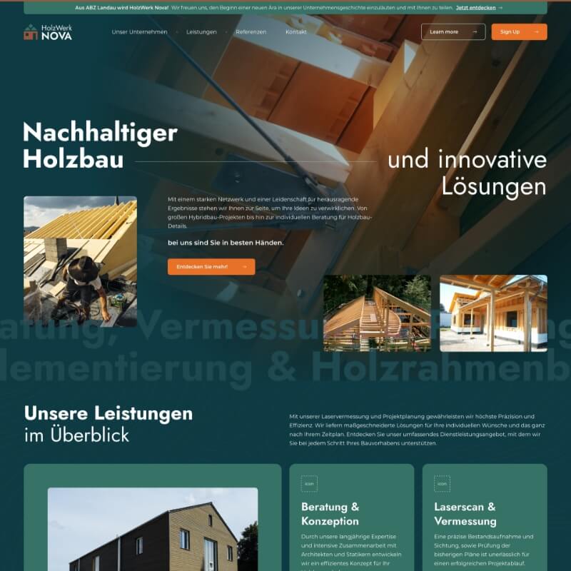
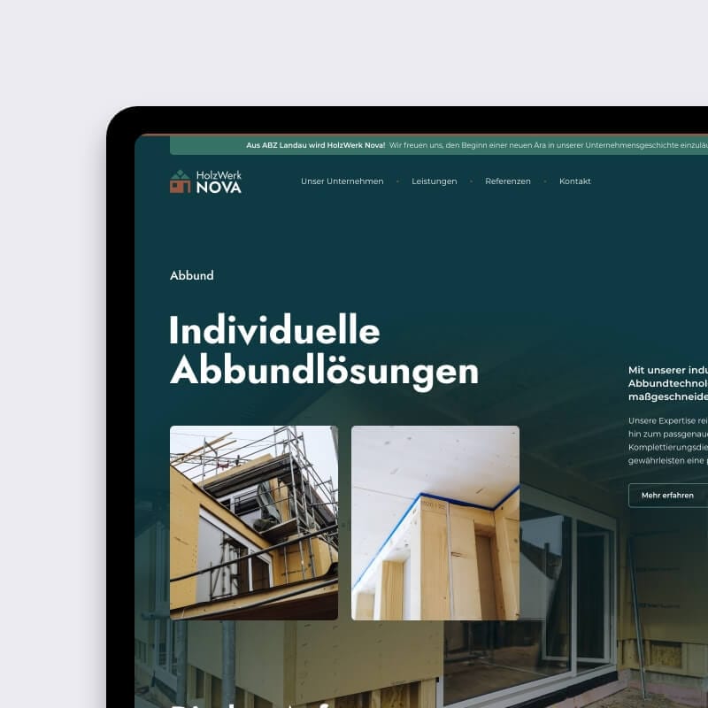
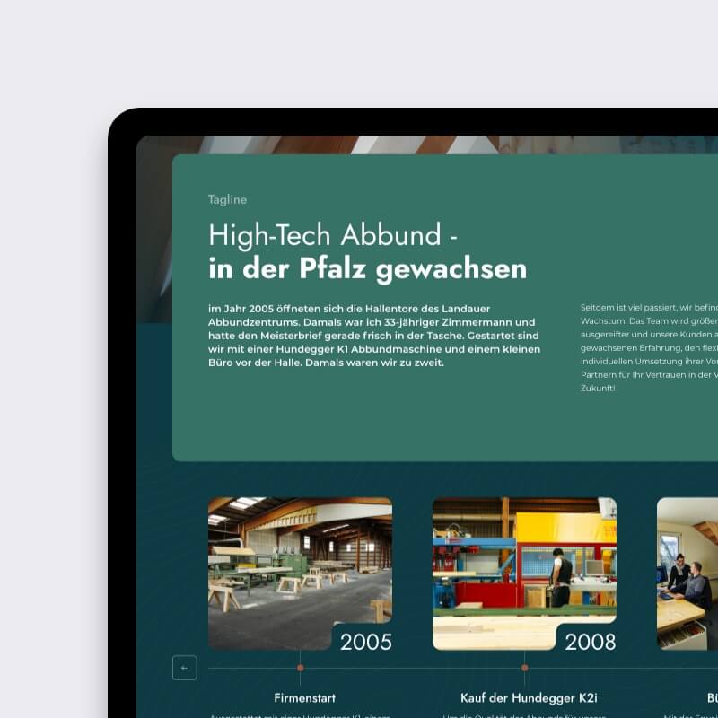
The result? A highly functional timber construction website UX design system tailored to Holzwerk Nova’s needs. By focusing on structure and scalability, we delivered a solution that supports their growth and aligns with the demands of the construction industry.
We designed in Adobe XD, delivered in tidy artboards — with clear logic and enough breathing space for future iterations.
For this UX-only project, our tools stayed sharp and focused to deliver a high-quality Timber construction website UX design system:
Since our role was design, not development, we ensured the handoff was clean, scalable, and developer-friendly, aligning with the needs of the construction industry UX design.
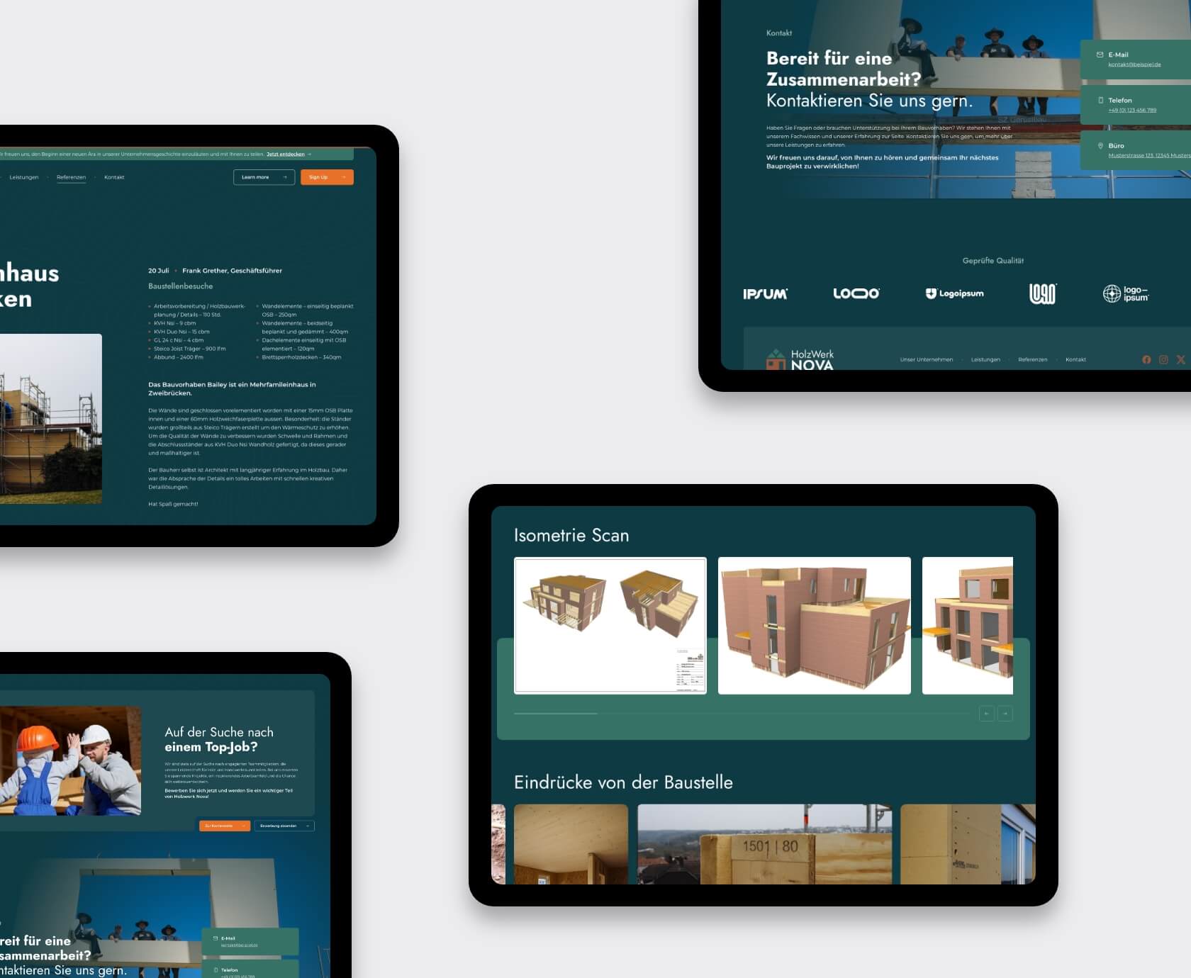
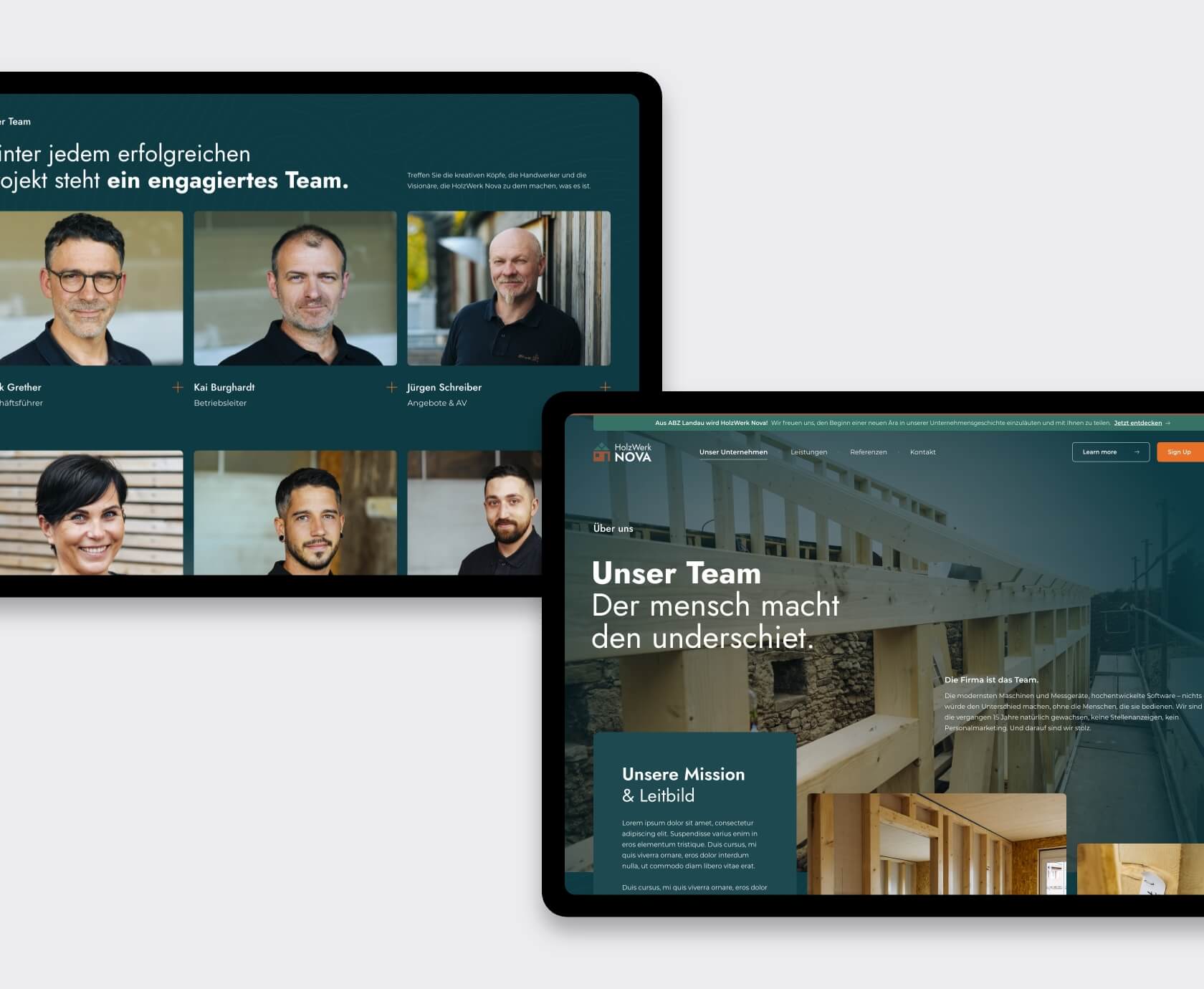
What started as a loosely structured vision became a clearly defined timber construction website UX design system with personality. The final UX design for Holzwerk Nova delivered:
The client was happy. KUBE was happy. And the site? It finally looked as sharp as the timber it promotes—a perfect example of B2B construction brand web design done right.
Need structure, clarity, and a bit of visual edge? Book a quick 30-min video call — we’ll show you how to turn your messy UX plans into pixel-perfect results, whether it’s for a timber construction website UX design system or a modular website design system. No pressure.
Let’s talk →


Tell us where you’re stuck, what you dream of building, or what needs fixing. We’ll reply within 24 hours