From plug-in to real-time insights in minutes

Industry:

Logistics & Transportation Tech

Timeline:

1 month

Impact:

+54% boost in app store ratings

Kayo fitness app mobile interface showing personalized workout dashboard

A slick product needs a sharper pitch

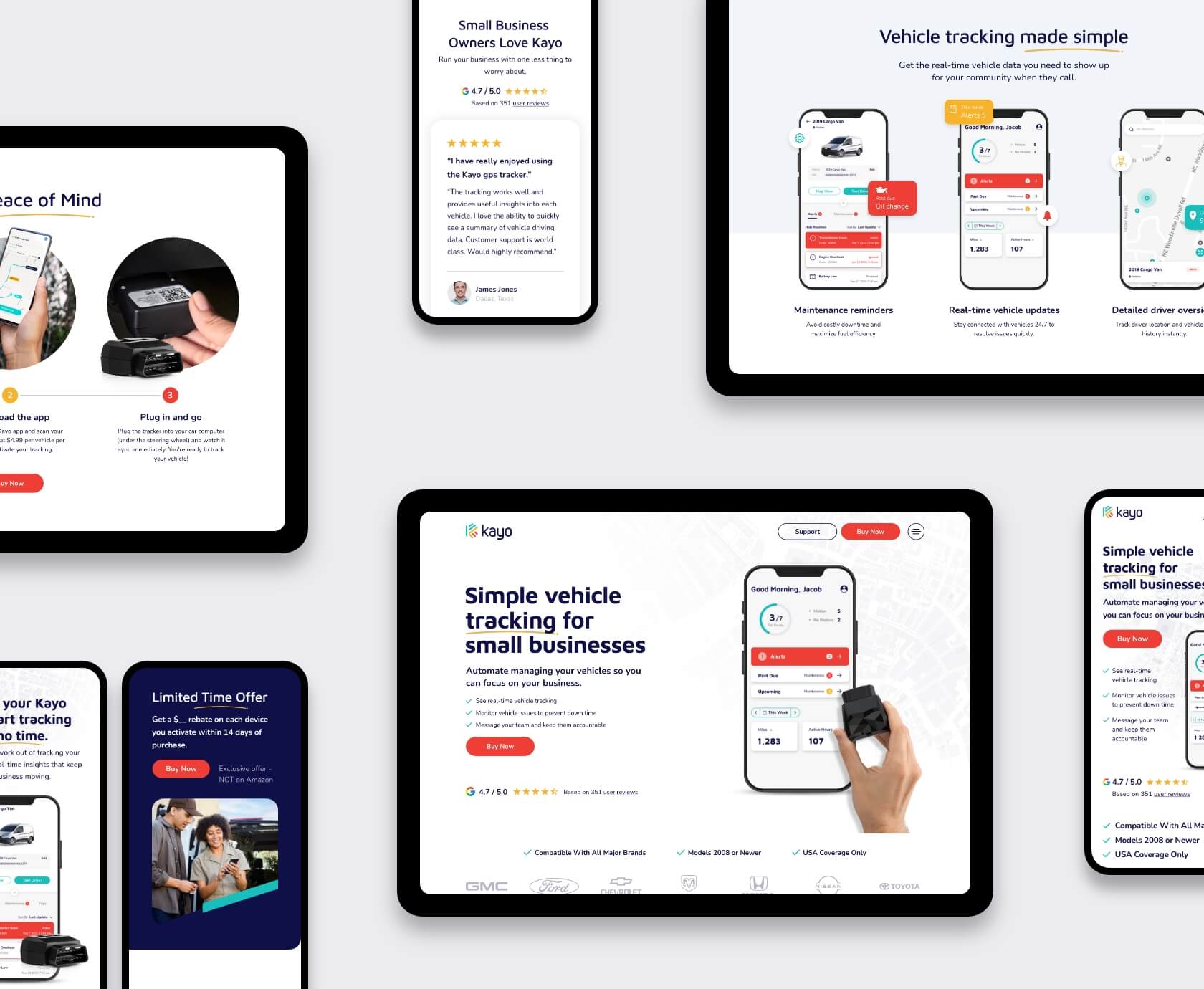
Kayo provides GPS tracking software for small businesses, but their old marketing site wasn’t doing the product justice. The confusing layout, unclear messaging, and lack of a proper mobile UX were holding it back—especially for a product aimed at people constantly on the move.

They came to us with wireframes, a brand guide, and a deadline. Our team dove in, turning this project into the ultimate Kayo mobile app UX/UI design case study. From optimizing the mobile onboarding experience to refining their UI design system for GPS tracking applications, we focused on creating a streamlined, user-friendly experience.

No fluff, no fluff allowed.

It’s 10 p.m. Do you know where your trucks are?

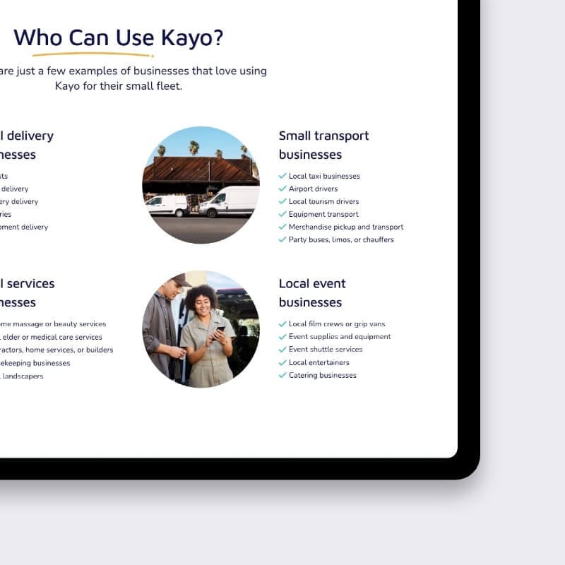
That’s the kind of pain point Kayo’s customers face: missed deliveries, no-shows, and spiraling costs. Their product solves that — but the site didn’t explain it quickly or effectively enough.

We approached the Kayo mobile app UX/UI design case study with clear goals:

  • Sharpen the message
  • Simplify the journey
  • Respect the wireframe
  • And make mobile users feel like first-class citizens


Our process also included usability testing mobile prototypes to ensure the experience was seamless for all users. And we delivered.

Mobile interface mock-up showing personalized GPS tracking dashboard
Mobile mock-ups of the mobile onboarding and pricing screens

What we delivered

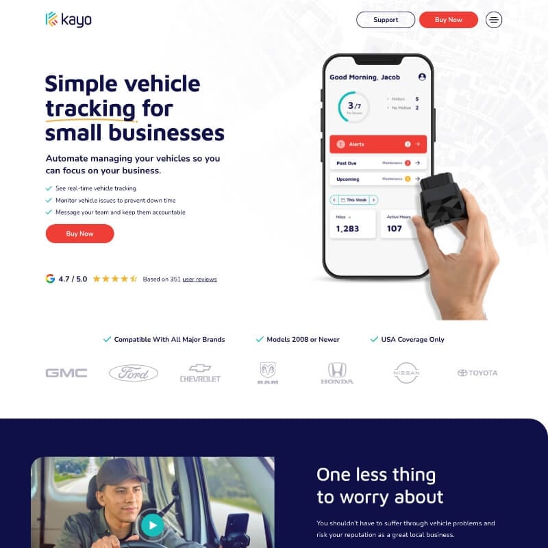
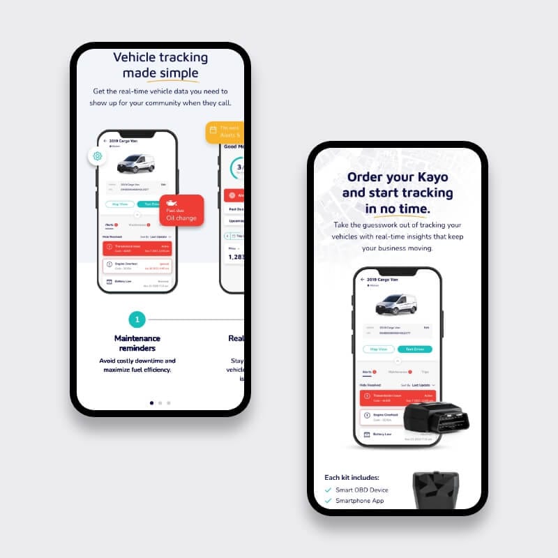
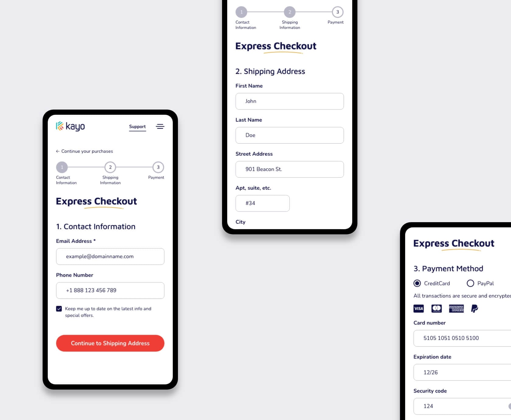
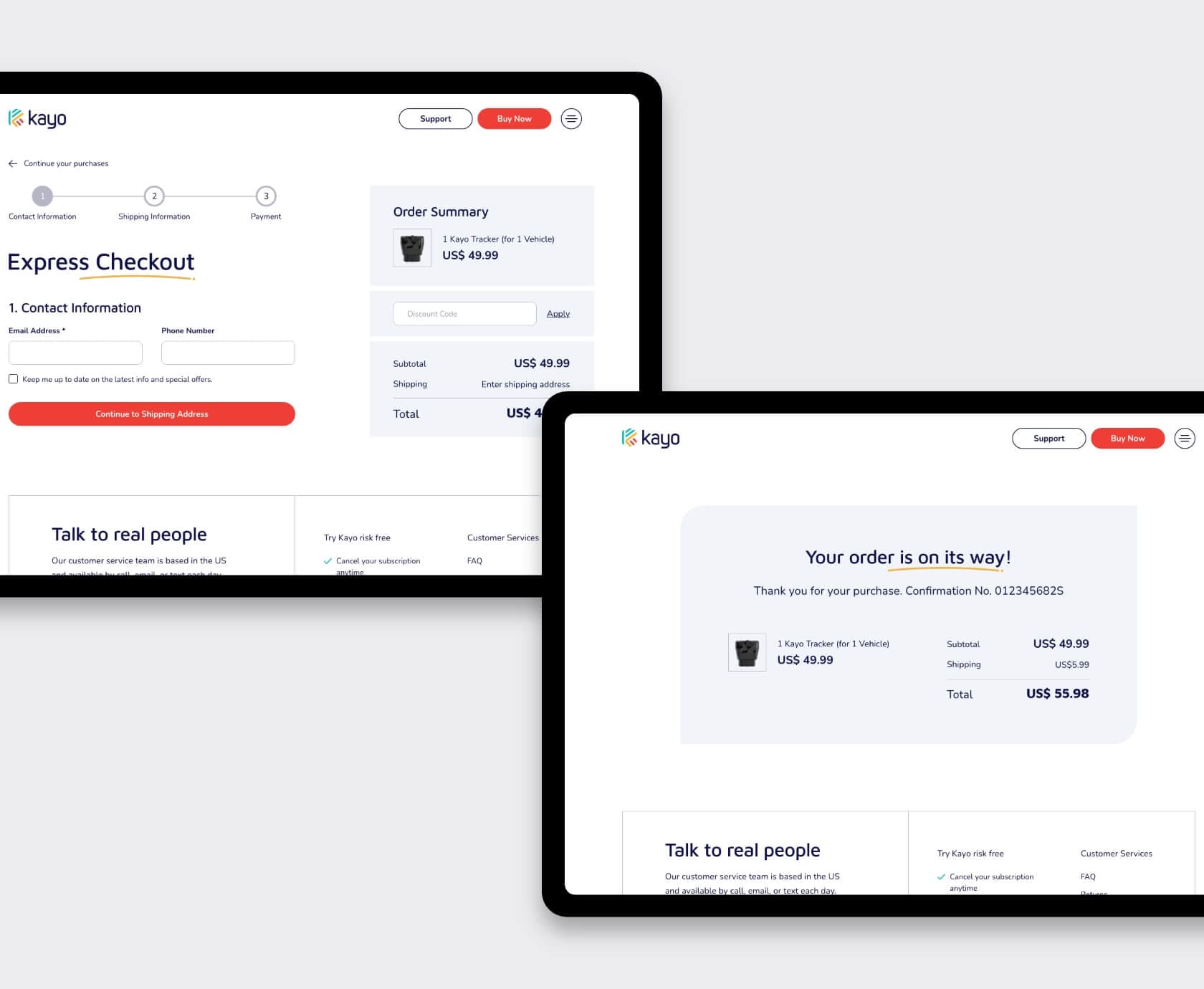
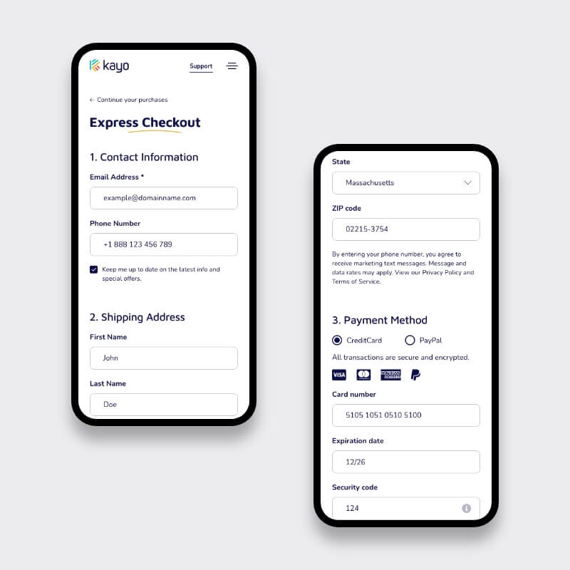
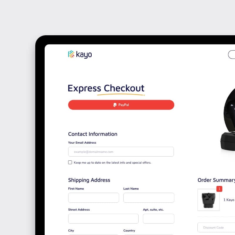
We took Kayo’s wireframe and brand materials and transformed them into a focused, modern interface for the Kayo mobile app UX/UI design case study. The result is a user-friendly experience that’s quick to scan, easy to act on, and friction-free on mobile.

Our approach:

  • Desktop + mobile designs delivered in Adobe XD
  • Built with a clear conversion path and strong call-to-action hierarchy
  • Created flexible design components for future updates
  • Worked fast, with weekly design check-ins and feedback rounds


Design focus areas:

  • Simple value messaging (you track, we visualize)
  • No-nonsense structure for pricing and service tiers
  • Clean iconography and color usage that builds trust


This project highlights how usability testing mobile prototypes helped refine the design, ensuring a seamless experience for Kayo users from start to finish.

Tablet wireframe showing conversion-focused call-to-action hierarchy

Tech stack and delivery

  • Design tool: Adobe XD
  • Handoff format: Layered desktop & mobile files, icon sets, specs
  • Process: Weekly feedback loops → visual QA checklist → final delivery

No developers left guessing. No clients left waiting.

Explore the Kayo mobile app UX/UI design case study to see how we optimized the mobile onboarding experience and delivered a seamless handoff process.

Mobile display of design-system components and iconography for the Kayo app
Tablet display of design-system components and iconography for the Kayo app

What changed?

  • Navigation went from “where am I?” to “get started now”
  • Product benefits now jump out on desktop and mobile
  • Client onboarding sped up thanks to better page structure
  • One-click booking and quote requests are now front and center


We didn’t just make Kayo’s interface nicer. We made it work. Check out our Kayo mobile app UX/UI design case study to see how we optimized the mobile onboarding experience and crafted a seamless user journey.

Mobile prototype usability testing with user feedback
Layered tablet image of the check out page

You’re one wireframe away from better results

Whether your product is GPS tracking or something entirely different, you don’t want to lose leads at the first scroll.

Book a 30-min call — no pressure, no jargon — and we’ll show you how to make your next UX project easier to sell and easier to use. We’ll even share insights from our Kayo mobile app UX/UI design case study and discuss strategies like mobile onboarding experience optimization to ensure your product stands out.

👉 Let’s talk

UX strategist mapping sprint tasks on flip-chart while developer reviews code on phone and laptop, Studio Ubique office
Designer pointing at code review on monitor during pair-programming session with developer, plant-filled Studio Ubique workspace
Colleagues checking website mock-ups on laptop in bright corridor, blurred team in background, Studio Ubique design agency Mobile coffee cart barista serving cappuccino to UX designer in sunlit hallway, Studio Ubique team break
Team lunch-and-learn: three coworkers discussing project over salads and laptop in airy Studio Ubique café-style area Studio Ubique team walking with client, showcasing new website on laptop while chatting in modern white corridor
Designer jotting product ideas in notebook beside laptop on window bench at golden hour, Studio Ubique brainstorming
Remote UX sync: designer video-calling teammate on desktop monitor, taking notes in minimalist Studio Ubique office

Let’s make your digital
project the next success story.

Tell us where you’re stuck, what you dream of building, or what needs fixing. We’ll reply within 24 hours

    Just a heads-up: we’re not into acquisitions. If you’re not here for our services, please step away from the button :)

    whatsapp-icon