Trusted by clients on top review platforms


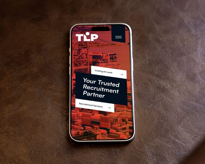
Recruitment UX design sits at the heart of your hiring funnel. Most career pages slow candidates with tiny buttons, long forms and unreadable text. We fix that. Our studio focuses on candidate experience optimisation, mobile career site UX and recruitment interface redesign.
You get thumb-zone layouts, progress nudges and clear copy that keep busy talent moving forward and your ATS filling up.


65% of users start on their phones, but 40% drop off halfway through. To solve this, we optimize recruitment UX design by automatically compressing files, repositioning key fields into the thumb zone, and reducing taps by a third.
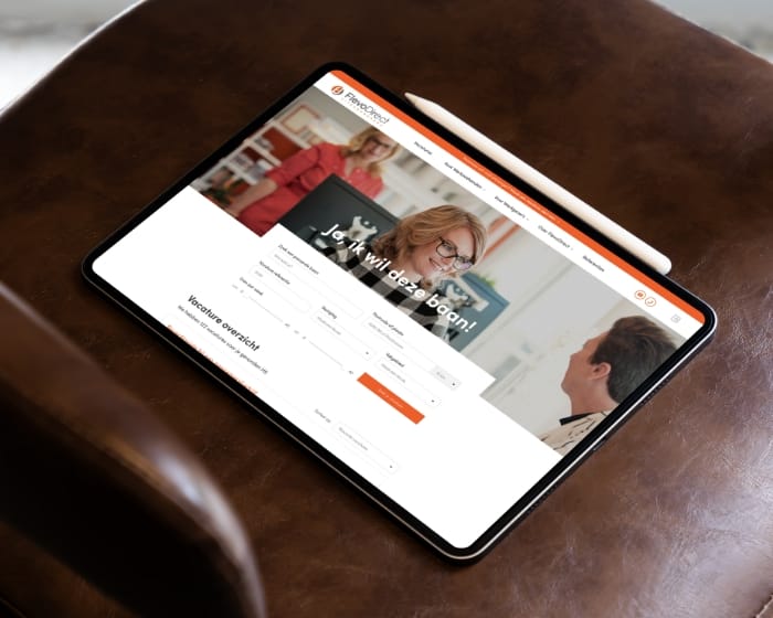
Walls of text and unclear progress bars can drive users away. That’s why we simplify the process into three clear steps, using concise micro-copy to address questions before they even arise. This approach ensures a smoother mobile career site UX design, keeping users engaged every step of the way.

Poor color contrast and missing labels can exclude a significant portion of your talent pool. That’s why every palette and component we deliver is designed to meet WCAG 2.2 AA standards, ensuring accessibility for all. With inclusive recruitment interface design, no one is left squinting or struggling to navigate.
As experts in candidate experience, we pair Dutch UX strategists with an India-based sprint team to deliver polished recruitment UX designs. This ensures you get tested, high-quality designs every week.
01
We analyze Google Analytics, heat maps, and ATS drop-off points to find areas for improvement. Together, we set clear KPIs to improve recruitment UX design, ensuring a smoother candidate journey. This includes optimizing candidate experience, mobile career site UX, and recruitment interface design.
02
Low-fidelity user flows were created in Figma and Adobe XD, then tested with five candidates by day ten. This process focused on improving recruitment UX design and optimizing the candidate experience. From prototypes to testing, the goal is to refine mobile career site UX and prepare for recruitment interface redesigns.
03
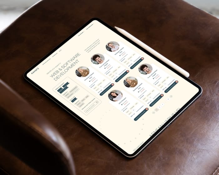
Token-driven colors, WCAG-compliant palettes, and a component library optimized for Storybook. These tools ensure seamless recruitment UX design with clarity and efficiency. Ideal for projects focused on candidate experience or mobile career site UX, they support intuitive interface redesign and more.
04
Interactive mobile demo with fast feedback for quick adjustments. Great recruitment UX starts with adaptability. Our demo allows real-time candidate experience optimization, so you can gather feedback and make changes in hours. Whether improving your career site or redesigning your recruitment interface, our process ensures a seamless experience for recruiters and candidates.
05
Zeplin specs finalized, redline documentation completed, and the dev Q&A channel launched—all within week six. The first page went live, showcasing a seamless integration of recruitment UX design principles. By focusing on candidate experience optimization and leveraging mobile career site UX, the process ensures a smoother recruitment interface redesign that enhances usability and efficiency.
Our team has been collaborating with leading brands to create innovative digital products that captivate audiences and accelerate growth.


From mobile-friendly career sites to intuitive interfaces, we specialize in recruitment UX design that transforms the hiring process. By enhancing the candidate experience, we deliver tailored solutions that meet your unique needs. Whether it’s optimizing mobile sites or redesigning recruitment workflows, we ensure a seamless, user-friendly journey for both employers and candidates.
We’ve put together a handy list of frequently asked questions to light your path. Curious about something else? Whether it’s about developing a custom ATS or something more, you’ll likely find the answer here or on the FAQ page.


Tell us where you’re stuck, what you dream of building, or what needs fixing. We’ll reply within 24 hours