Jump to
Jun 22, 2025
Introduction
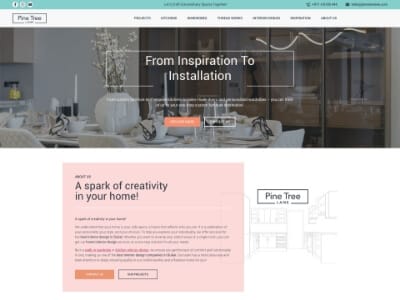
This B2B website UX case study begins with a common frustration: your old interior-design site may have looked sleek, but it leaked leads like a broken faucet. Visitors bounced, forms felt like a chore, and the all-important “Request a quote” button was buried in a maze of links. Leave things as they are, and you’ll keep pouring ad budgets into a black hole while competitors capture your potential customers.
Now, imagine a homepage that directs visitors to a clear call-to-action, strategically designed pillar pages that address pricing questions before they even arise, and a contact form so seamless it feels like a handshake. That’s exactly what we achieved for Pine Tree Lane with a WordPress website redesign focused on interior-design website optimization to increase conversion rates online.
In the following sections, we’ll show you the step-by-step process of what changed on each page—and how you can apply these same before-and-after web design strategies without a complete overhaul. Let’s dive in.
The friction we fixed
Visitors arrived, sighed, and left. Here’s what the data and user-testing clips revealed before our WordPress website redesign:
- Hidden calls to action — Quote buttons were buried in pastel backgrounds, nearly invisible.
- Long contact forms — An eight-field form meant “We’ll finish later,” which often turned into “never.”
- Messy gallery design — Mixed-size thumbnails created a chaotic grid that screamed, “We don’t pay attention to details.”
- Overwhelming text blocks — Endless walls of text made scrolling feel like a chore.
Left unchecked, these issues kept ad costs high and inquiries low. This B2B website UX case study shows how we tackled these challenges through thoughtful interior-design website optimization and a strategic before and after web design approach to increase conversion rates online.
Before and after web design wins
This section of our B2B website UX case study breaks down each page with clear, actionable insights—no fluff, just straight talk.
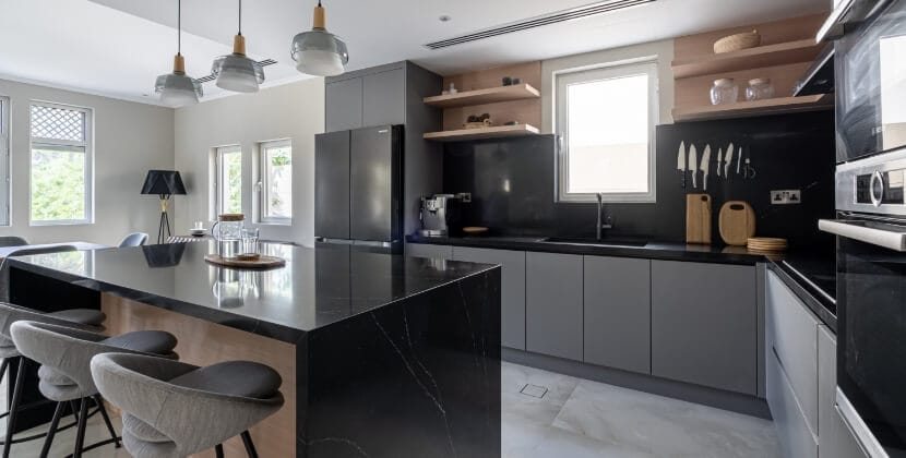
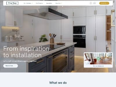
- Home – The old hero section was cluttered with two buttons and a dull, washed-out photo. We simplified it with one bold “See our work” button, a sleek kitchen image, and a clear, single-line value proposition. Fewer choices mean more clicks.
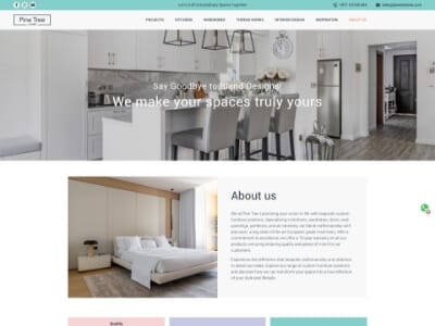
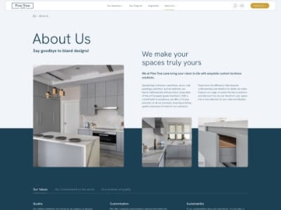
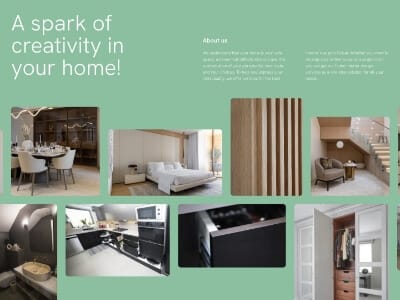
- About us – A generic mission statement buried the human side of the brand. We replaced it with a quick timeline, an authentic founder quote, and friendly team headshots. Showing the faces behind the craft builds trust and connection.
- Contact – An eight-field form with a captcha felt like airport security. We trimmed it to just four fields, added live validation, and included a WhatsApp link for instant communication. Simpler, faster, better.
- Inspiration hub – Endless scrolling overwhelmed visitors with too many thumbnails. We introduced a clean card grid with category filters and a search bar. Now, finding a Scandinavian kitchen takes three clicks, not thirty.
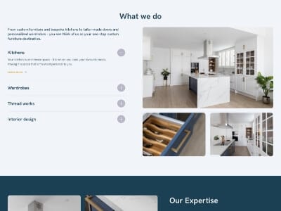
- Interior design pillar – Dense text and generic stock photos made readers lose interest. We fixed this with a concise, four-step visual process, a sticky call-to-action, and real project images to keep visitors engaged and moving forward.
- Kitchens pillar – Jargon-heavy content without cost transparency raised doubts. The updated page features a before/after slider alongside a clear price-range badge and an FAQ accordion to address budget concerns instantly.
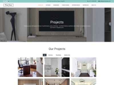
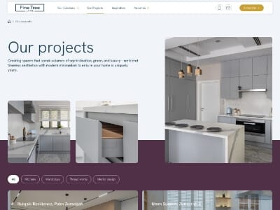
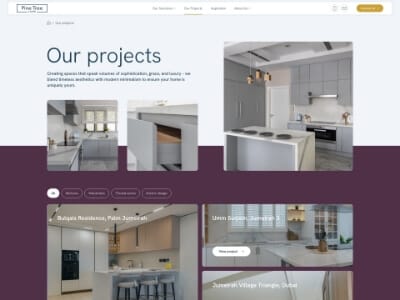
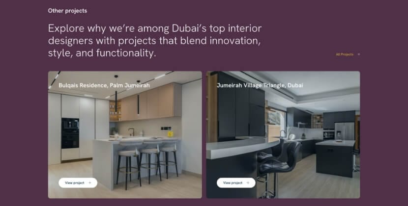
- Projects overview – Mixed thumbnail sizes created a messy, inconsistent look. We upgraded to a polished masonry gallery with uniform card sizes and hover details, improving both style and functionality.
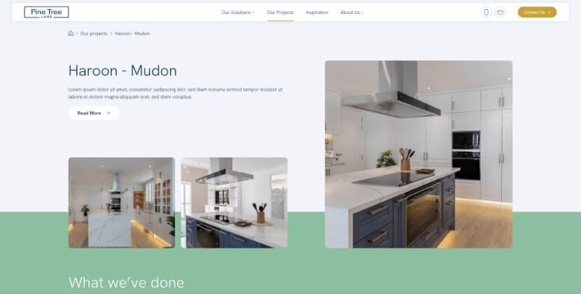
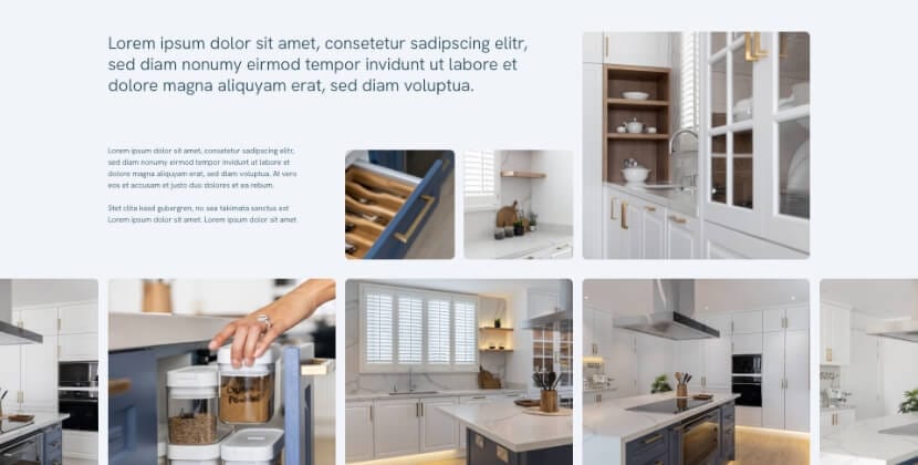
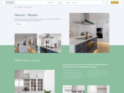
- Project modal – Moving to a new page for just two photos was clunky. Now, an in-page pop-up with an eight-shot carousel and metrics bar (covering space saved and days delivered) tells the story and shares the stats in one seamless view.
- Thread works – Service details were hidden two layers deep, making it hard to find information. A new dedicated page highlights fabric swatches, sustainability details, and a “Request sample” micro-CTA next to each textile—delivering proof in seconds.
- Legal & care – A wall of legal text was a recipe for frustration. We introduced accordion-style sections with a sticky side index and an optional PDF download, allowing users to skim or dive deeper at their own pace.
These updates reflect key goals like WordPress website redesign, before and after web design improvements, and interior-design website optimization. By reducing friction, answering visitor questions, and guiding them toward action, we’ve made it easier to increase conversion rates online.
Results of this B2B website UX case study
Sixty days post-launch, we checked the data—no champagne, just results:
- Home page bounce rate dropped from 54% to 38%
- Average session time on key pillar pages increased by 39%
- Quote-request completions soared by 61%
- Revenue-per-visit increased enough to cover the cost of the WordPress website redesign in just three weeks
Not bad for a strategic facelift focusing on clicks over color swatches. This B2B website UX case study shows how thoughtful design and interior-design website optimization can increase conversion rates online while delivering measurable results. A true before-and-after web design success story.
WordPress website redesign metrics
Why did the numbers improve?
- Single focus per screen – one task, one clear call-to-action button.
- Fewer form fields – every extra field once cost 4% of leads.
- Sticky header CTA – keeps the call-to-action visible for users who skim.
- Optimized media loading – lazy-loaded galleries ensure a lean Time to First Byte.
- Proof early, proof often – logos, metrics bars, and sliders build trust and reduce hesitation.
Each of these tweaks was tracked in Google Analytics as a “before and after web design” annotation, making it easy to measure the lift in performance. This B2B website highlights how a thoughtful WordPress website redesign and interior-design website optimization strategies can dramatically increase conversion rates online.
Interior-design website optimization tips you can steal
- Showcase your best project front and center—ditch that outdated “latest news” block no one reads.
- Add a price-range badge next to every flagship service to set clear expectations.
- Replace autoplay videos with portrait quote sliders—they load faster and feel more personal.
- Use a masonry grid with equal-height cards to highlight craftsmanship and create a polished look.
- Standardize your quote button color across the site; consistency builds user habits quickly.
Follow this checklist, and you’ll boost engagement and increase conversion rate online—all without touching the backend. Whether you’re tackling a WordPress website redesign or refining an interior-design website optimization, these tips can transform your site’s usability. Want to see how these changes make an impact? Check out our B2B website UX case study for a before and after web design breakdown that delivers real results.
Ready to see numbers like these on your own site?
Book a free 30-minute video call and get actionable insights:
- A live audit of your top three pages—we’ll screen-share what’s working, what’s not, and what’s fixable.
- Clear benchmarks from a recent B2B website, including before and after web design metrics you can apply to your analytics.
- A simple, no-jargon plan to increase conversion rate online—no fluff, no endless slide decks.
Schedule your call now and let’s turn your WordPress website redesign or interior-design website optimization into measurable success. Every visitor counts—make sure your website does too.


Let’s talk
Is your website holding your business back? From slow loading times and clunky design to struggling to connect with your audience, we’ve got you covered. Don’t just take our word for it—160+ clients have rated us 5 stars on Clutch, Sortlist, 99designs, and Google. Let’s talk!
Schedule a free, no-strings-attached 30-minute consultation and let’s discuss your goals and how we can help you achieve them.